Of the entire color spectrum, the red hue is considered the most difficult. Indeed, no other color can be associated with so many emotions, events, objects. Sometimes these associations are radically diametrical. Look, the red color has become a symbol of Valentine's Day, that is, a symbol of light and sublime feelings, and at the same time adorns specific areas of megacities, nicknamed "Red Light Streets", bearing the sign of vice and base passions. This is a sign of courage and danger. And how is red perceived in the interior? There will be no single answer to this question. Maybe that's why red decors are quite rare. Inscribing such an emotional color into a living environment is not a task for the faint of heart, and only true professionals successfully cope with it. Sometimes their imagination gives rise to stunningly beautiful interiors worthy of sincere admiration.
red color in the interior of the living room
Ordinary inhabitants, not knowing the secrets of decorative craftsmanship, are simply unable to curb red energy, so the bulk of them try to completely ignore it - but in vain. It is quite possible to smooth out the minuses of red and even get rid of them completely, but for this you need to know how to emphasize the decorative pluses of the shade.
Cons of red in the interior
The main problem of red in the interior is its exciting effect on people. It dramatically raises the threshold of irritability. Even a phlegmatic in such an environment begins to show concern and look for a more comfortable place for himself, but what about people with an unstable psyche and hyperactive children? The red color, which has become the background in the interior, will be incredibly tiring and will steadily reduce performance.. And on the very space of the room, this shade does not work in the best way. The red walls squeeze it, literally dropping the ceiling on your head. Moreover, such an effect of distortion of spatial perception is inherent not only in the red color, but also in its “partners” in the spectrum.
upholstered furniture in red color gives the interior a festive atmosphere
Pros of red in the interior
"One cannot do without red in Arabic, Chinese and other ethnic interiors"
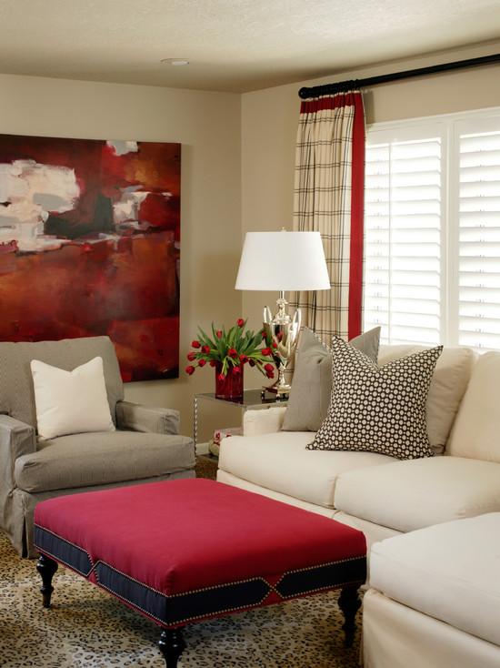
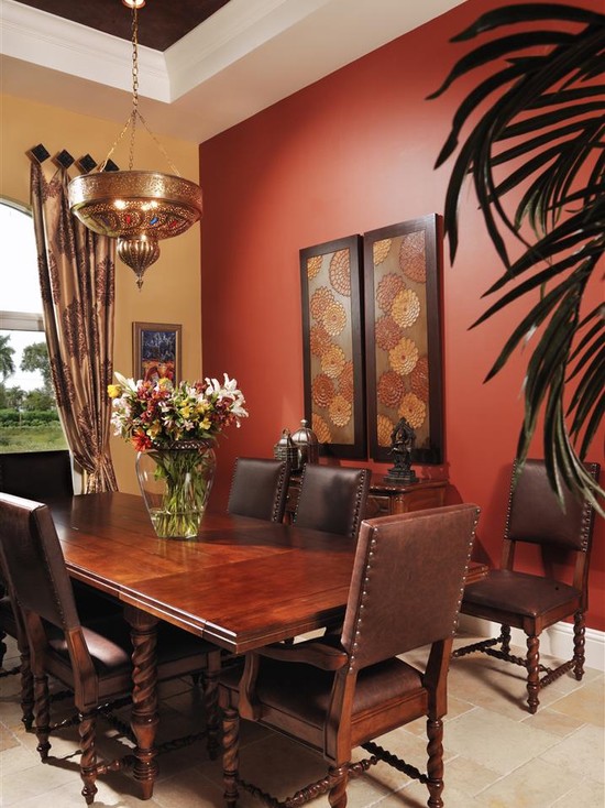
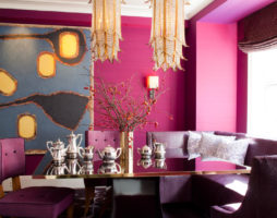
A completely different perception of red in the interior with its moderate presence. In such rooms there is always a realm of festive mood. Red perfectly conveys solemnity, which is why it can always be seen in theater halls, on concert stages. Furniture, carpets, curtains can be made in such colors. Burgundy, crimson, burgundy are popular.
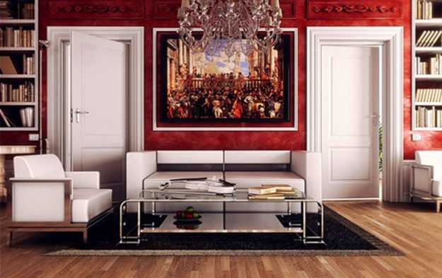
Red is simply indispensable in situations where you need to create a majestic atmosphere akin to a palace. In combination with noble wood and gilding, it brings a touch of incredible high cost to the interior.
red accessories turn into a bright decor element in a simple black and white kitchen design
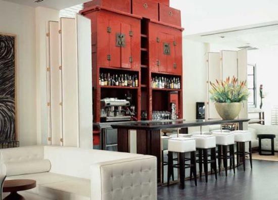
You can not do without red in Arabic, Chinese and other ethnic interiors.Oriental decors are always filled with a variety of red shades.
The harmonious presence of red in the decoration, its skillful use cheer up and give a positive charge.
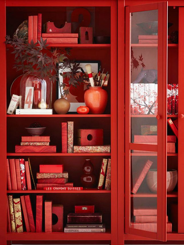
back to index ↑Decorative shades of red
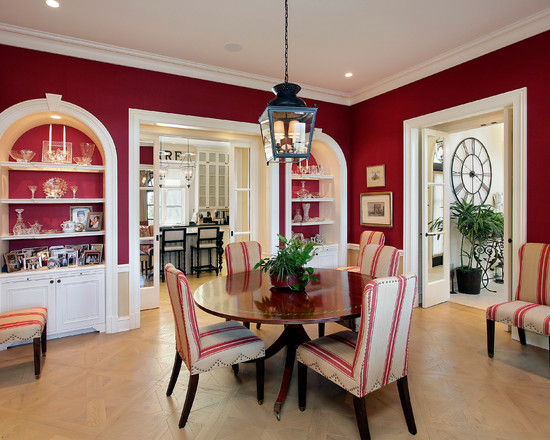
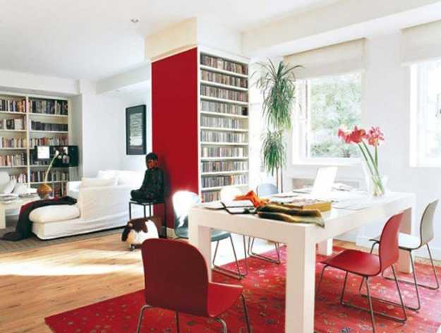
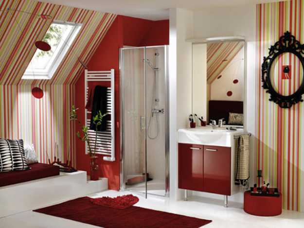
If designers are talking about a red interior, then this does not mean at all that we are talking about its true color; most likely, they mean its shades, and red really has a lot of them. In the red spectrum, there are light pinks, soft terracottas, rich purple-reds, and heady burgundy. Each of them finds its application in decors.
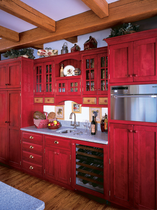
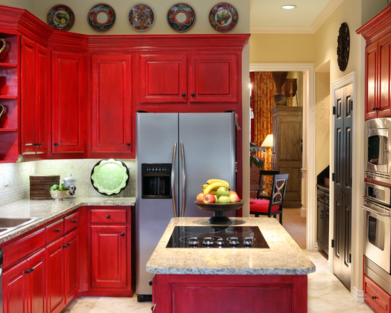
red furniture in a classic kitchen interior
- A pink shade of red is a welcome guest in girlish interiors;
- A warm range of red-brown and red-yellow shades is ideal for halls, living rooms, fireplaces;
- Bright red is an accent option. A somewhat greater presence of it is allowed in the Empire and ethno-interiors;
- Soft natural tones (berry, red sand colors, etc.) are needed for cabinet decors;
- The warm spectrum of red pastel is suitable for decorating any room and can even be the main background.
As you can see, the red color itself is not as important in the decor as its magnificent shades. It remains only to figure out how, what and where exactly to use them. This is what we will do now.
terracotta shade of red looks great in the interior of the living room
Red color in the interior of the house
Do not be afraid of the presence of red in home decor. Its shades can be safely introduced in all rooms, and at the same time, each decor will turn out to be individual and not like the others.
red hallway
The red color in the decoration of the hallway will immediately tell your guests that they have come to the house of extraordinary, bright and self-confident people. A correctly selected shade will not be perceived intrusively and annoyingly at all. Moreover, he will show that the owners of the house have good taste. The only thing not to do is to use passionate red in small hallways. Here, even the most innocent of its shades will "crush". In modest spaces, it should be relegated to secondary roles, giving it an accent of decor.
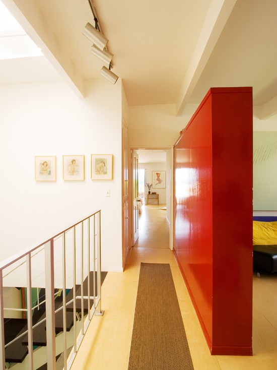
in this case, the red cabinet zonally separates the space of the hall and the room
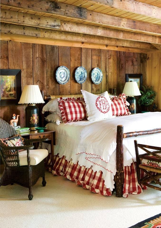
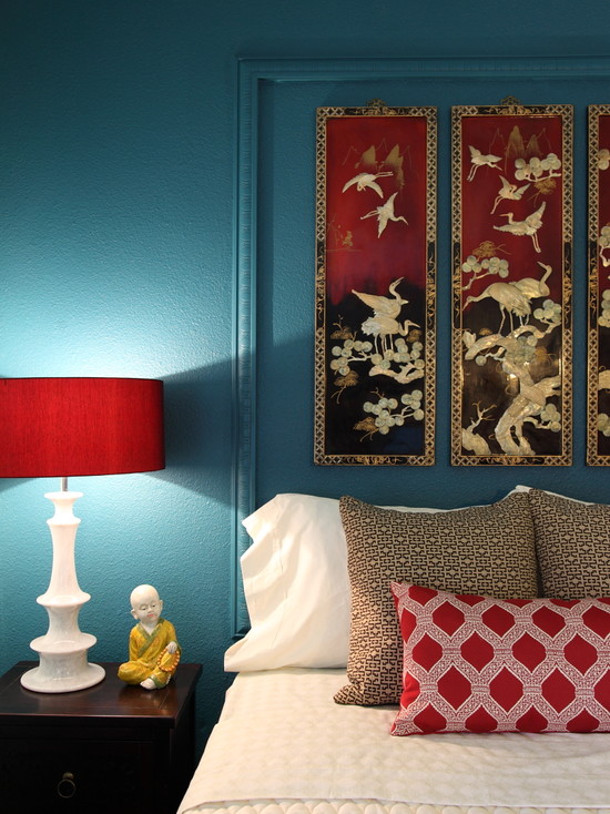
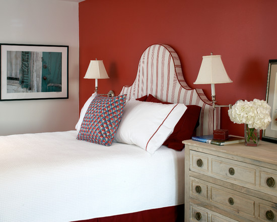
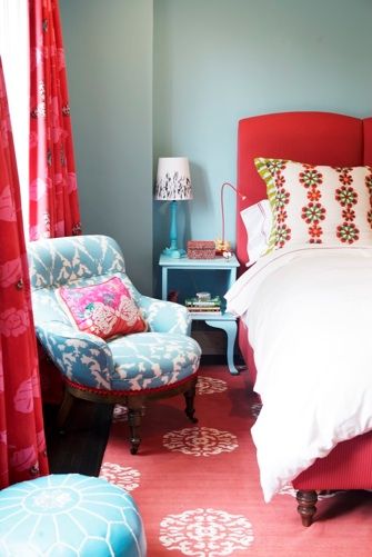
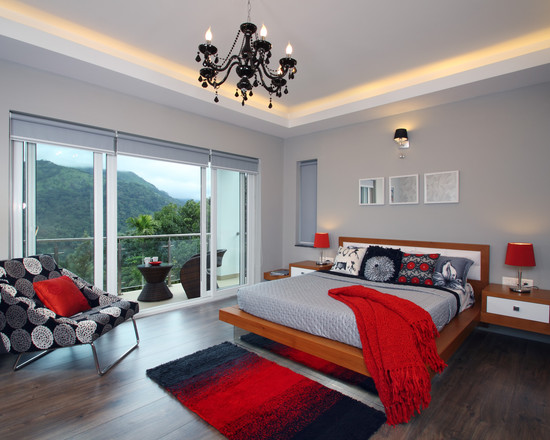
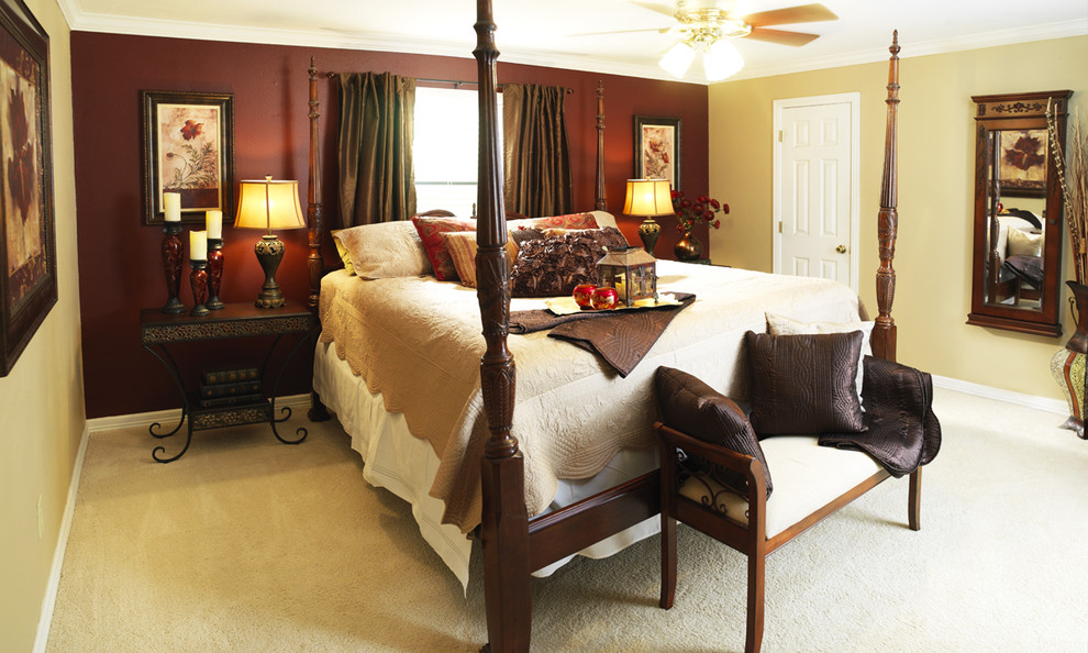
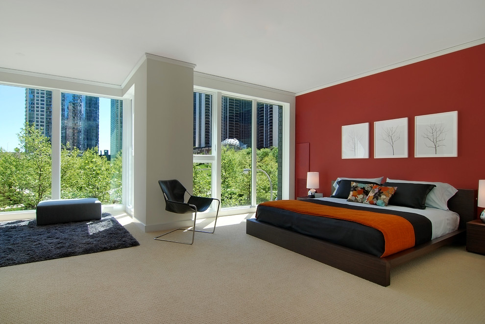
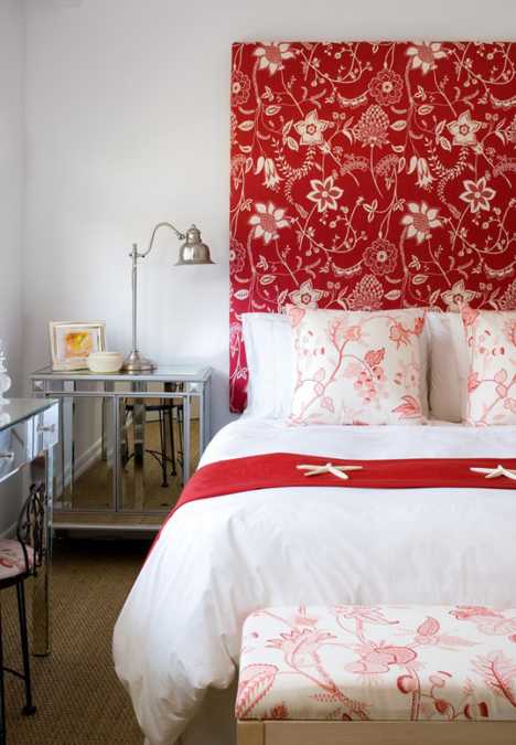
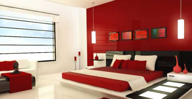
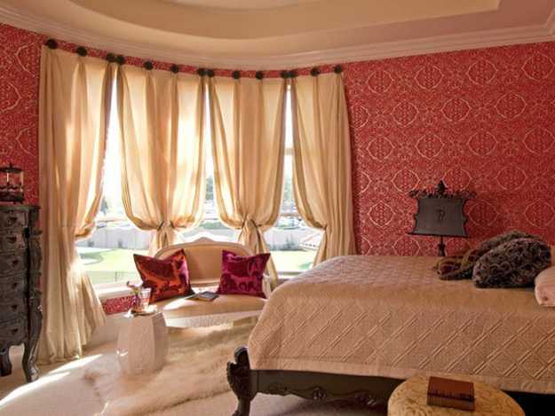
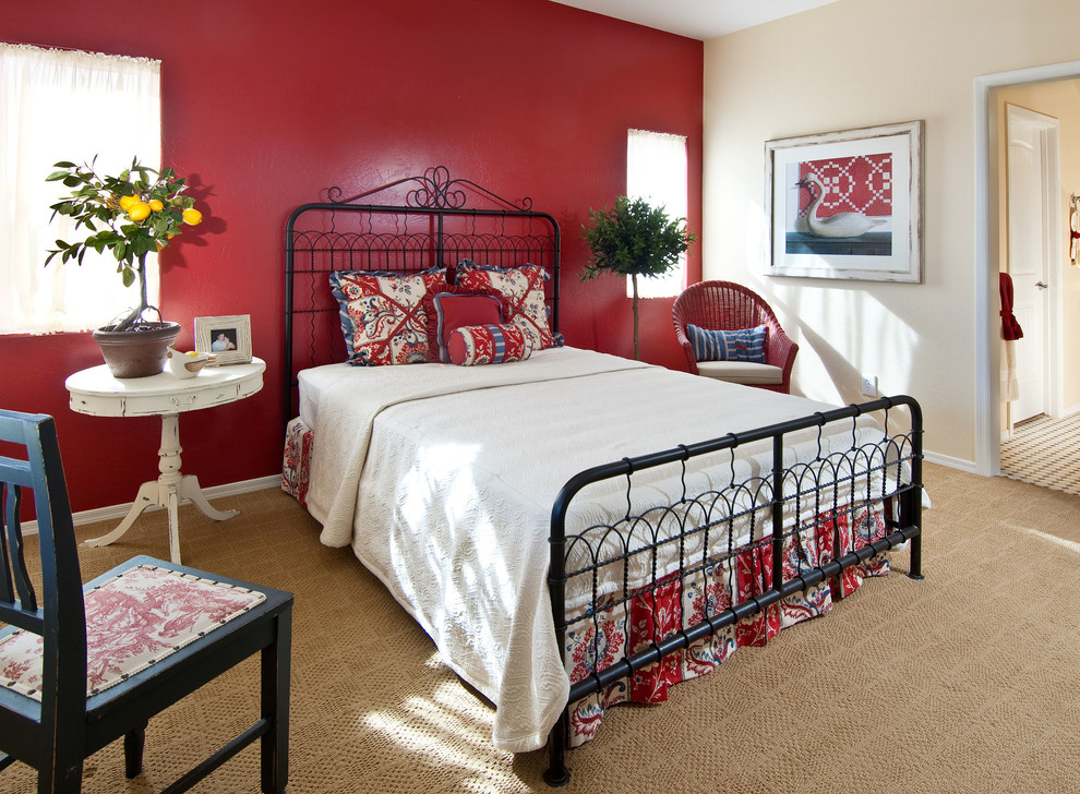
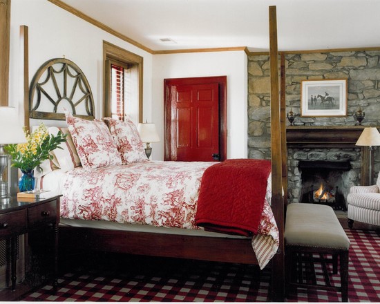
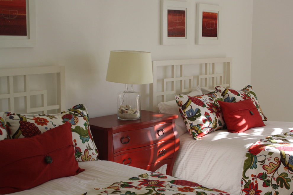
red bedroom
“Red is just a godsend in the interior of the bedroom, especially if this room belongs to the newlyweds”
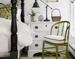
Red color is just a godsend in the interior of the bedroom, especially if this room belongs to the newlyweds. This spectrum symbolizes the most powerful of human emotions - sexual. The red bedroom is passion and love, balancing on the fine line of vice. But such a color solution for bedroom decor will satisfy the needs of not only the young and ardent. He will also be favorably treated by people who have lived in a couple for several decades. In a red interior, sexual energy will circulate with renewed vigor and refresh marital relations. You can achieve this effect not only with a pure red background, but also with its calmer shades, such as terracotta or light brick. Sometimes it is enough to add a red bedspread, a floor lamp with an identical lampshade and an armchair with red upholstery to the decor.
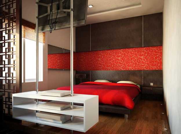
red color brings a touch of sensuality and passion to the interior of the bedroom
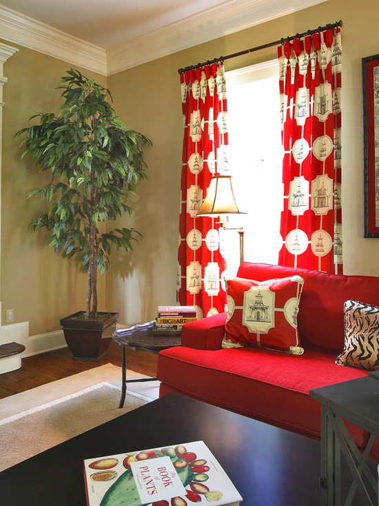
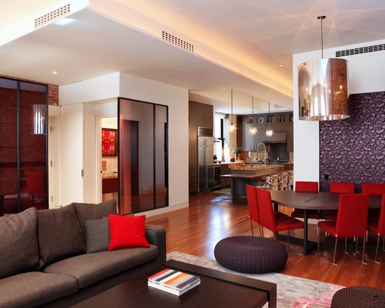
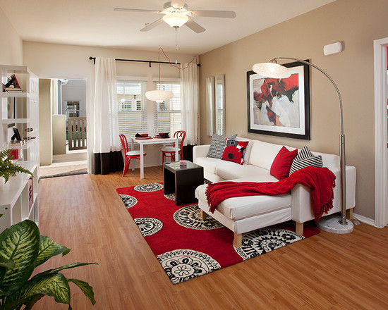
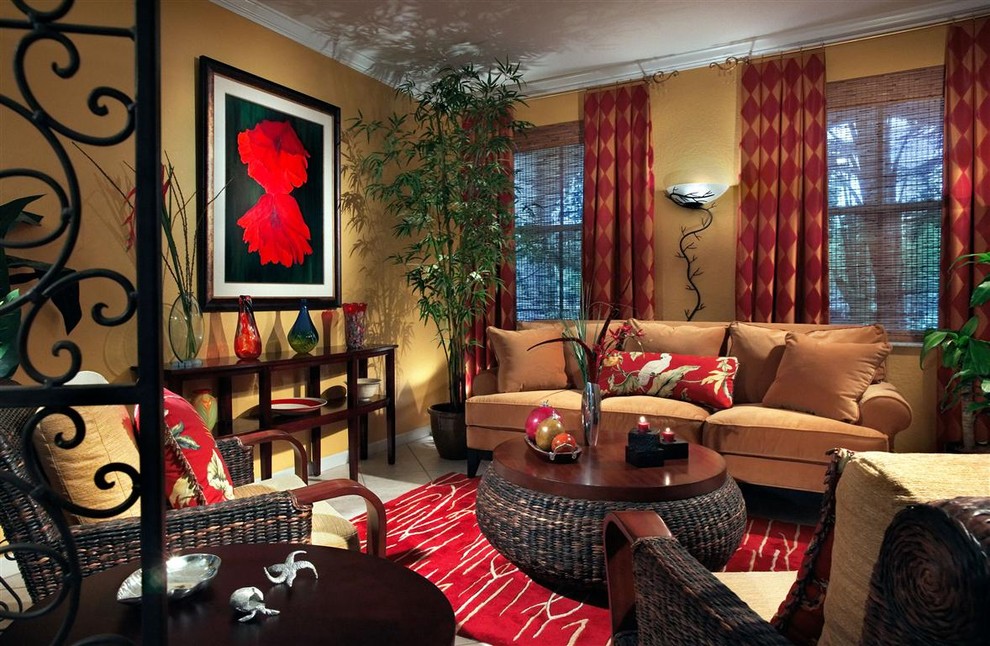
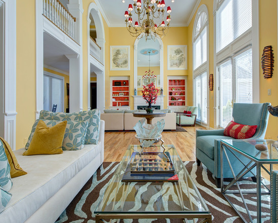
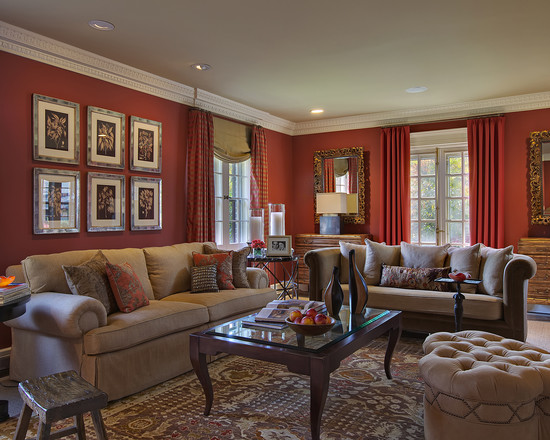
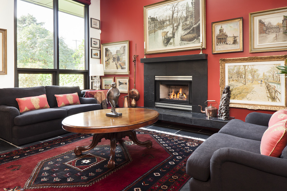
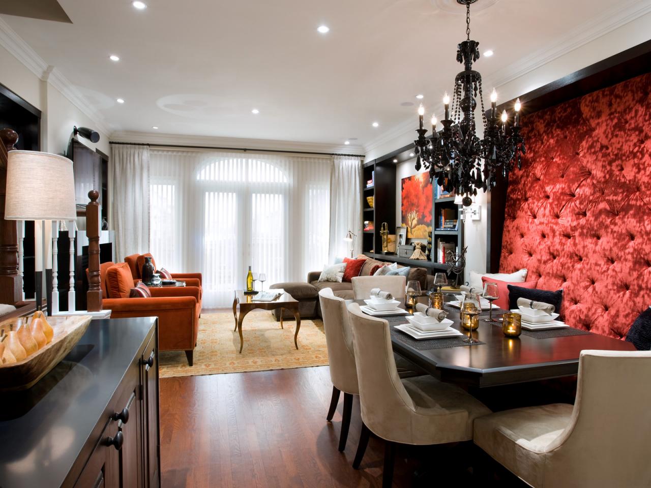
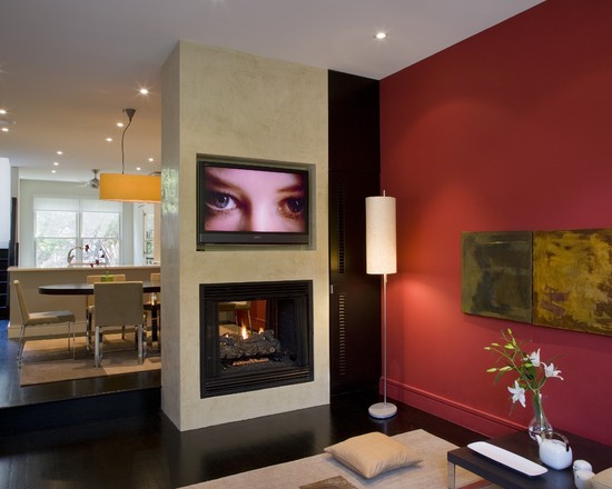
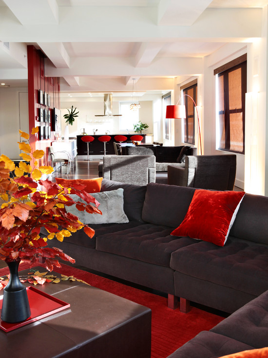
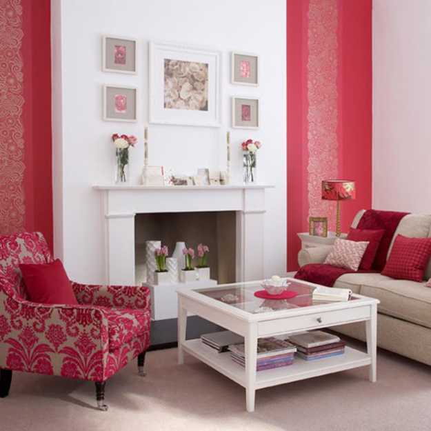
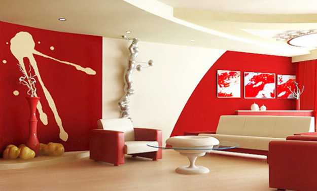
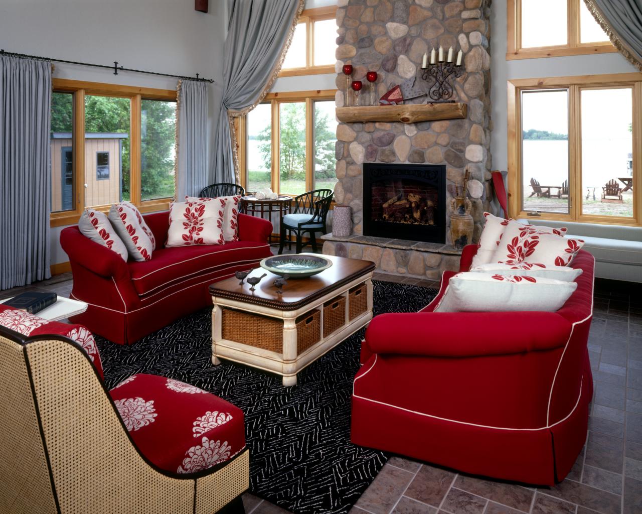
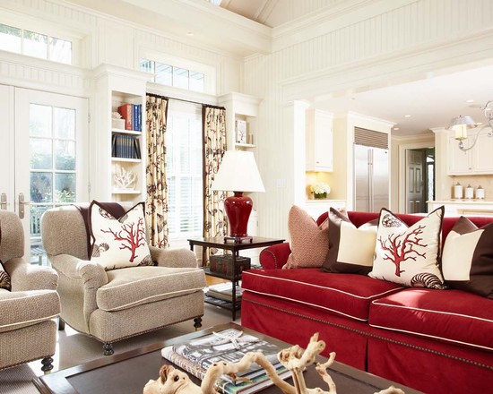
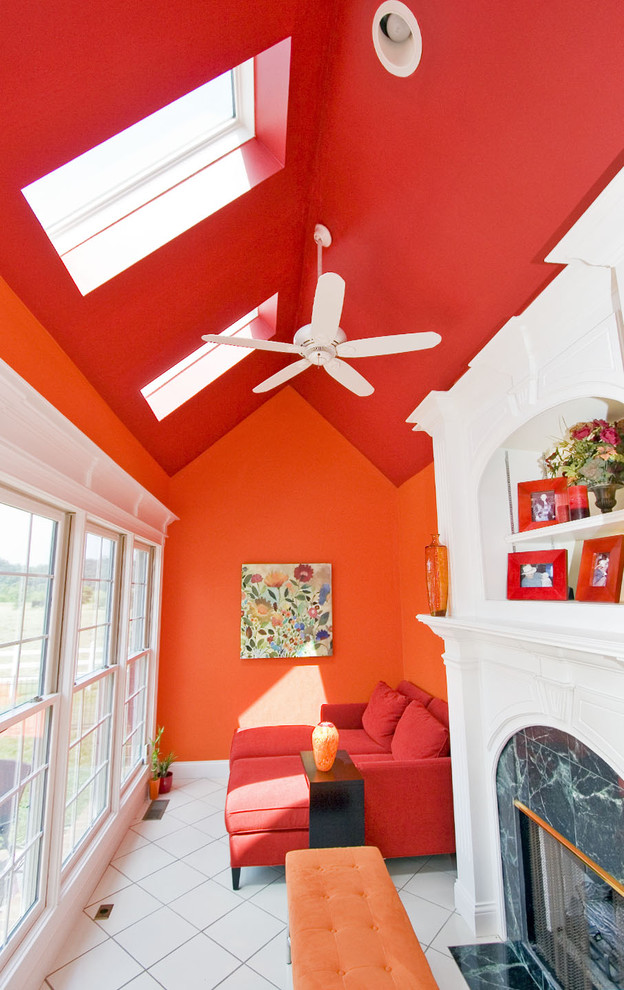
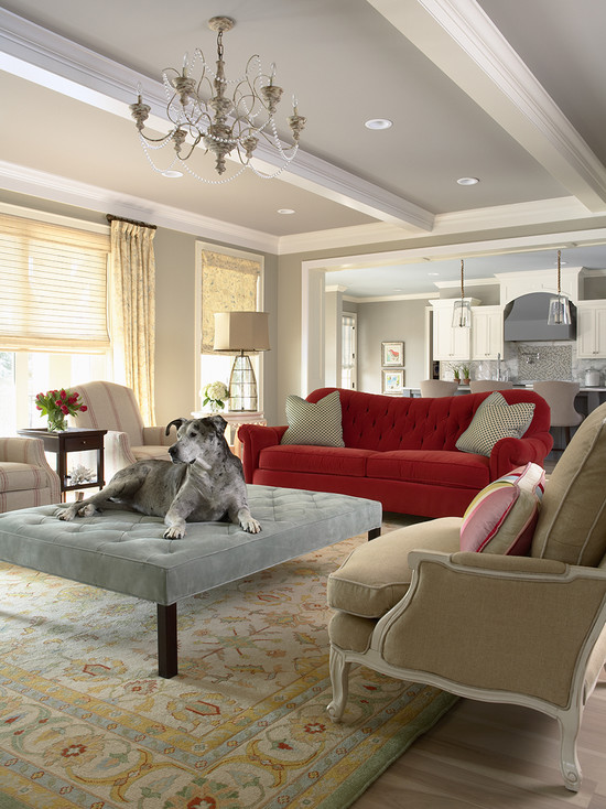
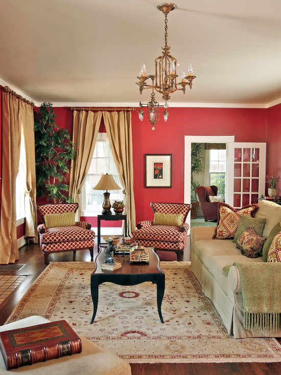
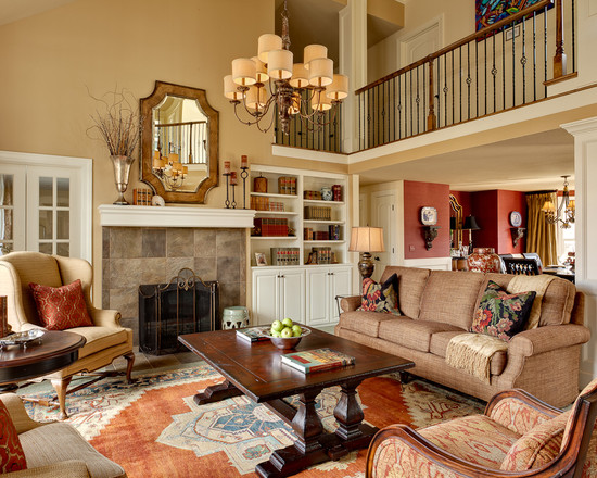
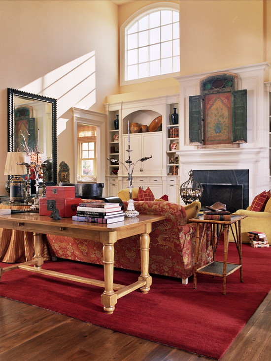
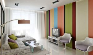
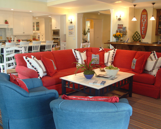
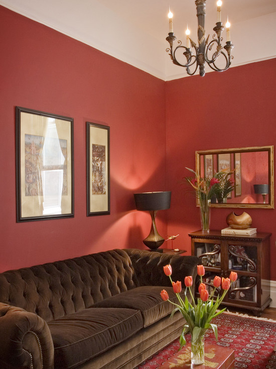
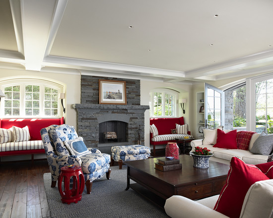
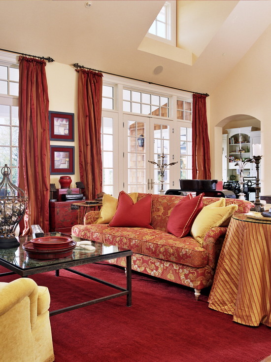
red living room
The central room will always have a decent look if its interior is made in red. But since this bright tone is very contradictory, you need to be able to use it in a tactful and dosed setting, then absolutely everyone will be comfortable in the living room: those of the household who are going to relax at the television screen, and guests who are ready to have fun. The best way to do this is to leave the main background neutral and emphasize its tenderness with a red accent color in the interior, present on items such as chairs, curtains, sofa upholstery or cushions, carpets, paintings and other small things..
No less competent decision can be considered the design of the walls of the living room with red patterned wallpaper or their plain matte and more muted options. Against such a relatively calm background, photos in beautiful frames, baguettes, mirrors will look great.
red pillows in the interior of the living room
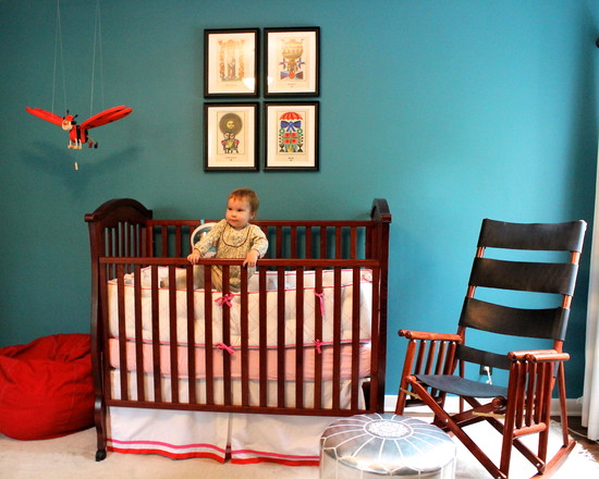
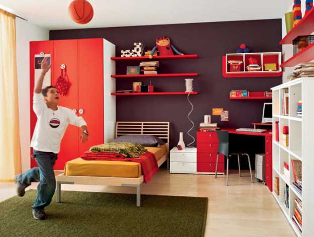
Red nursery
A children's room is not the place where you need to get carried away with interiors in red tones. The problem is that children are easily excitable and in a bright environment it will be difficult to calm them down, although melancholic children in such a decor will be quite comfortable. Sunny and bright red-orange or terracotta shades will contribute to a good mood.
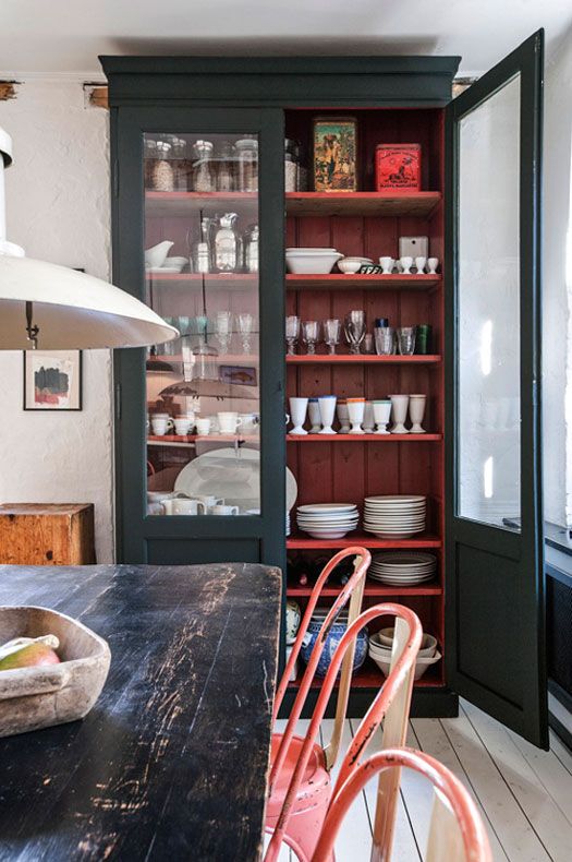
red cabinet
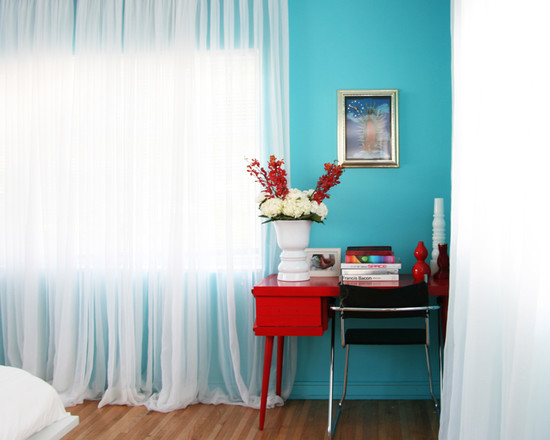
The presence of red in the office interior is a very right decision. In addition to being elegant and aesthetically pleasing, red shades also stimulate brain activity, that is, they contribute to the working mood.
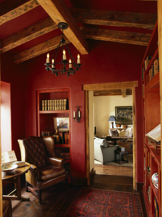
office in red
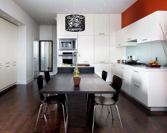
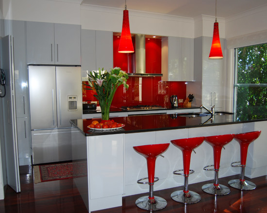
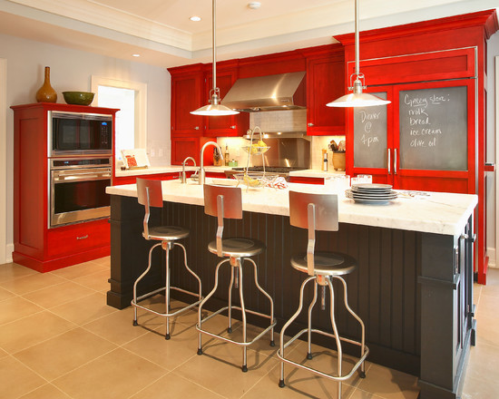
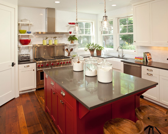
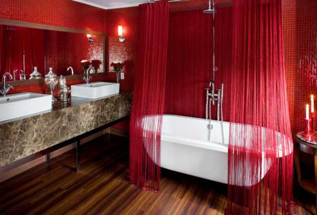
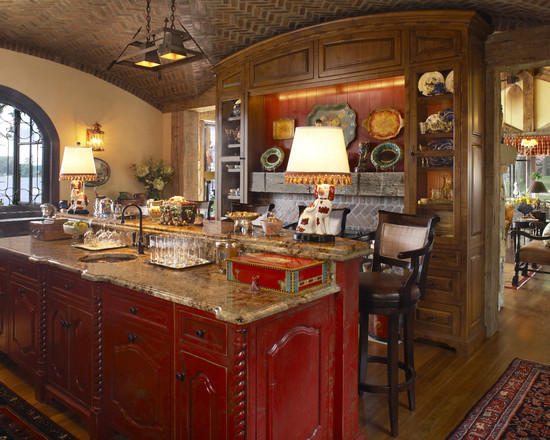
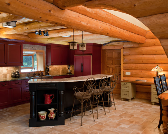
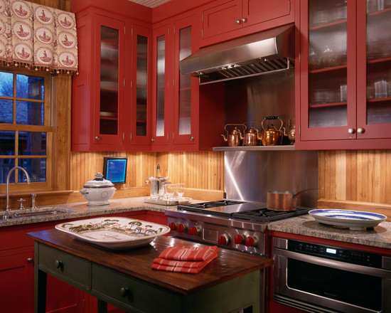
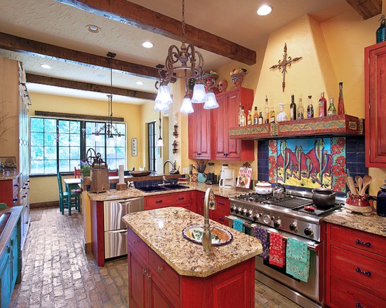
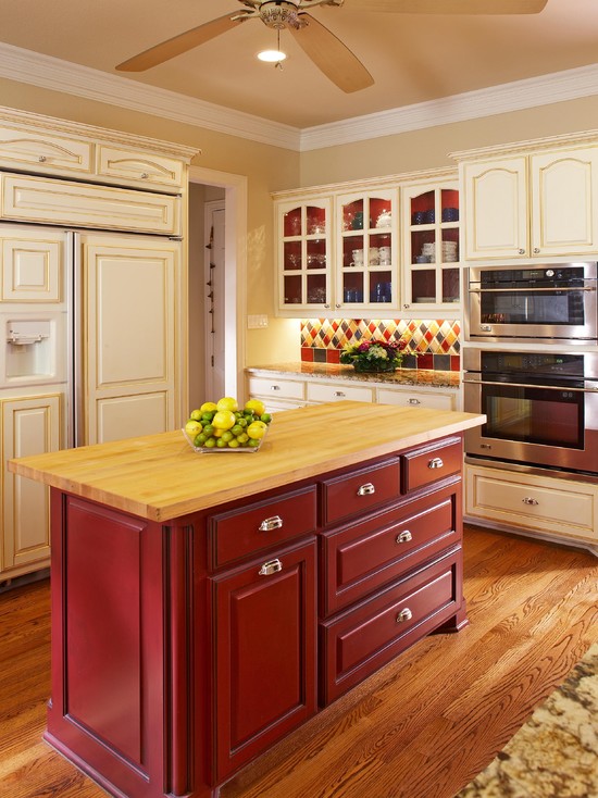
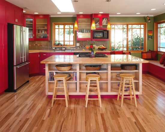
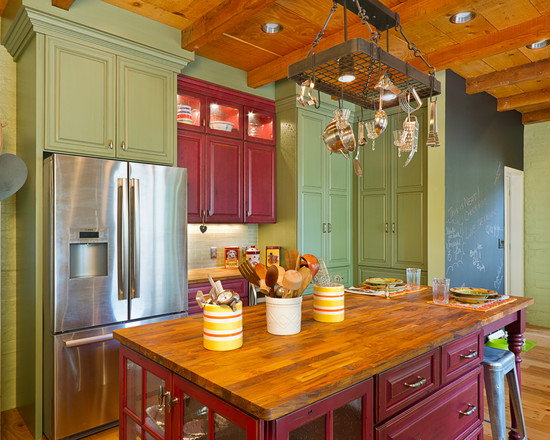
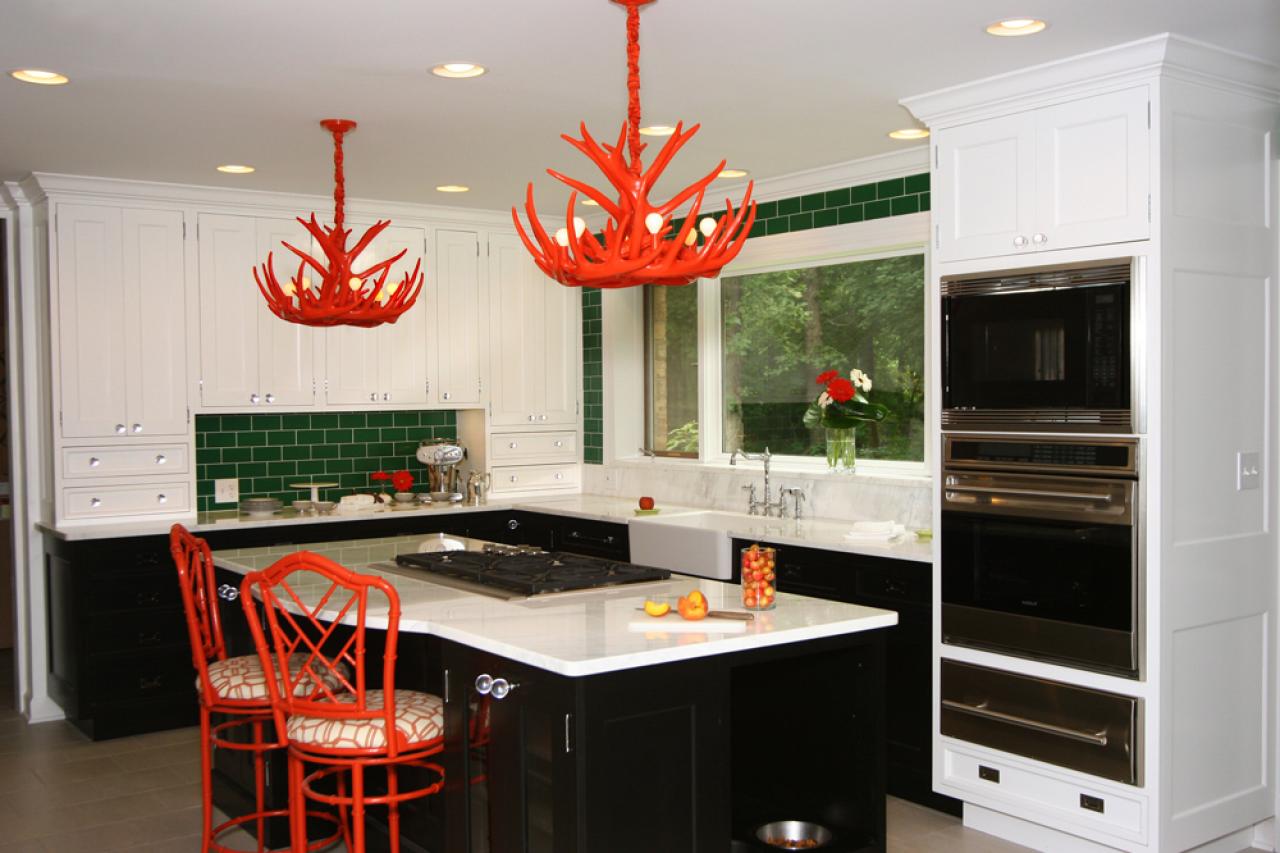
red kitchen
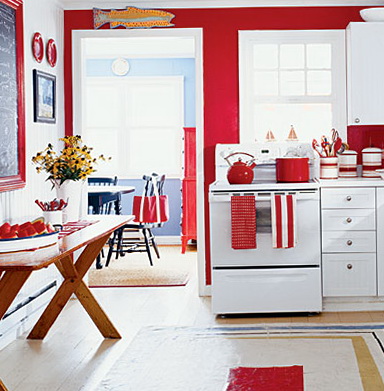
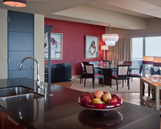
Most often, red interiors are found in the kitchen. This color is good because, due to the variety of shades, it can be used in kitchens of any size and stylistic orientation. But again, this doesn't mean that all surfaces in the room should be on fire. It is better to furnish small kitchen spaces with sets not with natural red facades, but with pink, burgundy or cherry ones. You can lay out the kitchen apron with red tiles, and decorate the rest of the wall with white. Since the red color perfectly stimulates the appetite, it will be a good solution for decorating the dining area in the interior of the kitchen.
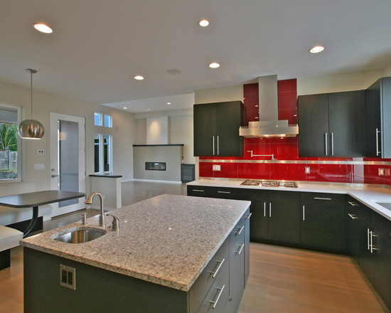
The high-gloss red work area transforms into a bright accent in a modern kitchen interior.
Popular interior combinations with red
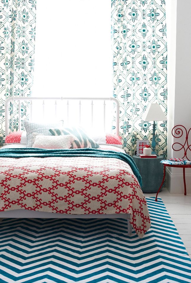
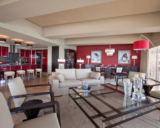
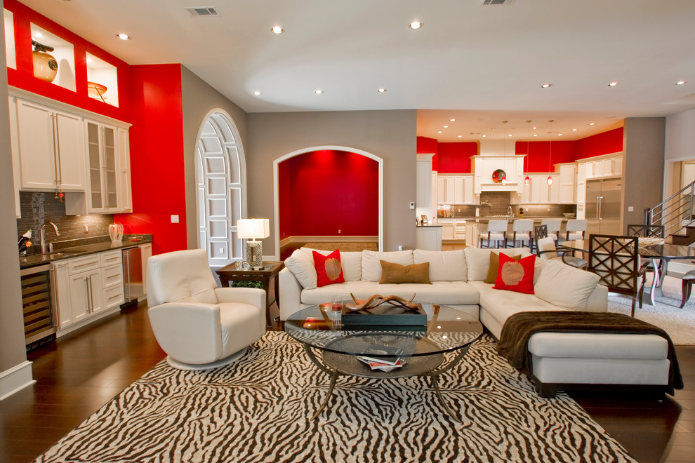
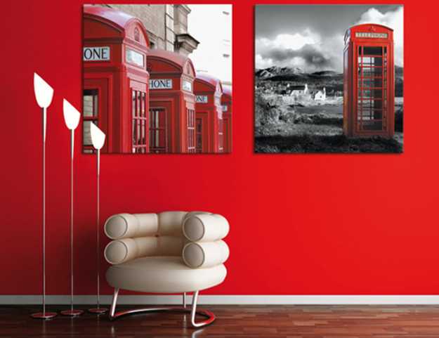
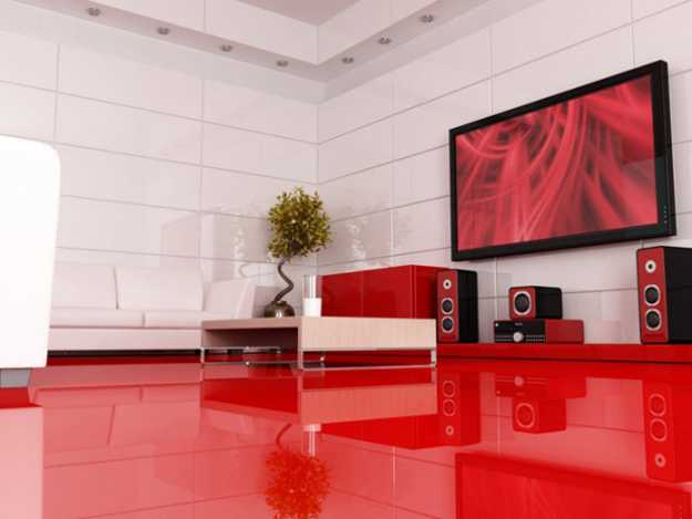
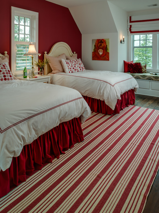
Red White
White color is an almost inseparable partner of red, and above all because it perfectly neutralizes its excessive activity. This combination is perceived as a symbol of justice, care, purity. Such color schemes attract people's attention on a subconscious level.
From the aesthetic side, this combination pleases with the freshness of the contrast and expands the space. The red and white tandem is often complemented with black elements. Since the red hue is close to monochrome, this tricolor chord is always favorably contrasted.
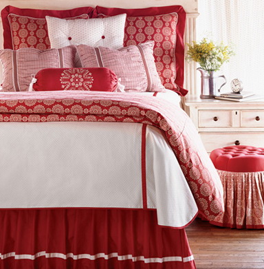
the combination of red and white is an unsurpassed classic duet in the interior of the bedroom
Red Yellow
A truly summer mood can be created by combining red in residential interiors with a yellow-orange spectrum. Such combinations can often be found in decor:
- Children's rooms.
- kitchens.
- Fast food.
- kindergartens.
- Playgrounds.
But you need to use such super-warm combinations in the design only after a thorough assessment of the level of comfort in each case. If the room is sunny, then you should not additionally “warm” it with such a color combination. The general atmosphere may turn out not at all the one that was expected. People with a heightened emotional background should not be in red and yellow decors. However, with an irresistible desire to use such a tandem in the design of a room, reduce the tonic effect of colors by diluting them with beige and white.
yellow accessories in a red living room
A completely different atmosphere will be created by the combination of red and gold. The combination is royally luxurious. Such decor is the prerogative of luxury hotels, expensive restaurants, art galleries.A special nobility is the combination of gold not with red, but with its burgundy hue. For respectability, black can be introduced into the red-gold color of the decor in the interior.
Red Green
A very interesting effect is obtained by combining red with green. Both colors emphasize the colorfulness and juiciness of each other. The combination is incredibly spectacular, but with a long stay in such an interior, excessive nervous excitement may appear, developing into irritability. In order to reduce the negative impact, in contrast to red and green, they drive white or dilute the pair with beige.
If there is a need to enhance the contrast of the design, then this is done using the brown-black spectrum.
combination of red and green: the green bedside rug is in harmony with the red furniture in the children's room
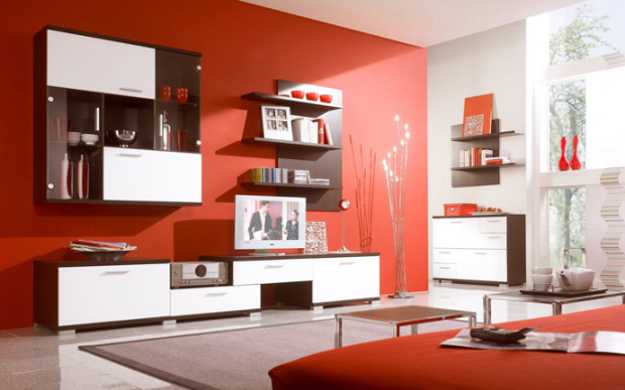
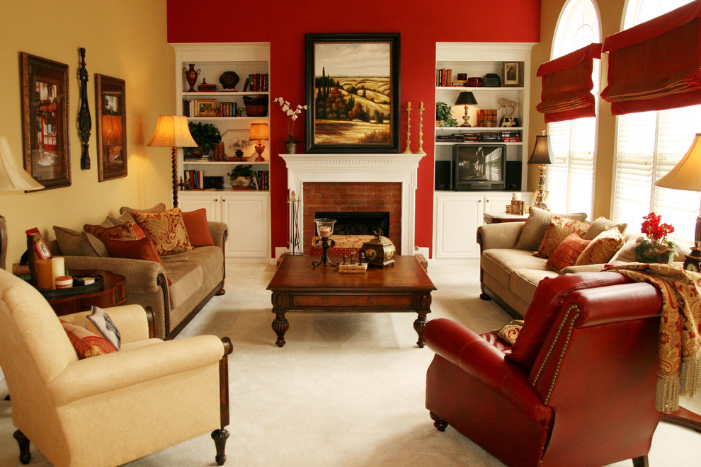
Red - brown
Dark shades of brown in their complex composition have a little red, so in some ways they can be considered related, but, in fact, brown is much more restrained. It is a symbol of hard work and stability. Brown harmonizes perfectly with red in the interior. He sets it off with his nobility and gives the whole room a presentable look.
In such brown-burgundy tones, prim English interiors are created. Complementing the duet with gold blotches, they get more pompous decors in the spirit of Victorian.
Red - gray
Gray color is very good in combination with light shades of red. It helps to create a calm contrasting atmosphere, so this color composition can often be found in living rooms, bedrooms, and bathrooms. You can add a touch of exoticism to the finish by introducing golden and brown hues.
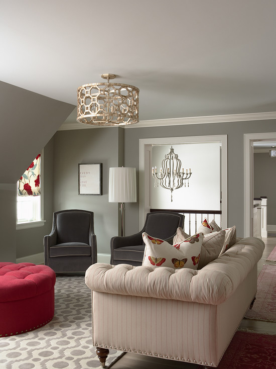
red ottoman in a gray living room
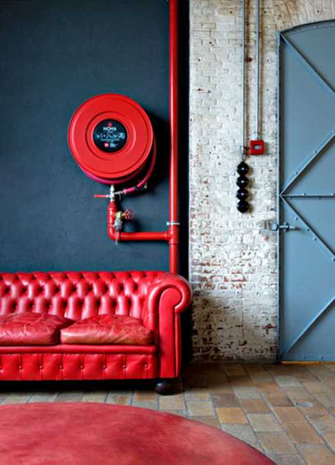
Red Black
The tandem is classic, but in its pure form it is practically not used in decors due to depressing effects. Large amounts of white will help to neutralize the complexity of perception of red-black color in the interior. A good way to turn a gloomy environment into a pompous one is to fill the red-black combination with the shine of gold. The feeling of threat and danger will instantly disappear.
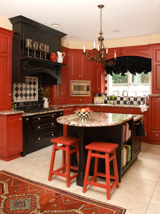
red and black furniture in the interior of the kitchen
Conclusion
They are frankly afraid to use red in the interior, and in vain! With the right approach, you can get incredibly original decors that will not only please you, but also make a splash among your guests. The courage shown will be adequately rewarded!
Photo gallery - red color in the interior: