The unusual shape and amazing color of corals have always attracted people. In ancient times, these organisms were considered of great value, so those who were engaged in their extraction were well off. Already at that time, they learned to make amazing jewelry from these seafood. Corals can be white, blue, silver, black, blue, but the most attractive are the so-called red species. They have an incredible variety of shades: they look like a cross between reddish-cherry, pink and orange. The inability to accurately represent this palette gave rise to the name "coral". Today it is popular in clothing and accessories, but the most interesting thing is that the demand for coral color is also growing in the interior. If in the West such decors have already become trendsetters, then in our country coral shades in the design of spaces are just beginning to be mastered. This means that we will have a very pleasant acquaintance.
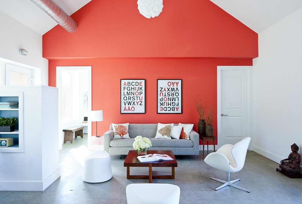
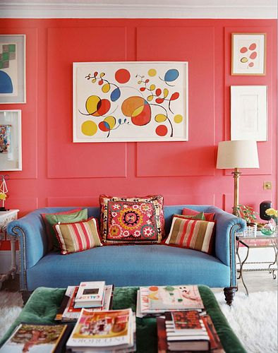
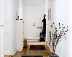
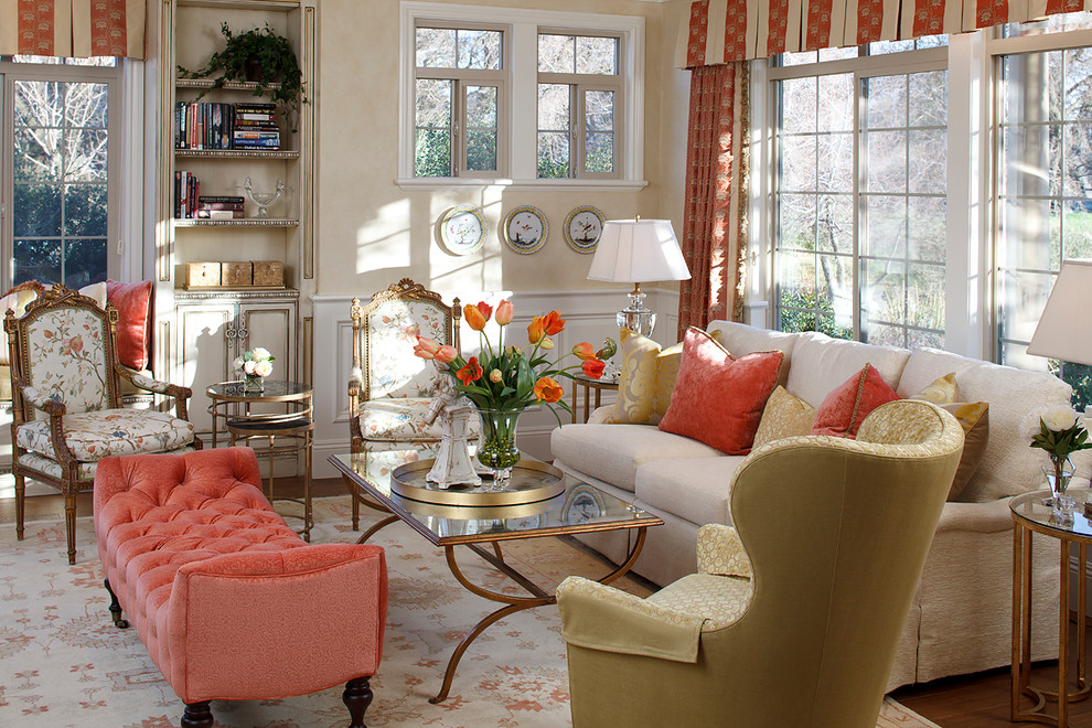
coral color in the interior of the living room
Well, let me introduce - His Majesty is coral! So why is he so attractive? What to combine it with? How to use this "foreigner" in our interiors?
coral essence
As already mentioned, coral consists of:
- Pink.
- Dark red.
- Orange.
The original colors can be mixed in the most unpredictable proportions, so the intensity of the coral spectrum will be very diverse.
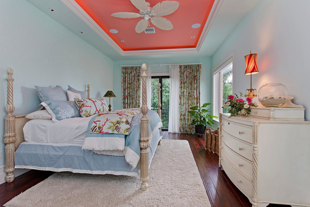
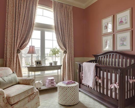
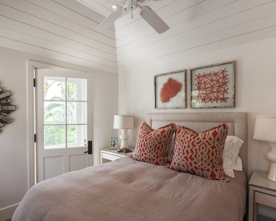
coral ceiling will create a charming atmosphere in the interior of the bedroom
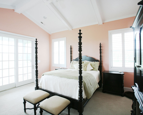
Light coral is somewhat akin to peach. Its bright shade is similar to salmon, but the dark one resembles rust. But, despite this similarity with other natural colors, the bulk of its shades are very individual. Perhaps this explains such a wide popularity of coral color in interior decors.
With regard to the characteristics of the perception of coral, it is seen as a bright, sweet, full of life, warm, summery, close color.
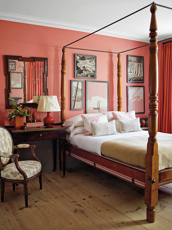
Naturally, the rooms decorated in these shades are filled with warmth, but with color overload, the atmosphere becomes hot and even stuffy. However, even with this effect, coral is much cooler and lighter than red and its successor, orange.
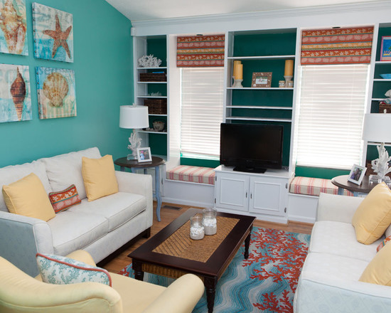
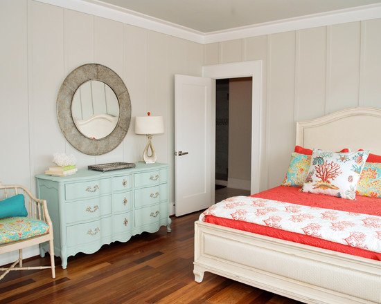
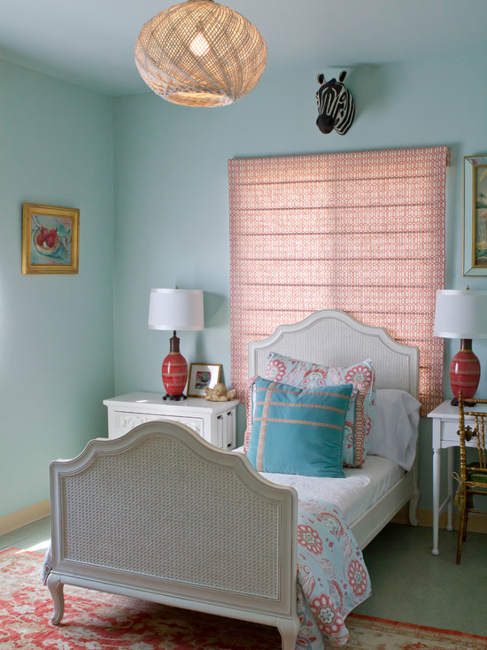
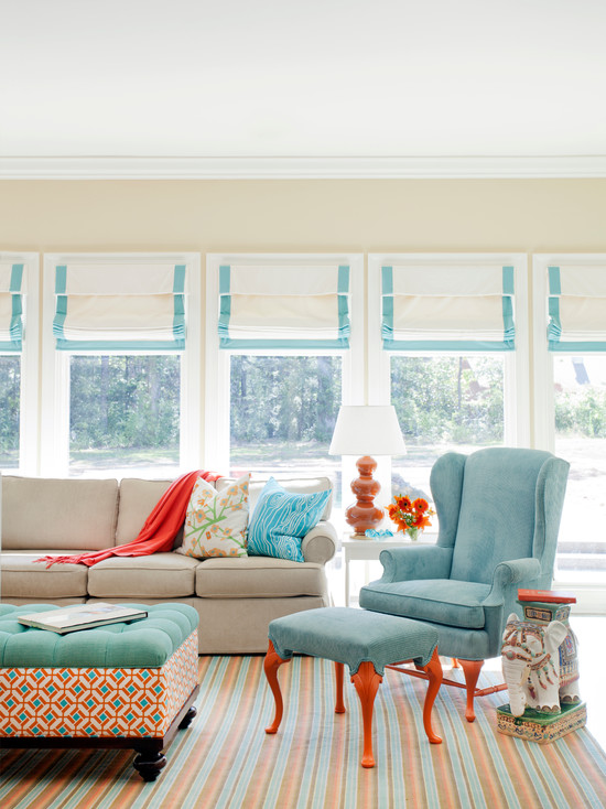
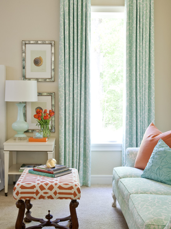
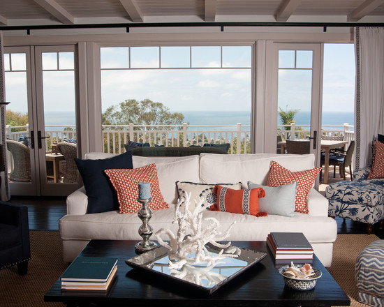
coral color combined with turquoise will help create an interior in a marine style
Given that the coral is bright and energetic, its abundance can be tiring. And it also significantly affects the perception of space, bringing the walls closer and reducing its volume. The room really seems much smaller than it is.
Why is coral color so in demand in the interior? Quite possibly, because he is a "chameleon". That is, this color does not cost anything to change the shade, adjust to the lighting or companions. From one perspective, it is perceived as truly red, but as soon as the surroundings are slightly changed, coral already seems sweet pinkish, or even orange-peach.
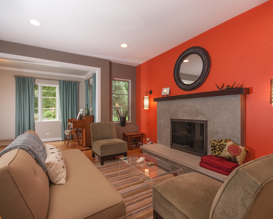
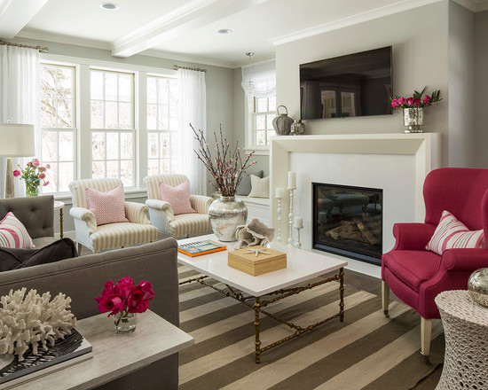
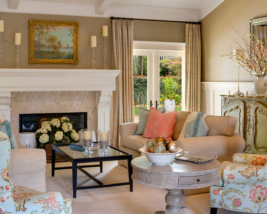
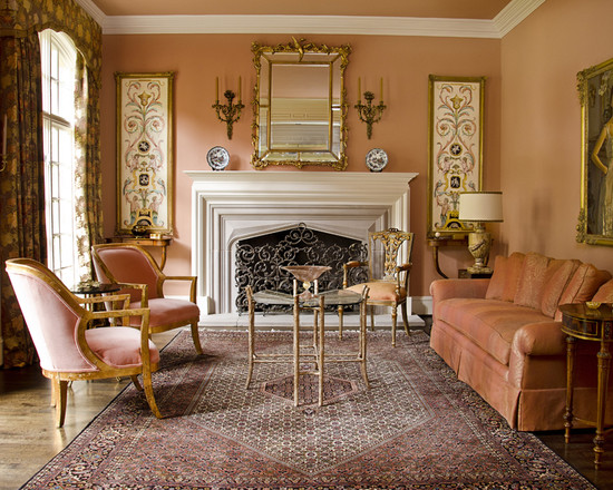
coral color in the interior of the living room creates a festive mood
So let's sum it up. Coral has been proven to:
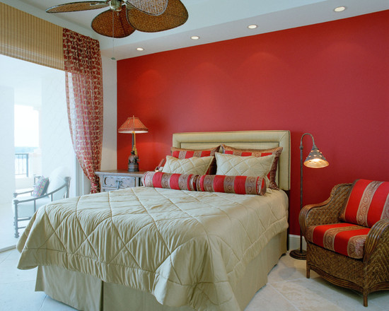
- Radiates warmth. So, it must be used carefully. Its bright shades can "set the heat" for the whole environment. Combine coral beauty with cool colors.
- Zooms in on objects. Walls with such a background will appear close; as a result, the room will be perceived as somewhat smaller. This suggests that the coral color is not suitable for the main tone of the interior of small rooms..
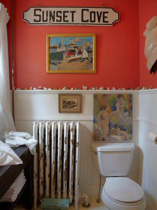
- Loves little things. A wall painted entirely in coral will be intrusive. This tone is advantageous in decors in small accessories. It is good in patterns or on furniture fronts.
- Changes. Coral reacts in a peculiar way to changes in lighting and the presence of additional tones. It changes its saturation, adjusting to the environment.
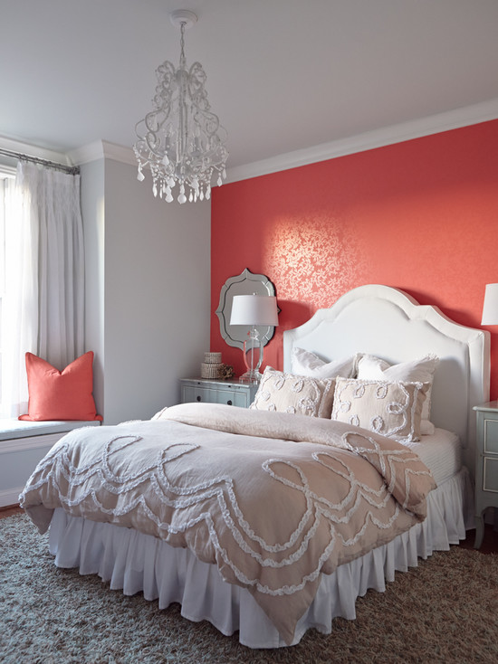
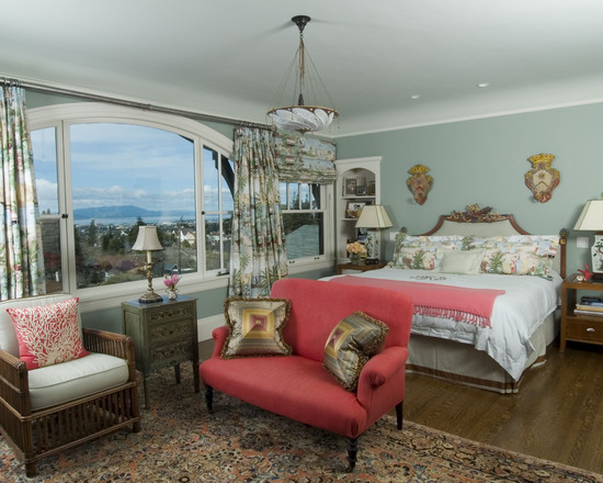
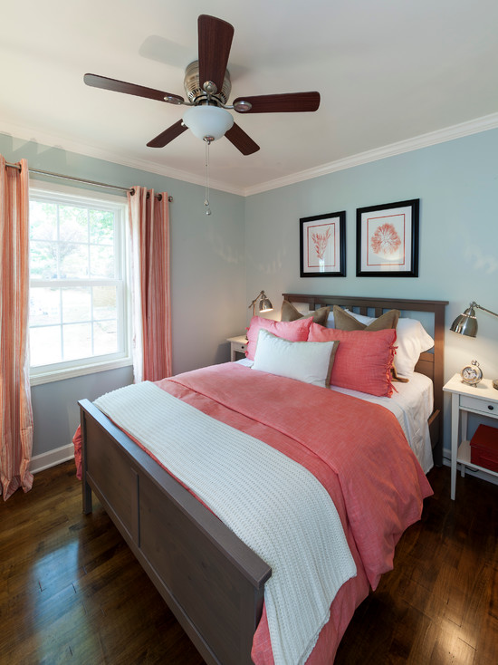
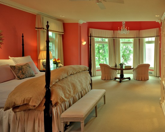
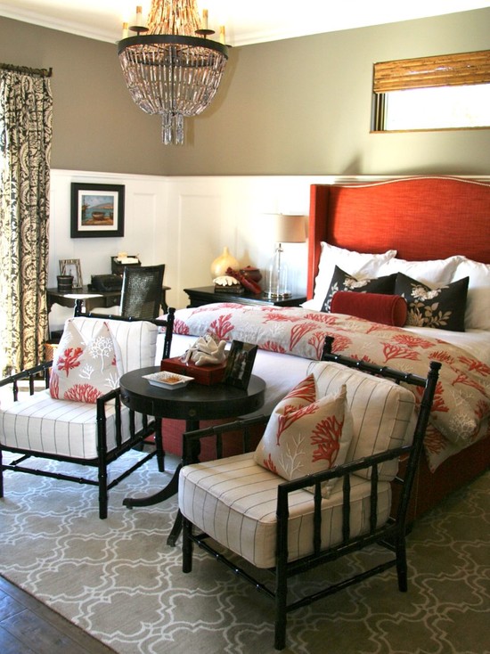
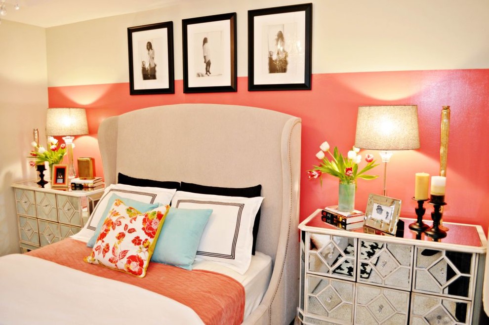
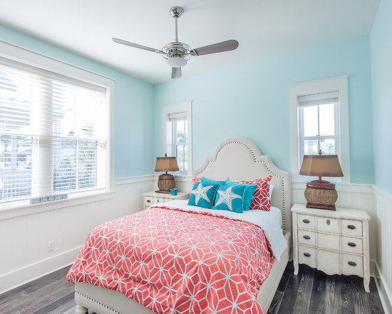
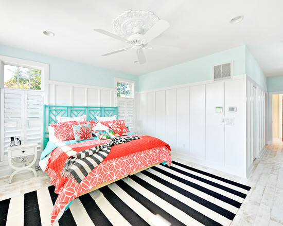
accent wall in coral color in the interior of the bedroom
How to add coral color?
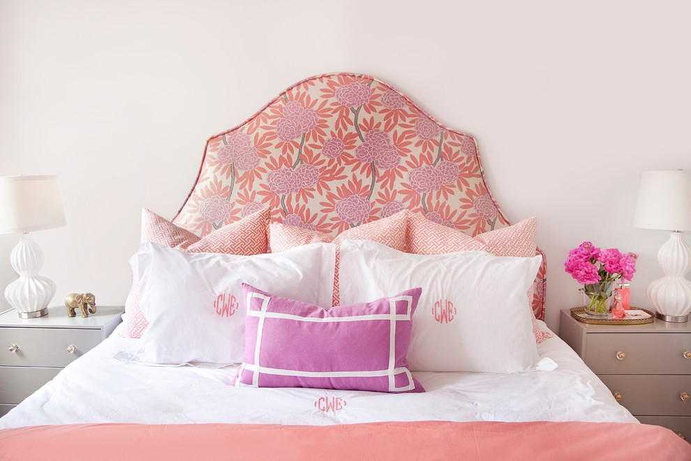
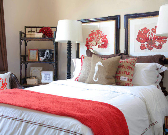
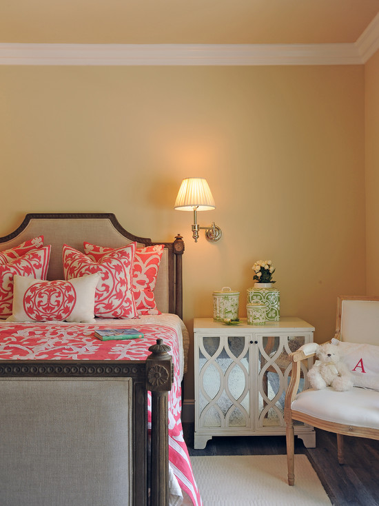
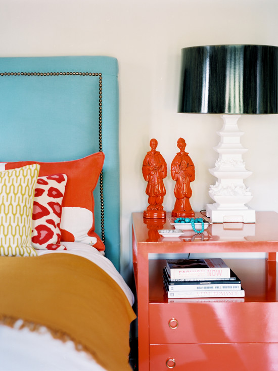
“Coral color in the bedroom interior can appear on the headboards, in the form of ottomans, dressing tables”
Since coral manages to significantly “warm up” the room and reduce its dimensions, it can by no means be recommended as an interior dominant. Painting global surfaces with it and decorating panoramic windows is nonsense, besides, it does not look so impressive on smooth walls. The interior becomes frankly boring.
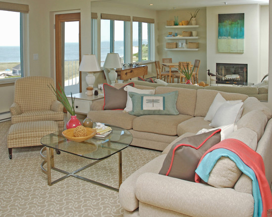
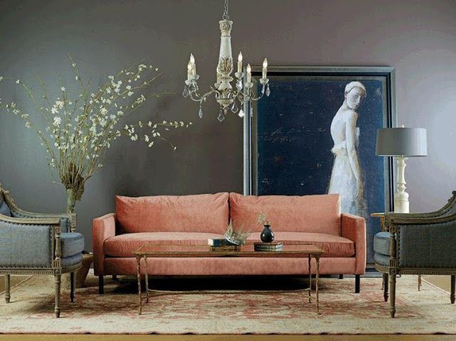
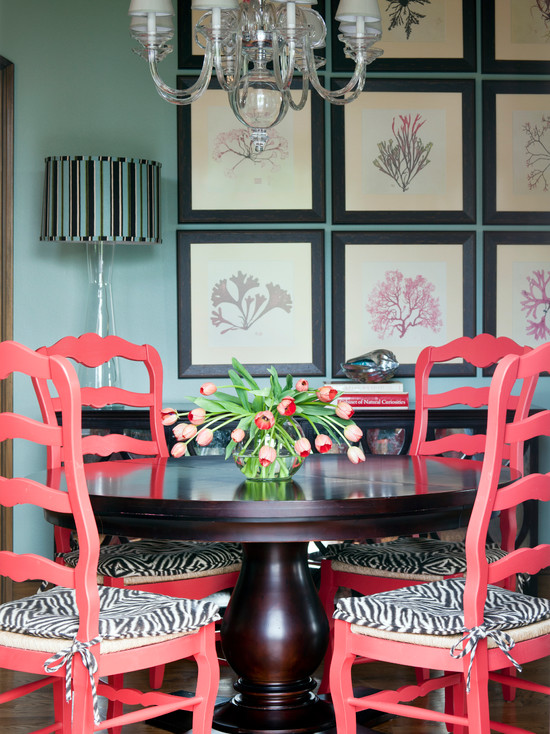
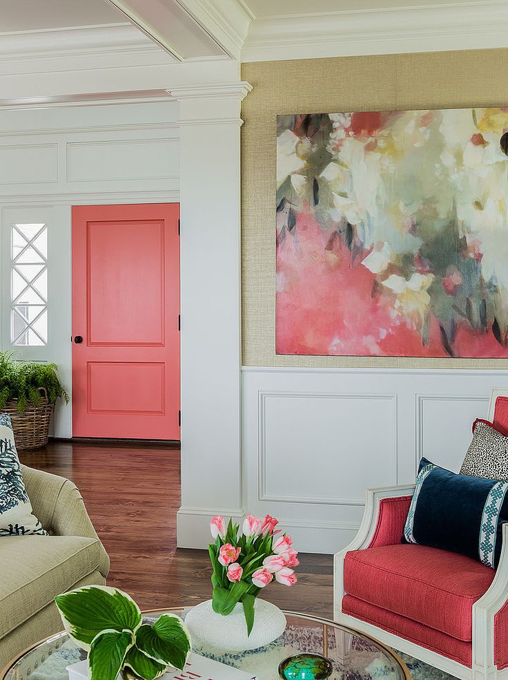
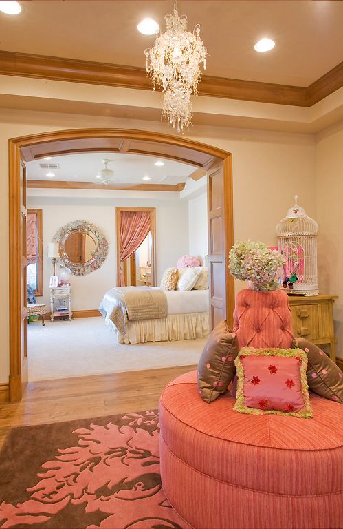
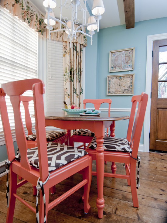
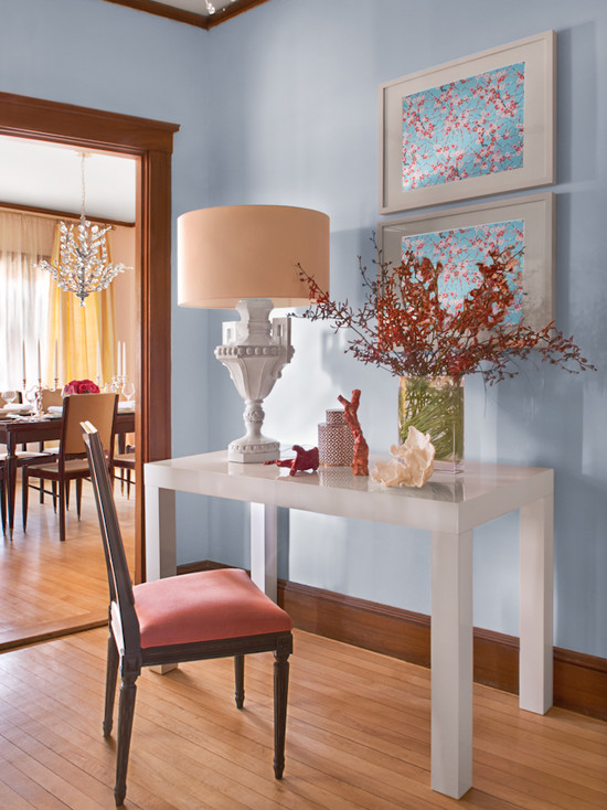
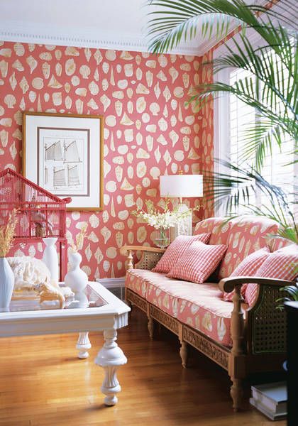
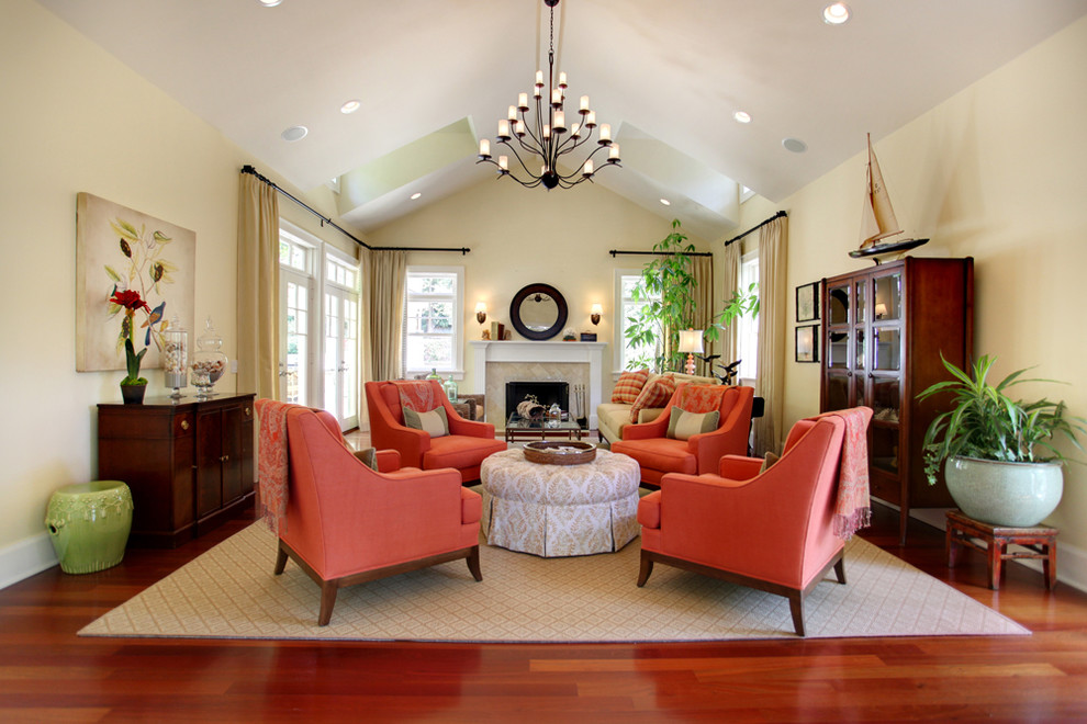
The best hypostasis and crown role of coral color in any interior is a contrasting accent. Its small inclusions look truly enchanting! Introduce color in detail, on different textured surfaces. Accents may well be large, like a coral sofa. In a light gray decor, it will look impressive. The same effect will be produced by a coral chest of drawers in a turquoise bedroom and curtains in a cream dining room.
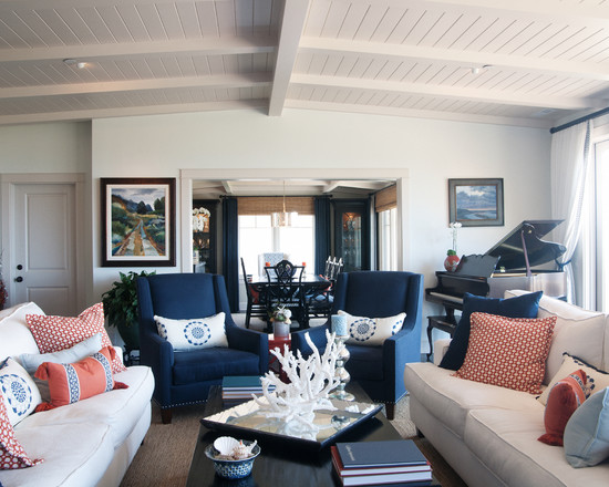
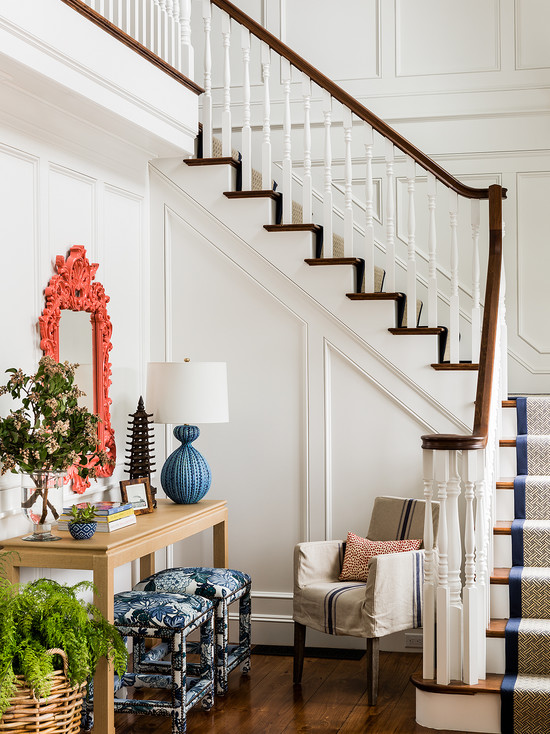
coral-colored accessories “smooth out” the contrast of dark blue furniture and light walls
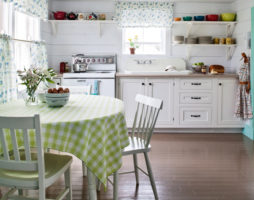
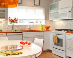
Coral color in the bedroom interior can appear on the headboards, in the form of ottomans, dressing tables. In the living room, it can be found on pouffes and pillows, luxurious vases. In the kitchen, he is in charge of napkins and dishes, lamps and facades of sets. Here, its active presence will only benefit, because coral makes the interior appetizing, because it is itself perceived as a shade of delicacies.
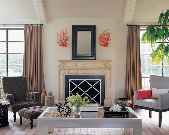
Coral can also revive walls. His accents are in demand in creating bright panels or abstract fragments.
If your desire to make coral the main background is irresistible, then pick up something from its pastel range, closer to peach, and enter bright shades with emphasis.
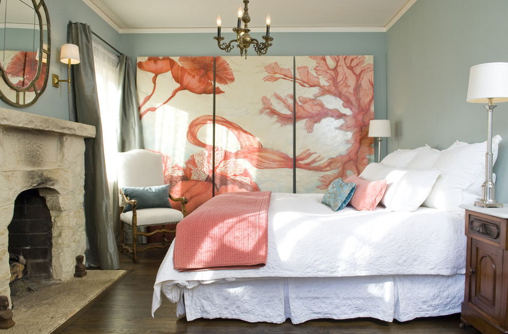
trio: coral, pale blue and white set a romantic atmosphere in the bedroom interior
Coral color in the interior: combination options
“Being defiantly bold, but remaining warm and noble, coral color is in demand in the interiors of living rooms and bedrooms, nurseries and kitchens”
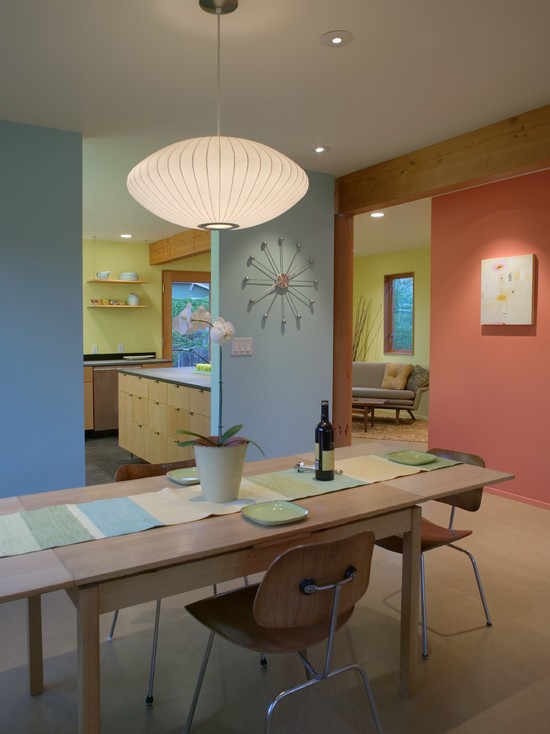
Due to the fact that coral contains several colors from a bright spectrum at once, it is able to become a partner of any shade. So, if pink goes wonderfully with green, then coral will become his perfect partner in decor. However, among the many combinations that exist, there are a number of those in which the coral color is presented in the most advantageous and colorful position. These combinations are win-win and spectacular in any interior.
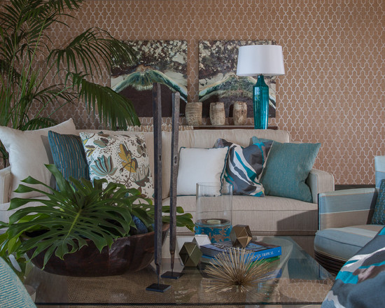
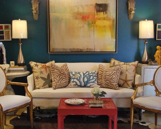
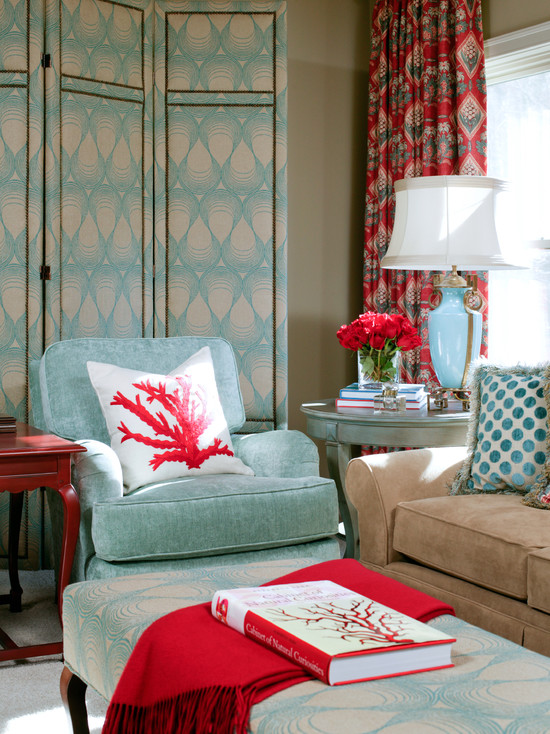
One of the best pairs can be called coral with turquoise. Their duet is amazing! And this is not surprising, because both colors, as they say, came from the same element - the sea. Turquoise accurately conveys the shade of the sea wave, and coral - the background of the seabed. And in psychological perception, both of these shades are similar in tone and mood.They talk about summer, give joy, only one brings coolness with it, and the other warm, but, in general, the companions perfectly balance and support each other.
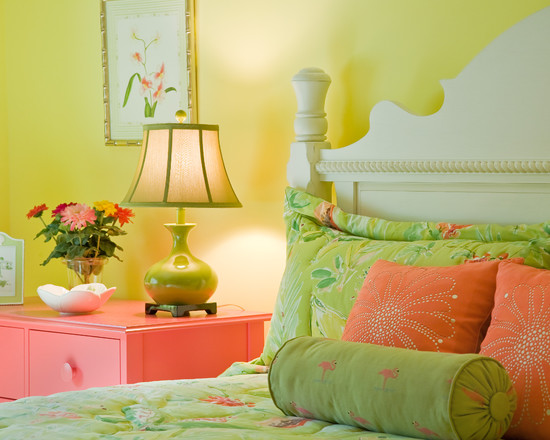
combination of coral and light green in the interior
Since coral is not recommended to be the leading color in the interior, turquoise fills the main space, and coral splendor appears only in accents.. However, there are options in which both colors can be introduced into the decor on an equal footing. Since they wonderfully contain each other's emotionality, the decor is very pleasant and balanced.
Turquoise can be successfully replaced with pale blue or light blue. In such a combination, the same binding associations will work.
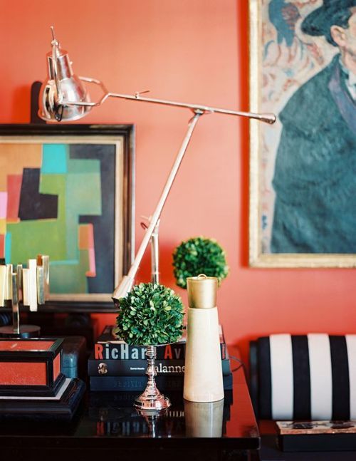
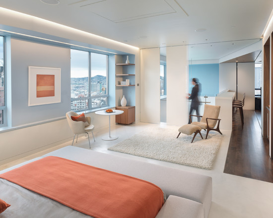
Coral will acquire a magnificent glow against an achromatic gray background and in the company of black and white partners. The neutrality of these tones contributes to the disclosure of coral in all its glory, allowing it to play with colors and demonstrate its richest inner spectrum. With this action, the general background will also be transformed - it becomes clear and perfectly clean.
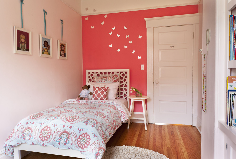
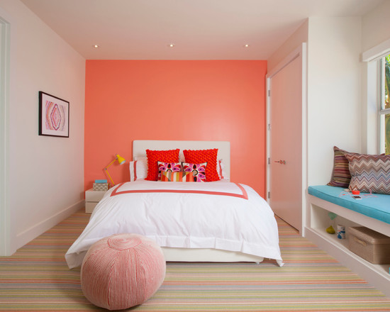
coral walls in the interior of the children's room
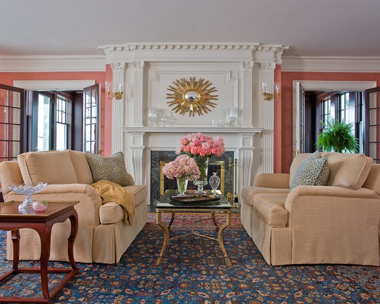
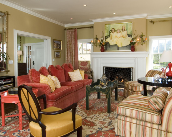
Good "friends" of coral color in the interior are all kinds of shades of beige. Moreover, if in gray-black-white tandems even the most muted tone of coral is perceived as bright, then in the case of beige, you need to use its most saturated shades. Otherwise, the richness of the coral color will simply be absorbed by the beige companion.
“Puff” interiors are well perceived, in which various subtle variations of coral color were used: from barely visible and as light as possible to dark, saturated with colors. They can be mixed with companion shades from pink, orange and, of course, red spectrum.
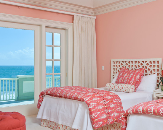
What options are most in demand in traditional decors? They achieve harmony by combining coral, milky-cream and creamy shades. Just keep in mind that in such combinations, coral cannot show all its cheerfulness, so the situation turns out to be too calm and may even seem boring to some. Such combinations of coral color are good in bedroom interiors, in which color activity is absolutely unnecessary.
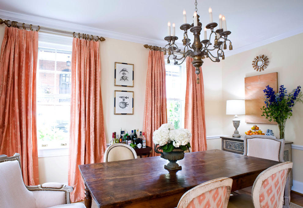
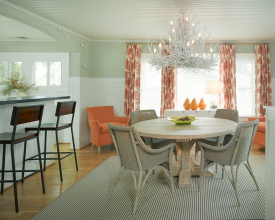
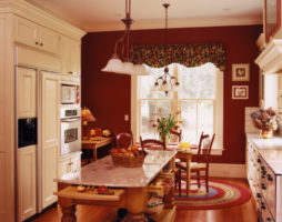
coral curtains in the interior canteen
Do you want to bring oriental notes to the decor? Coral color in this case is simply irreplaceable. Add luxurious pillows, intricate carpets or textured curtains to your living room or bedroom decor, dilute it all with wenge-colored furniture and get a chic, oriental-flavored atmosphere.
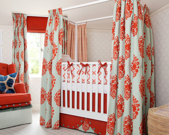
For home interiors, a combination of coral and mint is good. Delicate greens should be introduced in decor items, because the leader in this pair, oddly enough, is coral. In extreme cases, their presence in the finish can be in a ratio of 2: 1.
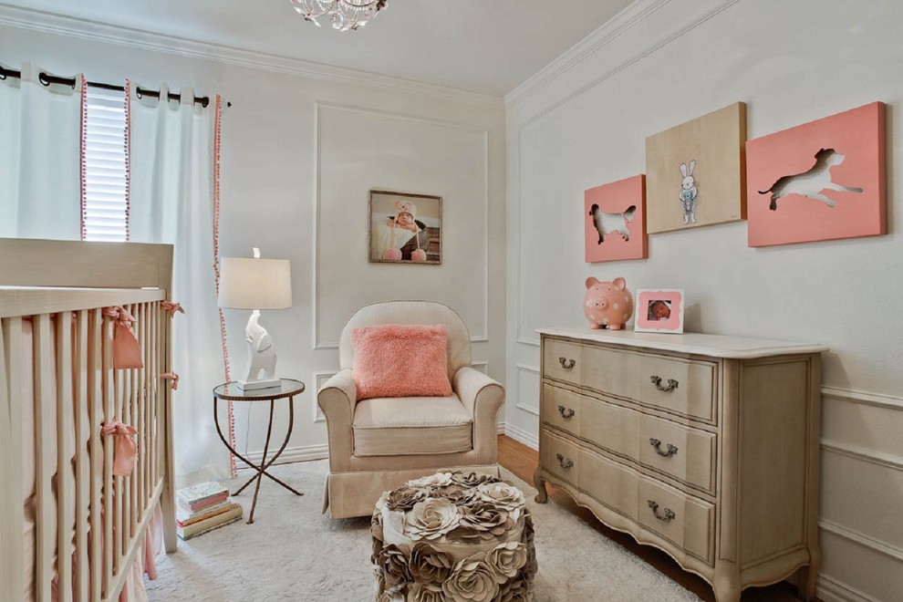
For children, a yellowish shade of coral color in the interior is very beneficial. The atmosphere will turn out to be mischievous and moderately dynamic.
No stranger to coral and romance. Combine it with the glitter of gold or silver, furnish the room with chocolate or even black furniture, complement the picture with candles and enjoy a sober, but incredibly charming, with a touch of exquisite charm, decor.
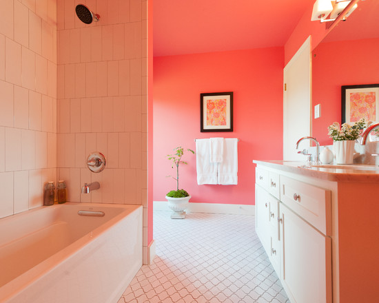
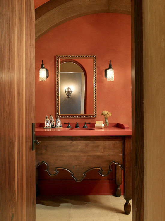
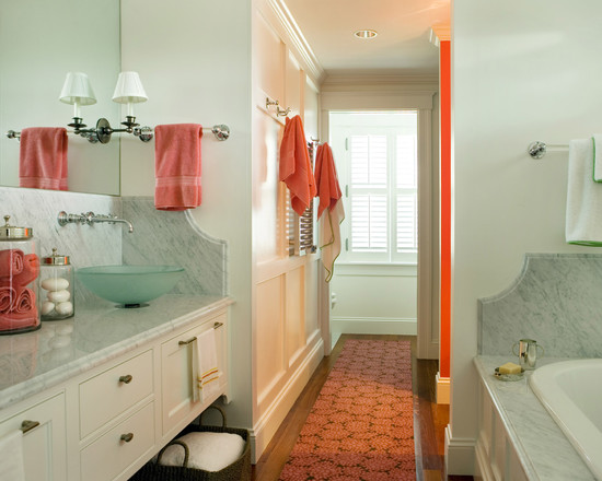
bathroom in coral colors
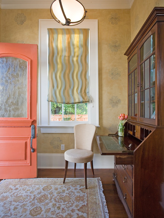
Coral color is a frequent guest in purely masculine rooms. In combination with dark tones, it makes the rooms both strict and aristocratic. Bright and colorful, it will turn the most ordinary atmosphere into a celebration of life. Having come to neutral decors on curtains, tablecloths, bedspreads, he will make them play with new colors and be filled with new meaning.
Being defiantly bold, but remaining warm and noble, coral color is in demand in the interiors of living rooms and bedrooms, children's rooms and kitchens.However, when using it, do not be zealous, let it remain a decorative highlight.
coral combined with gold allow you to create an elegant aristocratic interior
Contrasts in coral decors
Do not make porridge out of coral shades. Coral elements are completely lost against a similar background. Try to alternate colors rather than layering them in a sandwich. No matter how theoretically useful and pleasant coral shades are in interiors, they still need to be used very wisely. Incorporate “cooling” blues into coral decors and dilute them with light colors. In this case, the ice of white and the hard cold of the metallic sheen of the gray palette are just perfect.
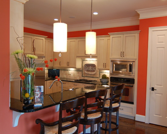
If coral is planned to be used in the design of the kitchen, then do not supplement it with citrus and fruit paints. It is not necessary to additionally “warm up” the already warm interior of the room, which is distinguished by a difficult temperature regime. Don't turn your kitchen into an open-hearth shop!
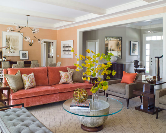
upholstered furniture in coral color makes the atmosphere of the living room more warm and cozy
Precautions when using coral color in the interior
Sophistication is easy to turn into a boring routine, one has only to refill the interior with it. Let the coral please the eye, and not set the teeth on edge. If you decide to decorate the walls in coral color, then stop at one surface. If you paint everything - then partially. Make simple coral panels.
A powerful and sufficient interior dominant will be the floor in this shade.
There can be many "hot" accessories in the decor, but they must certainly differ in size. Ideally, one large element is complemented by several small details.
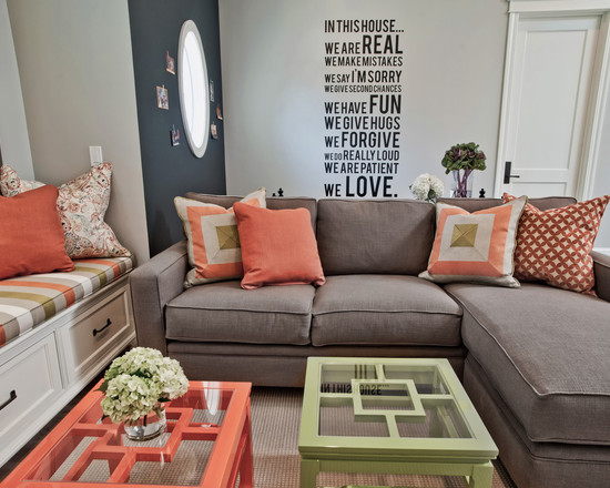
decor items in coral color in the living room
In the guest area, there is a place only for diluted coral flowers, because the attention of those present should not be focused on the color saturation of the decor, but on communicating with the owners.
back to index ↑Conclusion
The coral color in the interior is perceived noble, soft, without excessive aggression, but not cloyingly feminine, which makes it universal and allows you to use it in decors of a wide variety of styles. It is pleasant in every way, so take a closer look at it - it is quite possible that it will be the perfect solution for decorating your home!
Photo gallery - coral color in the interior: