There is no need to talk about the importance of the color scheme of the interior. Not interested in how the sofa in cherry upholstery will look like against the background of lilac walls, only color blind people can.
- Basic color characteristics
- What happens during the change in the color characteristics of tones
- Color temperature
- How color is perceived in the interior
- Rules for combining colors in the interior
- How to choose interior colors
- Color Scheme Examples
- Unusual styles that prefer a riot of colors
- Conclusion
- Photo gallery - color in the interior
- Video
The rest, with enviable diligence, exhaust themselves with the selection of color combinations, and are tormented by the question of whether they will be pithecanthropes, using a combination of only two colors in interior decor, and not three or more, as interior fashion dictates. And the reason for this is the abundance of shades. Today, coral, turquoise, and salmon are full-fledged representatives of the color palette.
The correct combination of colors in the interior is not just a matter of aesthetics. This is the key to a healthy psycho-emotional macroclimate in the house. With the help of well-chosen color schemes, you can achieve a wide variety of effects, including correcting the space.
There are a lot of nuances in the development of color design for interior decoration. Let's try to deal with them.
back to index ↑Basic color characteristics
The main parameters characterizing the color are:
- tone;
- saturation;
- lightness.
What it is?
Color tone
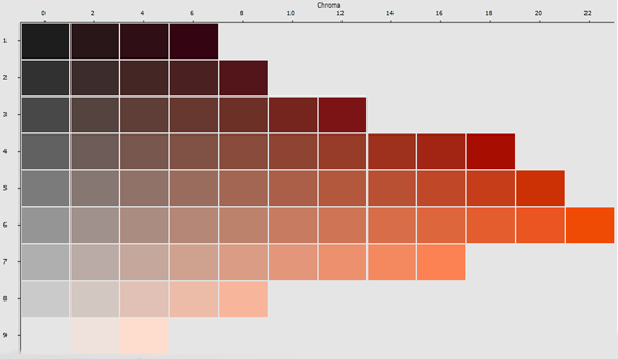
This indicator is responsible for the location of the chromatic hue in the color spectrum. If you look at the tone from the side of physics, then its perception by the human eye will depend entirely on the length of the emitted light wave. The red part of the palette is characterized by long waves. For the yellow-green segment - medium. For blue-violet - meek. Representatives of the medium-wave class are considered the optimal colors in the interior for vision.
color tones
There are toneless achromatic shades. We are talking about black, white and all representatives of the gray scale.
White is considered to be the product of a mixture of all colors, black is colorless a priori. To get gray, you need to mix at least two shades.
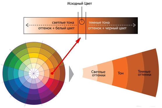
Color saturation
An indicator that determines the level of chromaticity of the tone. In fact, this is its degree of remoteness from gray, in the same lightness.
Pure spectral tones have maximum saturation. The more we mix colors to get the required shades, the less bright they become.
Color saturation
Consider the example of nature. Everyone remembers the freshness of the greenery of young grass. Now imagine how its color will change if its layer after layer is covered with gray dust. The purity of the color will dissolve before our eyes, that is, its saturation will decrease sharply.
Color lightness
Lightness refers to the location of the color in the white-black scale. The indicator is characterized by the terms "light" and "dark". Exceptional lightness is the prerogative of white tone. If you look at the color scheme, you can see that the tones in it initially differ in lightness relative to each other. Yellow is always lighter than blue.
Color lightness
What happens during the change in the color characteristics of tones
"Changing one saturation in a combination of colors will result in a monotonous, lifeless palette"
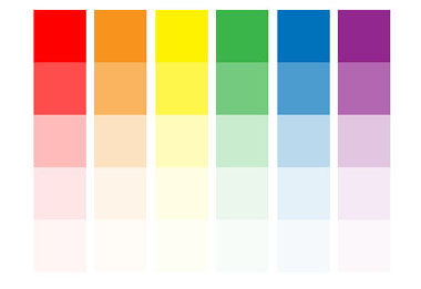
How often do we mix colors and do not get the desired result! And why? Perhaps because we do not understand the technology of the process. It is impossible to get an expressive multi-color gamut just by changing the hue. The resulting color in the interior will be more colorful than contrasting. The problem is that with this approach, the colors will retain their saturation and lightness at the same level.
A completely different result will be if two indicators change at once. A one-time adjustment of the saturation will also noticeably improve the gamut. Complexity will appear in the color scheme. It will become brighter, gain contrast.
Changing one saturation in a combination of colors will result in a monotonous, lifeless palette. The lack of transitions will not allow it to be read. Everything will be blurry and blurry. Hence the need to additionally change the lightness. This will give a sense of color diversity, add contrast to the composition.
Saturated colors in the interior
Changing only the level of lightness will give rise to a monochrome combination of colors in the interior. It can be quite expressive due to the presence of light contrast, but its facelessness will quickly get bored. To correct the situation will also have to change the tone. While maintaining the contrast, the composition will acquire color expressiveness.
The scope of fantasy is opened by the simultaneous change of all the main color characteristics. Here is a great chance to get amazingly beautiful shades and make great compositions from them.
back to index ↑Color temperature
Another important indicator of color selection in the interior. For ordinary people, the warmth of color is associated with the seasons. The colors of summer are automatically attributed to warm tones, the shades of winter - to cold.
Now let's look at the color scheme of the spectrum. It clearly shows that all chromatic shades are obtained from three basic tones: yellow, red, blue. The first two colors are associated with fire and the sun, respectively, and all shades where they will prevail automatically fall into the warm spectrum. Blue is the color of ice, the depths of the sea, so its presence in shades will make them cold.

Interior in warm colors
Everything is clear with the chromatic palette, which is made up of the combination of tones and semitones, but how to regard the achromatic spectrum of colors in the interior? White color is considered the most balanced. Since it is a derivative of all shades of rhinestone, it has a neutral temperature. Pure green tends to the same parameters.
Colorless black is also assigned to the neutral caste, but already due to the complete absence of radiation of light waves.
Monochrome interior
What happens when we mix colors with black or white? They lose their original characteristics. The bright red tone is super warm, however, its shades can no longer boast of this. To obtain darker or lighter tones of red, you will have to add black or white paints, respectively. They will dilute the saturation of the color and, as a result, “cool” it. How much heat the red color will lose depends on the dose of diluent additive. This does not mean that the temperature of the newly formed colors will become cold, just that they will move closer to the neutral spectrum.
The influence of color temperature on interior design
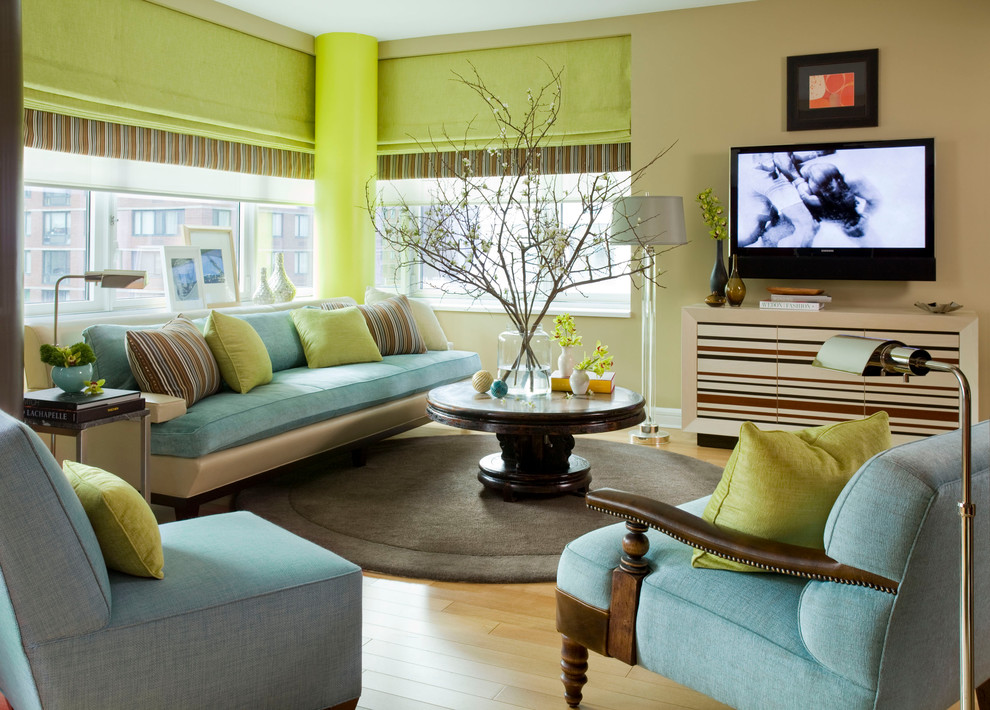
The combination inside the main warm and cold colors gives a lot of additional shades that help a lot in creating a stylish interior design. By mixing the colors of the warm spectrum in different proportions, you can get a delightful raspberry, terracotta rich brown.From the combination of cold blue and green tending to neutrality, shades such as turquoise, indigo, azure, ultramarine, purple will be born. And this is just a small list of possible options. Regardless of what temperature the derivatives of the tone belong to, they can be combined in any combination. For example, the green background of the walls is perfectly complemented by brown curtains with gold embossing or yellow print.
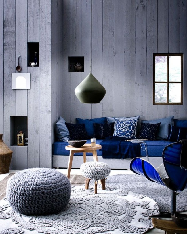
The combination of cold blue in the interior
The colors of the decor of the room will help make it lighter and more spacious. To do this, in too shaded rooms, you need to use their light spectrum.
The perception of volumes of objects also depends on the color in the interior. They may appear distant or close. Removal colors are usually cold. They can not only move one or another object at the visual level, but also make the whole room more spacious.
Approximation of objects in the power of the warm spectrum. Naturally, the higher the "degree" of the color temperature, the smaller the volume of the room will seem. Such abilities of paints are very useful when decorating non-standard rooms, with complex layouts, rooms and too high ceilings.
Warm colors will be useful in the design of non-standard rooms
How color is perceived in the interior
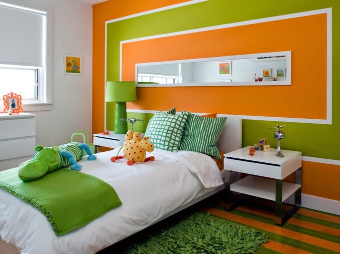
Orange
This bright, full of energy color in the design of rooms is used with care.
Although it has a wide palette of shades: from loudly saturated to delicate apricots, orange, nevertheless, is left in accent roles. It is extremely rarely used as a background, and more often introduced with accessories, textiles. Even scanty orange splashes in the combination of colors in the interior are enough to make the atmosphere cheerful and fill the room with warmth. We must take into account the tendency of the spectrum to crowd out other shades and try not to overdo it with its addition. In addition, the temperature of the color goes off scale in its warmth, so that in sunny rooms it will become completely uncomfortable from its abundance.
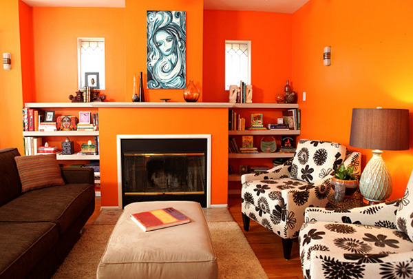
Orange color will fill the room with warmth
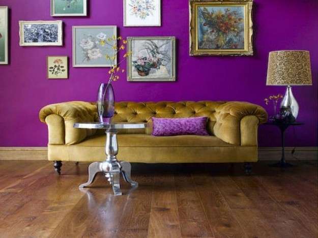
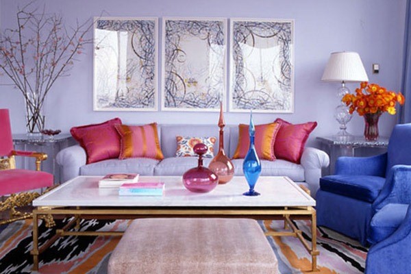
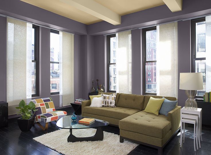
Violet
The complete opposite of orange. The color temperature is cold, so the interior meets with freshness and coolness. The violet spectrum boasts enormous design potential. It includes such shades as:
- plum;
- currant;
- bilberry;
- blackberry;
- violet.
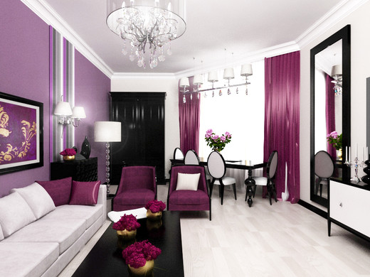
The violet spectrum boasts huge design potential
Combinations with these colors in the interior are chosen by noble and powerful natures, people who gravitate towards mysticism and creativity.
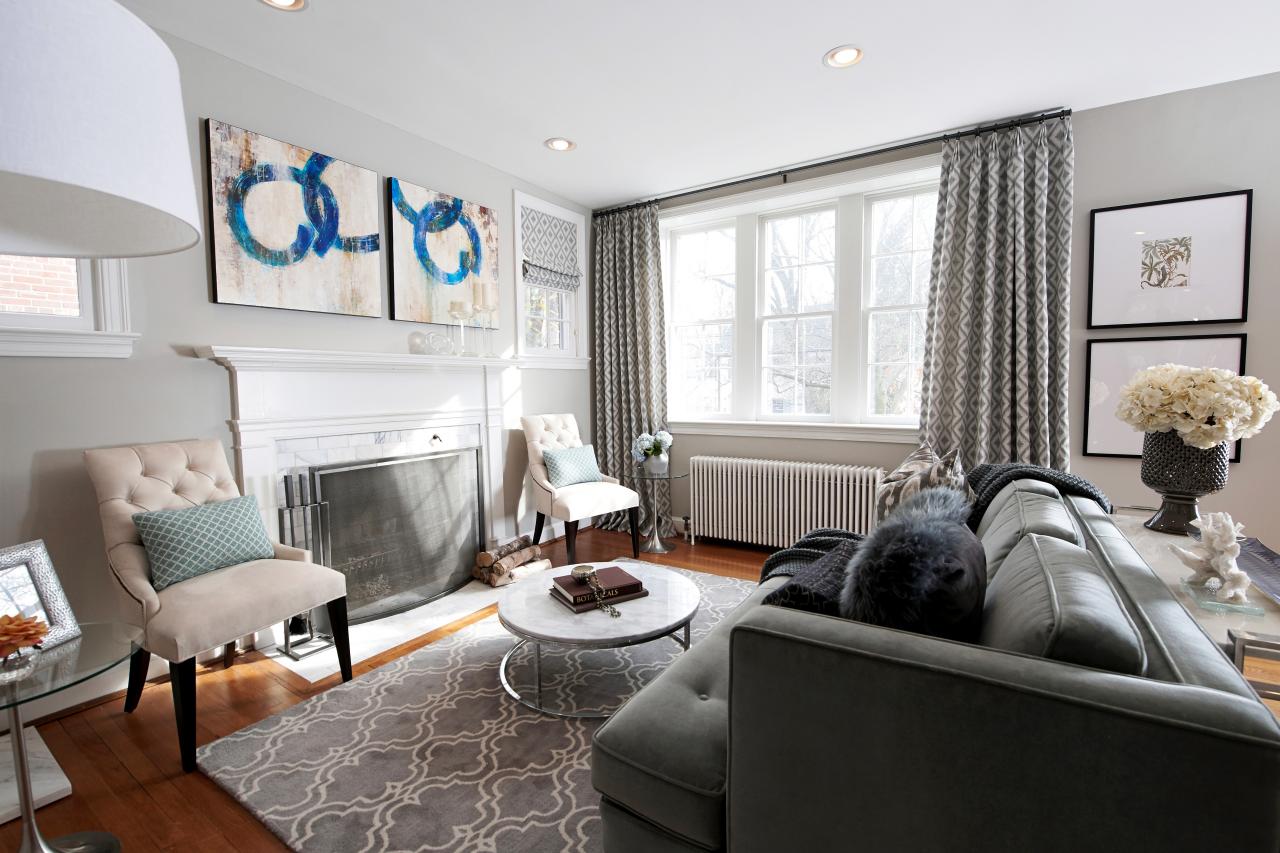
Grey
This color has been translated by many as outsiders, but its negative assessment is completely undeserved. It has long ceased to be a shade of poverty and old age. In modern color schemes of interior decor, it looks more than elegant.
Gray color in the interior looks more than elegant
Although the gray spectrum belongs to neutral tones, its simplicity is insidious. Against the background of improperly selected companions, he will fade himself and make the home miserable. To make the shade show its diversity and richness, you will have to try, that is, carefully work on color combinations in the interior.
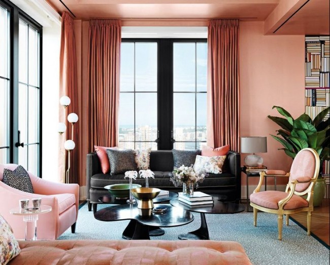
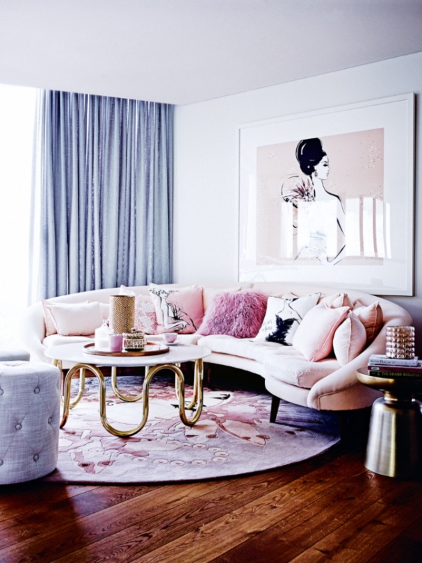
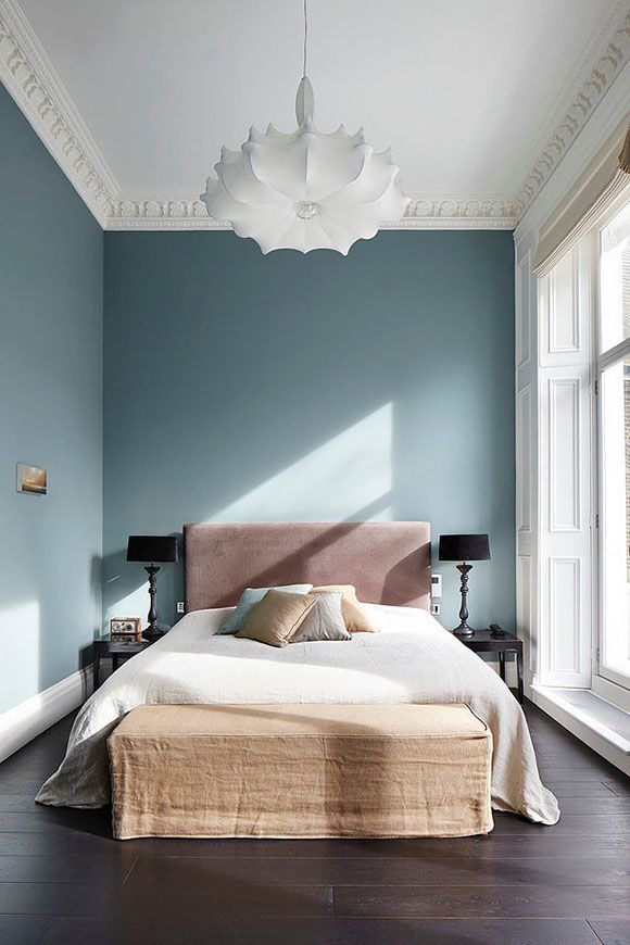
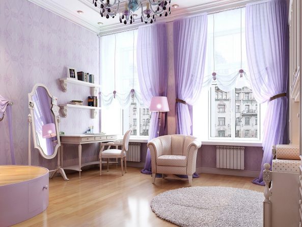
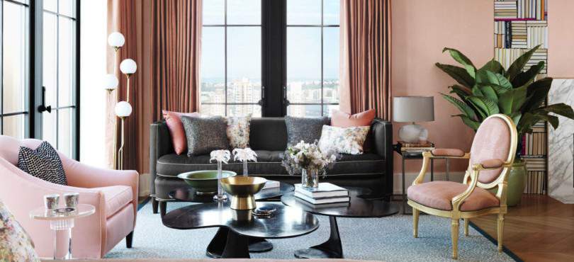
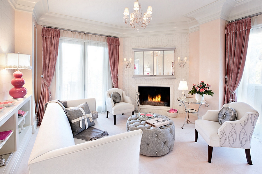
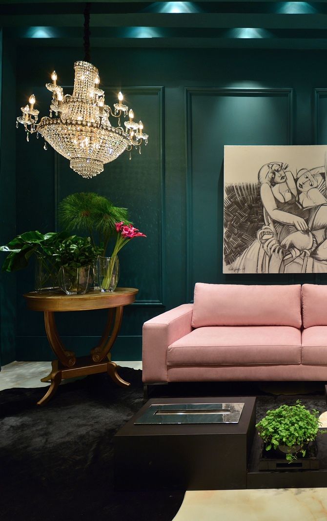
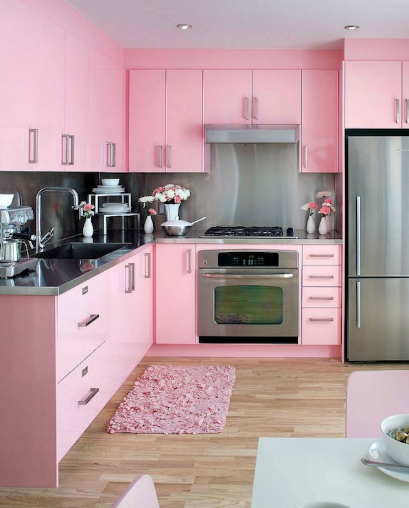
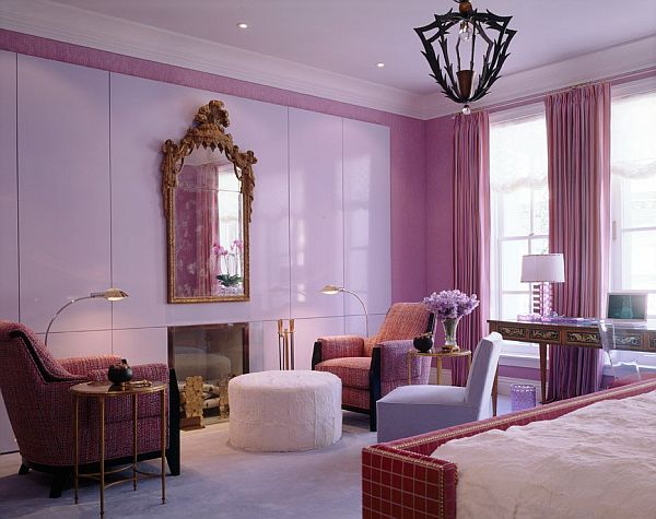
Pink
Romantic dream. A spectrum of gentle and sensual tones. Do not think that pink is all about glamour. He is very versatile. Here you can find motifs that delight admirers of princesses' boudoirs, and interpretations that are quite suitable for adult ladies.
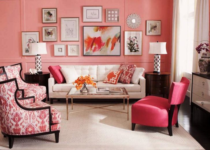
Pink color will suit the interior in any style.
As for the popularity of color in the interior, it literally rolls over. It can be used to decorate all surfaces, including the floor and ceiling, and to place stunning sensual accents. Pink is ready to fit into the interior of almost any stylistic orientation and make a room of any functionality a real “candy”.
Brown
This color is also looked at with caution. He is considered gloomy, pessimistic. But in color schemes where we mix multiple colors, brown has a lot of potential. In addition to the fact that its shades are simply beautiful, they have a beneficial effect on the indoor atmosphere.
Surrounded by brown shades, a person feels protected. They act as a mild sedative, help you get out of depression, cope with a stressful situation, and even reduce the intensity of physical pain.
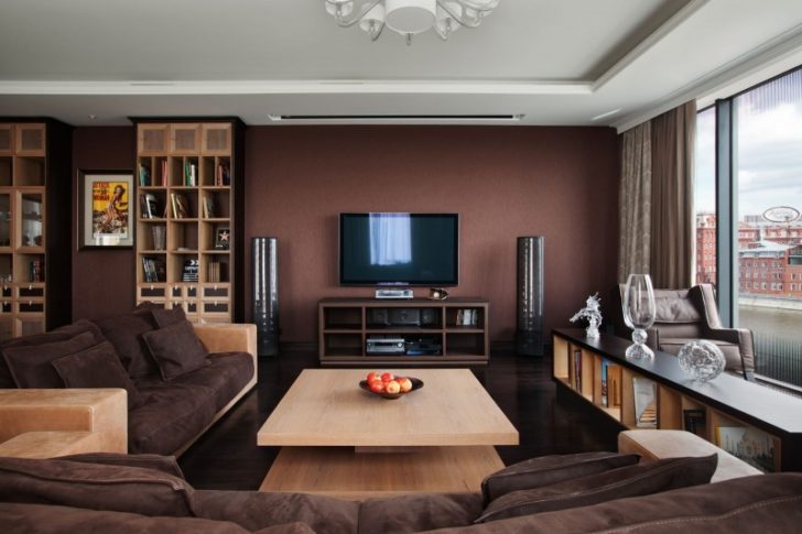
Brown has a beneficial effect on the indoor atmosphere
Brown is a color that promotes stability, the color of the earth itself. Basically, it can't be negative. By the way, the brown color in the interior also symbolizes the family hearth, so its presence is not just justified, but desirable.
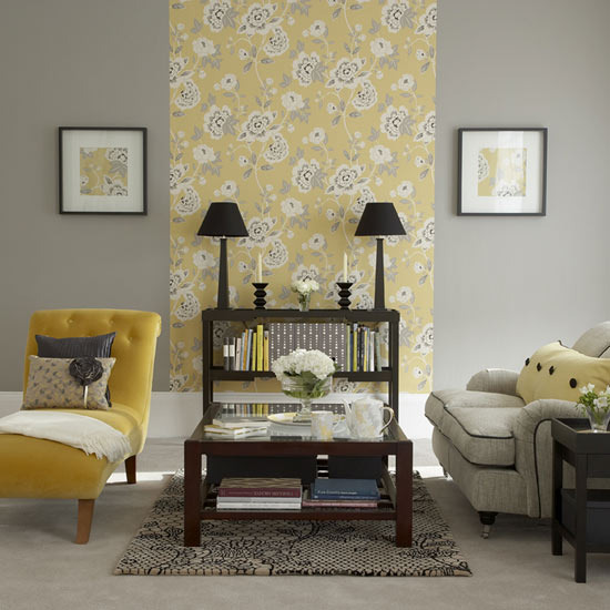
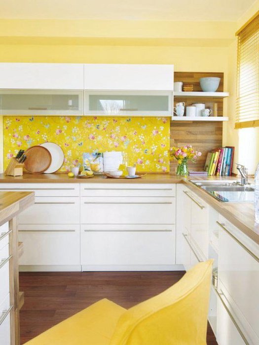
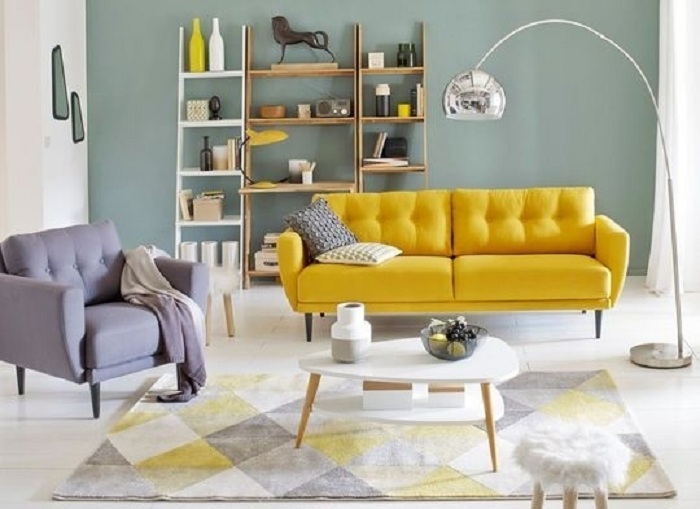
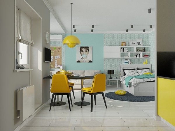
Yellow
In the color spectrum, yellow is the lightest and brightest. Invigorating and tonic, it stimulates mental activity, makes the brain move.
Yellow is associated with summer, so the temperature of the color is warm, and the interiors with it look festive and full of life. It is easy to combine, which is very good, since it is difficult to perceive it as a background. How many colors we mix is not so important, the main thing is that the idea looks harmonious and sets in a positive way.
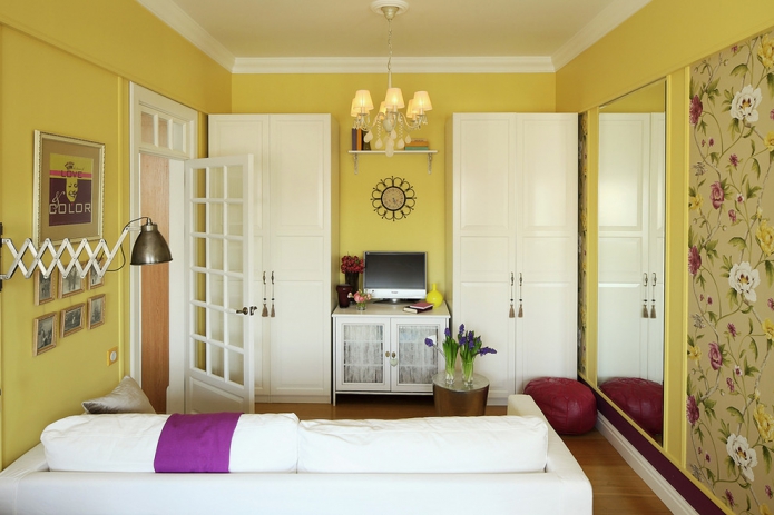
Yellow interiors look festive and full of life.
This color is added to the interior by people who find it difficult to reveal their full potential, who lack freedom.
Its color therapeutic qualities are also on top. It will alleviate the fate of rheumatic people, people with diabetes, kidney patients. But in the color schemes of the interiors of people prone to tachycardia and neuralgic disorders, there should be practically no yellow.
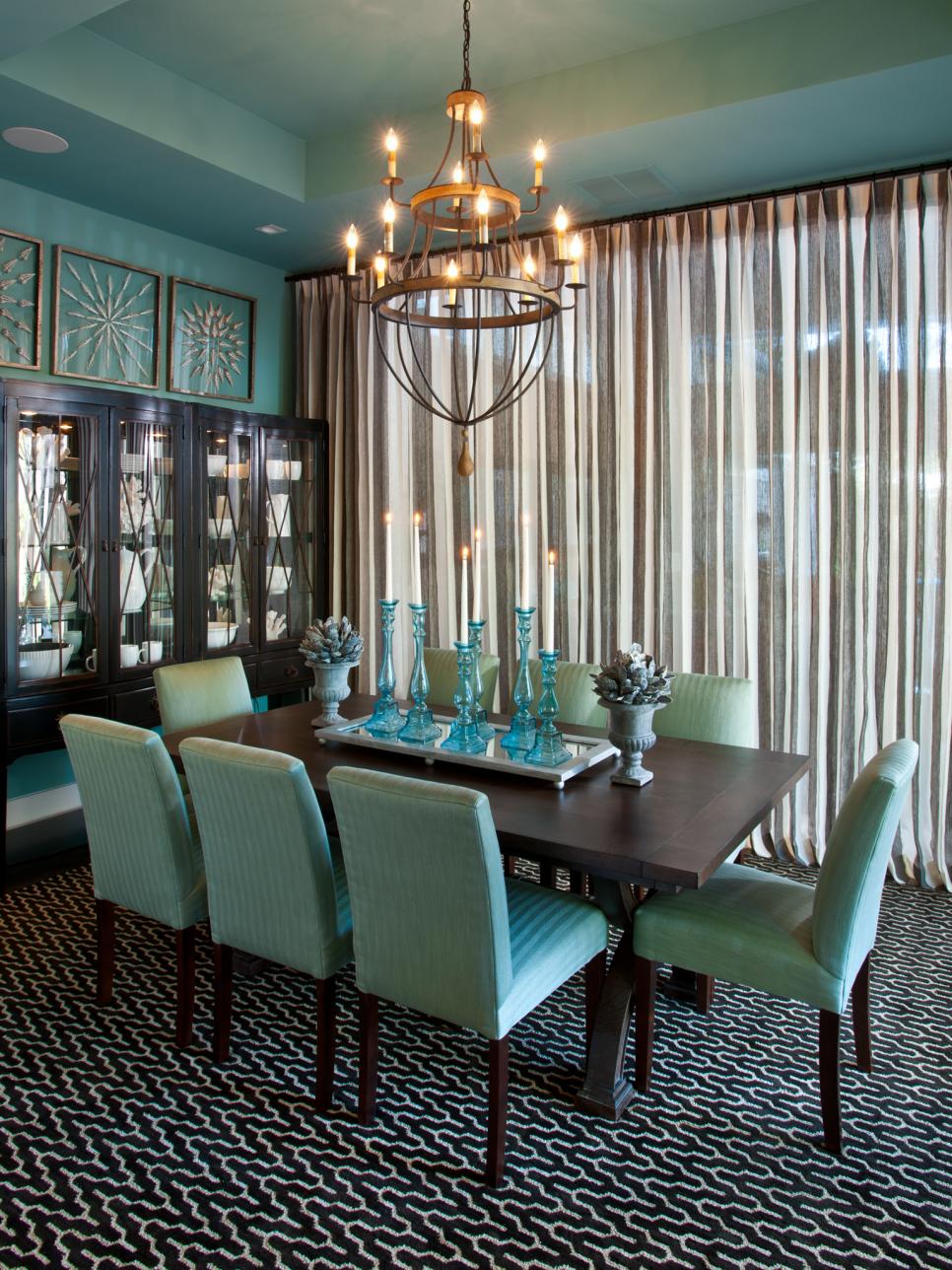
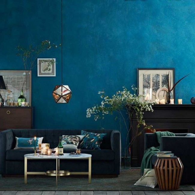
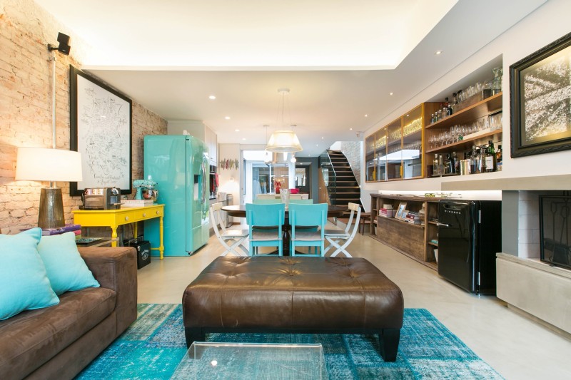
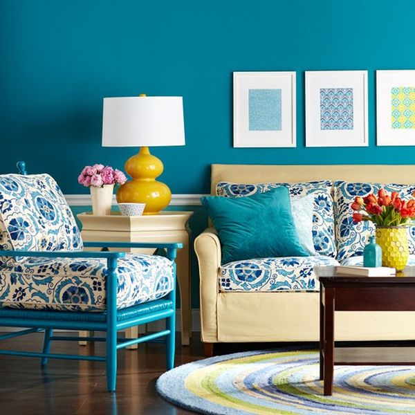
Turquoise
There are shades whose fate is unenviable. For example, scarlet and raspberry are considered by some to be red. Something similar happens with turquoise. It is no longer blue, but also not green, that is, something in between. The natural color in the interior is unique. Although it got its name in honor of a semi-precious stone, turquoise reminds many of the color of sea waves, which are simply not able to carry negativity. The color temperature is cold, but its softness is perceived with a bang! It is conducive to relaxation, so it can often be seen in the decor of bedrooms and bathrooms.
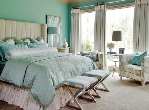
Turquoise color is conducive to relaxation
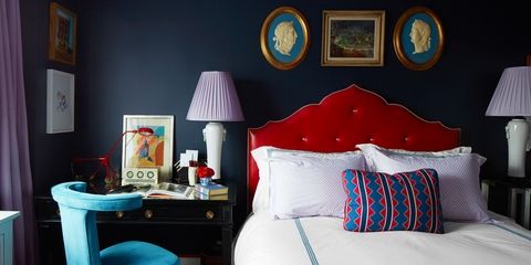
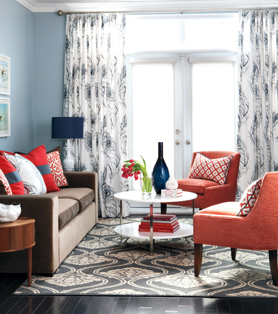
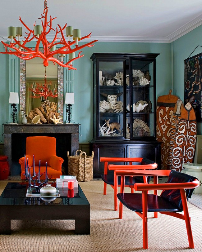
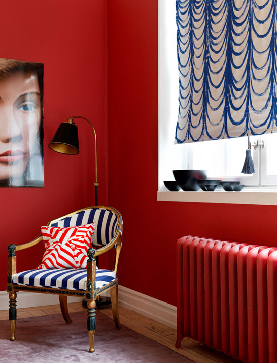
Red
A color that has no equal in intensity and psycho-impact on human consciousness. What exactly the latter will be depends on the combination of colors used in the interior.
Red is associated with fire and blood. This symbol of aggression carries a powerful energy potential. The spectrum is attractive to strong, powerful personalities.
It is noted that red shades help to get out of depressive states, have a positive effect on the hematopoietic organs, and help in the treatment of anemia. But the fiery color, under no pretext, should appear in the homes of the mentally ill, emotionally labile people and hypertensive patients.
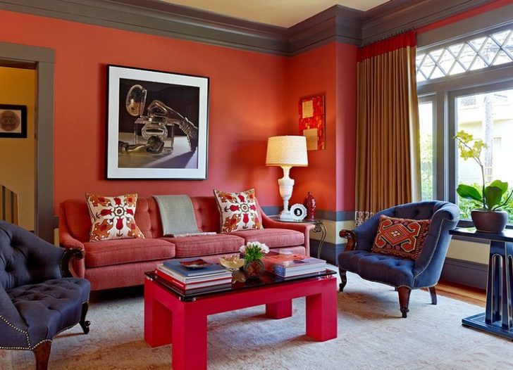
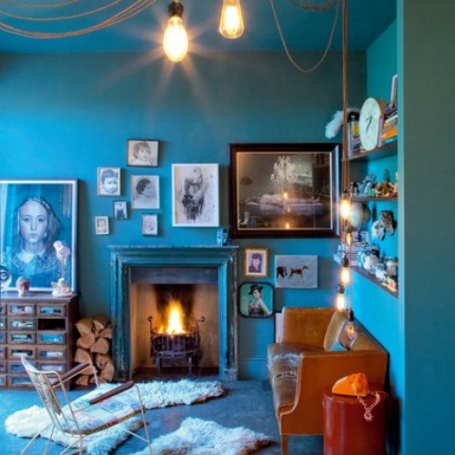
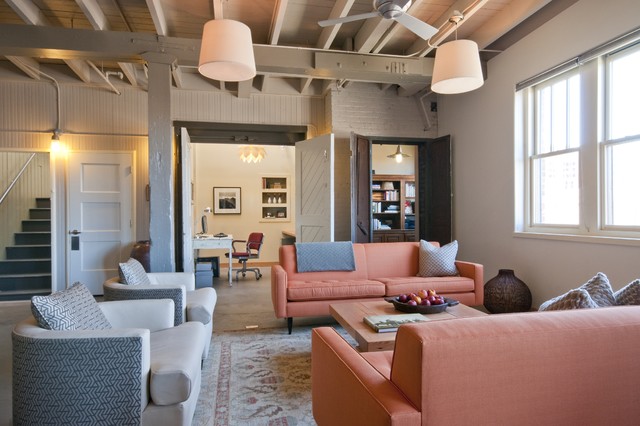
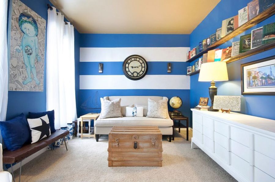
Red color in the interior of the living room
The main role of red shades is rarely trusted. It will be extremely difficult to make the atmosphere of such a room harmonious. It is impossible to cope with the task on your own. Even venerable designers have to rack their brains over color schemes for months, but the result is worth it.
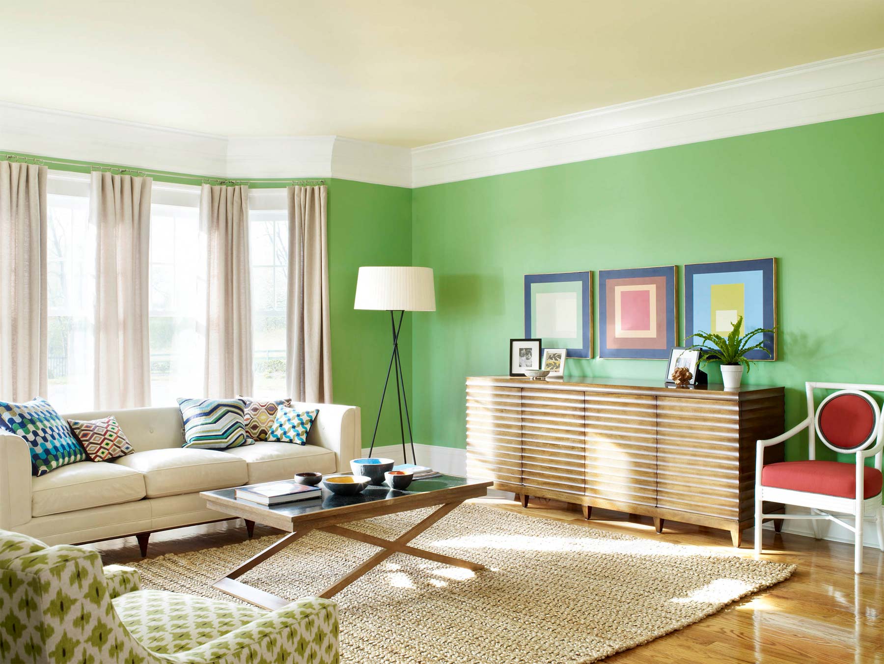
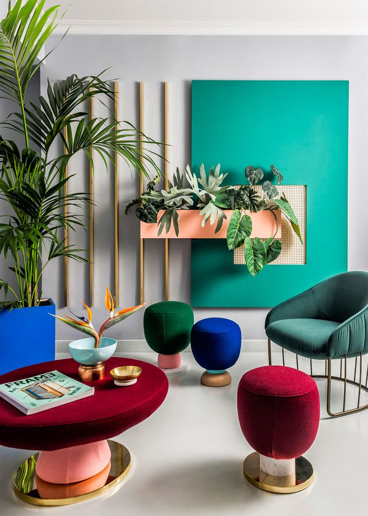
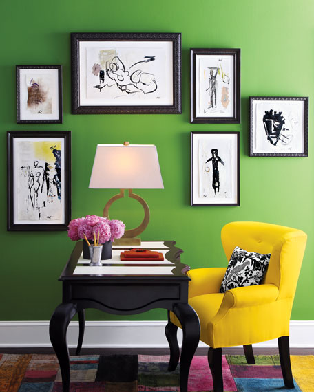
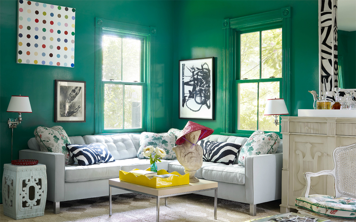
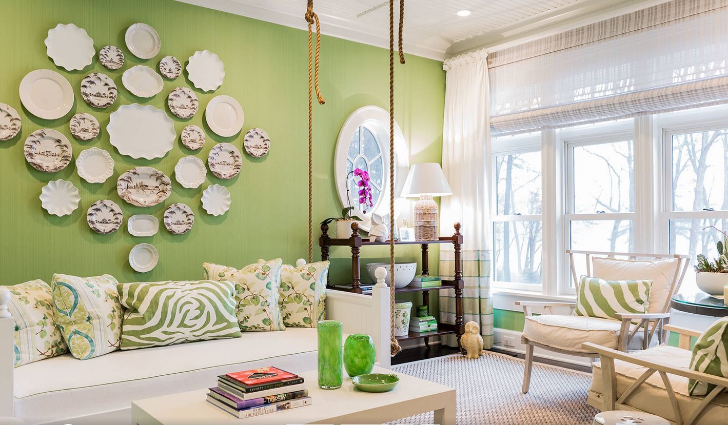
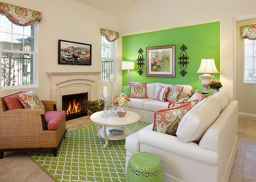
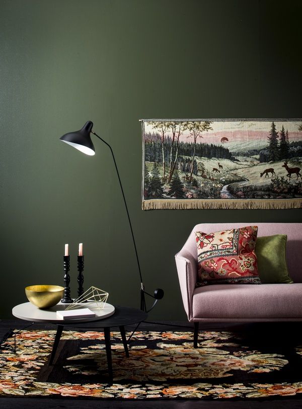
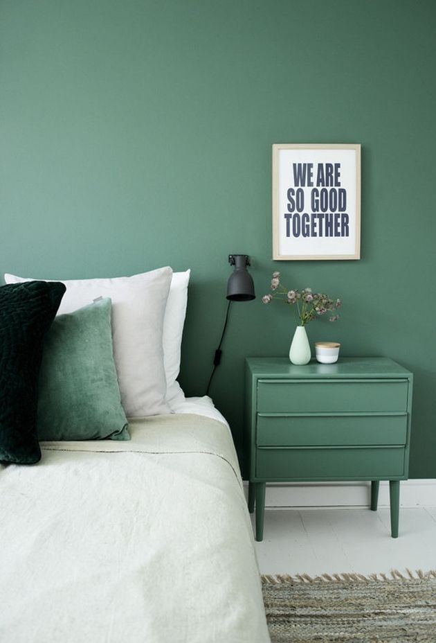
Green
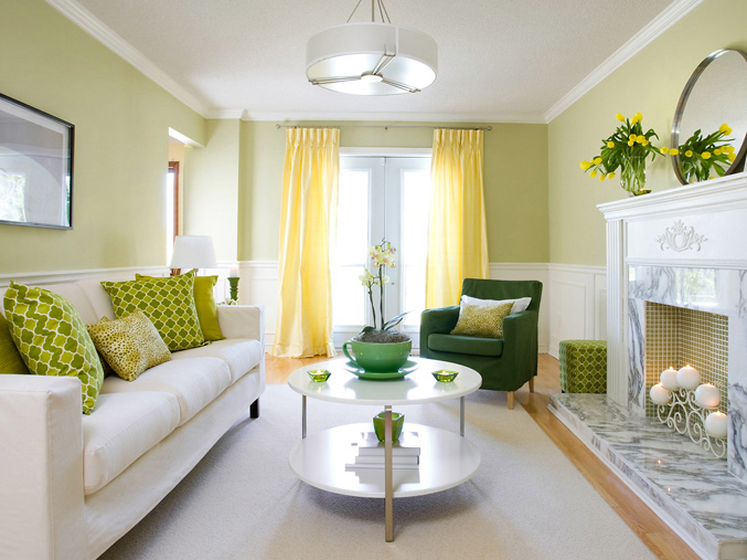
The most pleasant color from the entire palette, evoking extremely positive emotions and generating incredibly pleasant associations. This allows you to use it in the design of any room, whether it is a nursery or a kitchen. It will fit everywhere.
This color in the interior is simply necessary for those who appreciate peace. Green is conducive to relaxation and brings with it a feeling of coolness. The more blue you see in it, the colder the color temperature will be. The predominance of yellow in its composition can make the tone more pleasant to the eye.There are countless shades of green, so everyone can find something pleasant for him. In general, this spectrum is given a dominant role in the combination of colors in the interior by people who are reliable, prone to conservatism.

Green can be used in the design of any room
Green is also color therapy. In his environment, one can forget about insomnia, pain in the heart, asthmatic shortness of breath. It restores the nervous system, gives the opportunity to "rest" the eyes.
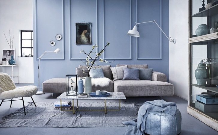
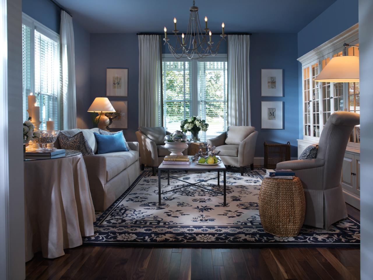
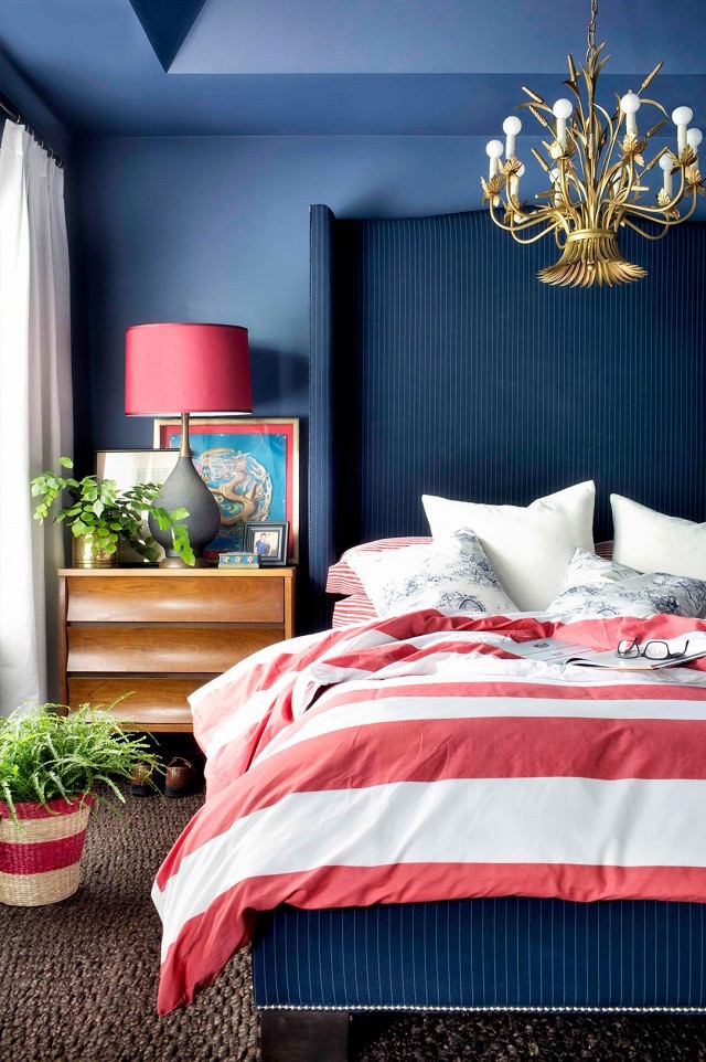
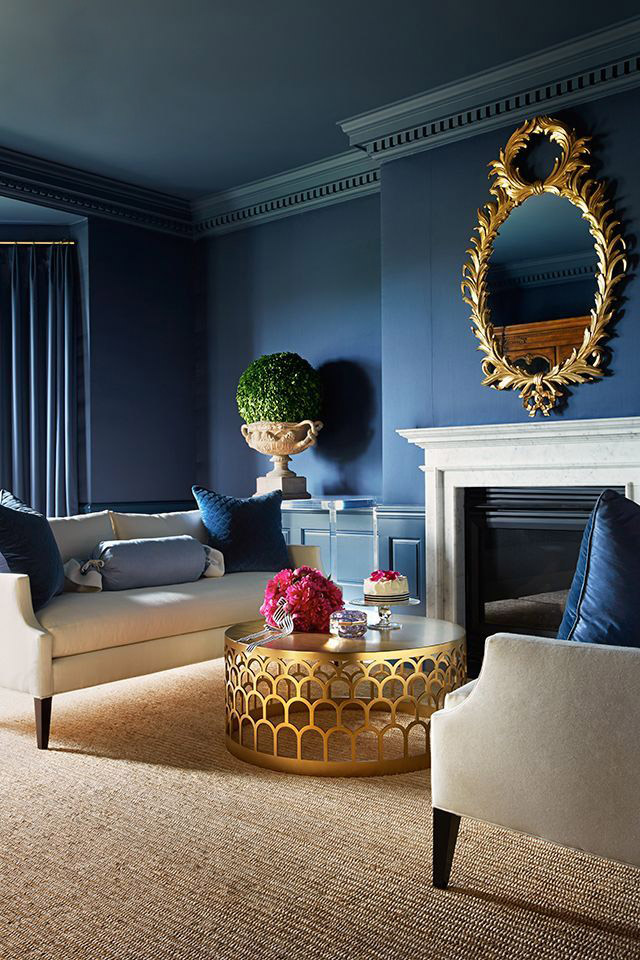
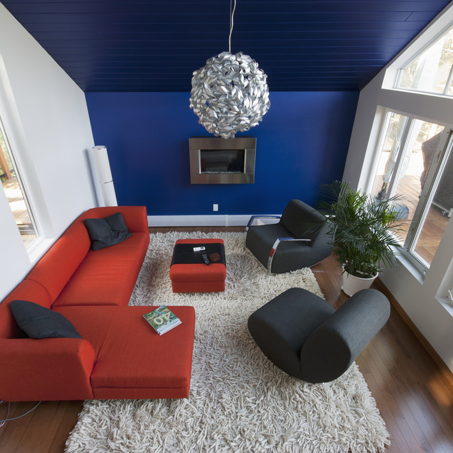
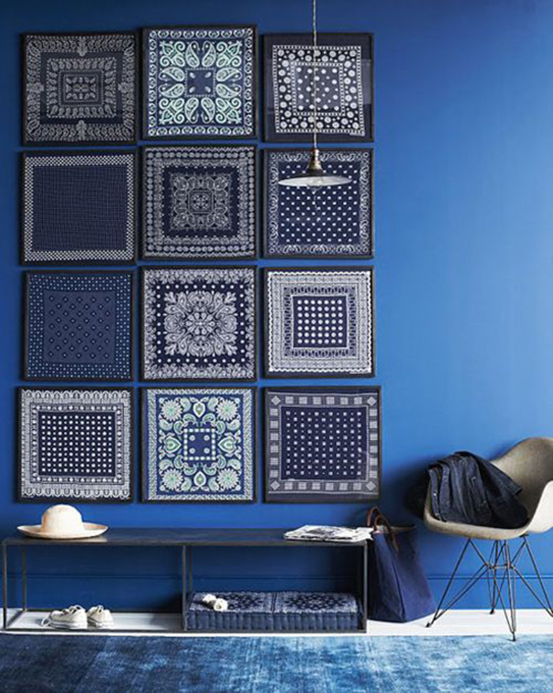
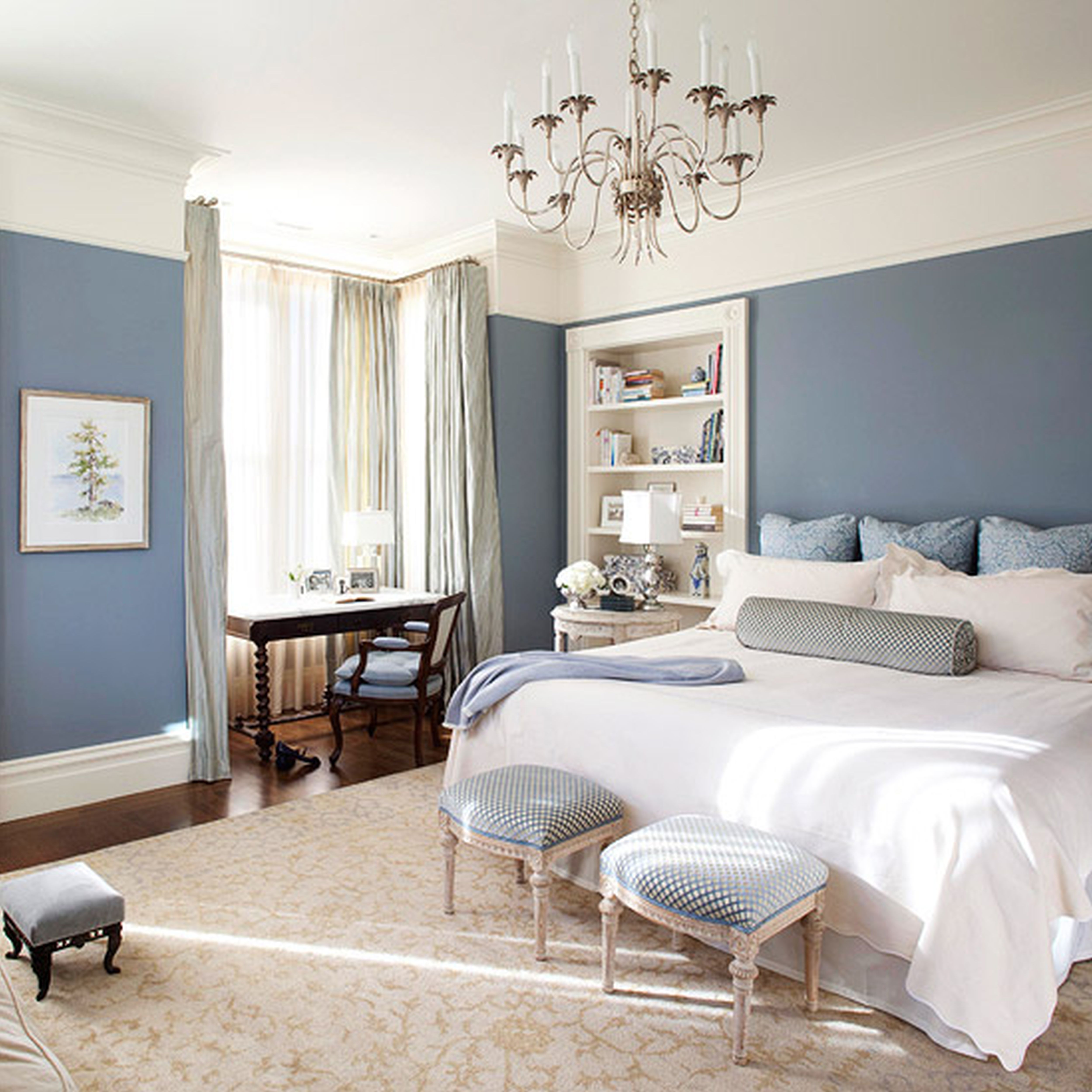
Blue
There is a belief that blue interiors are a legacy of the Empire era, because it was in those days that it was fashionable to make pale blue backgrounds in houses. Today, the shade can be found not only on the walls. Light and pleasant, he finds himself in different guises.
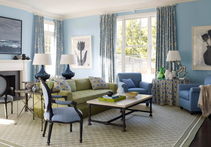
Blue color will create a light and carefree mood.
The color therapeutic effect of blue is weak. Its more saturated shades have a relaxing effect, while lighter tones sow a light and carefree mood.
back to index ↑Rules for combining colors in the interior
To make the home microclimate comfortable, you need to know how to combine finishing colors when arranging a living space. You can do this in different ways.
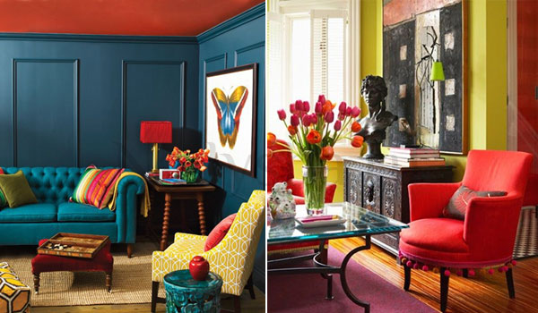
Playing on contrasts will require combining different temperature colors in one space. For the background, in this case, it is recommended to take the brightest of the shades that make up the color scheme of the design. The rest of the colors will be given a secondary, complementary role.
The use of contrasting colors in the interior
Contrasting solutions are not used in the decoration of rest rooms, corners intended for emotional unloading, rooms where people spend a lot of time. This solution will look good in halls and hallways. Sometimes children are made out in this style, but again, it is better to entrust the selection of a palette to a specialist so as not to injure the child's psyche with ill-conceived combinations.
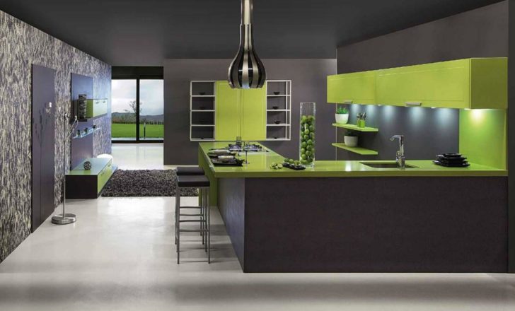
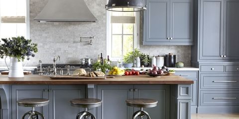
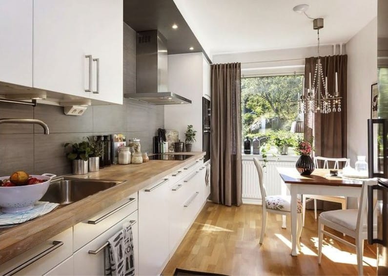
Shading overflows in one color scheme are very pleasing to the eye and initially set up for comfort, so these color combinations are used in the decor of bedrooms, attics, living rooms. It will be good to have such a combination of colors in the interior of the kitchen, where housewives have to spend long hours. Combining single-spectrum shades it is not bad to distribute them adequately. The lighter ones need to be made background, and the saturated ones should be added with furniture and interior accessories.
Kitchen interior in one color scheme
When decorating a room with a combination of close colors, the main thing is to avoid oversaturation. Stop at three shades, one of which is the main one.
Color has one more twist. It will eventually lose color intensity, perhaps even burn out completely. This happens, for example, with green, red and orange. Shades of the blue spectrum with excessive light become darker than they were originally.
By and large, the color in the interior with bright lighting will be perceived differently initially. Bright purple will take on a dark red tint and become more like wine. Yellow will lose in saturation and brighten, blue will lose its depth.
When compiling a color scheme for the design of a room, keep in mind that the degree of color output will be significantly affected by the texture of the finishing material. Each variety presents seemingly similar shades from completely different angles. The texture of some makes the colors deeper and softer, others colder and harder. In general, there are plenty of nuances, so before implementing a room design project, it would be nice to look at it in computer graphics.
Before implementing a project, look at it in computer graphics
How to choose interior colors
“You can leave the pursuit of fashion trends behind and prefer pastel colors in interior decoration to all defiant color schemes”
Start by looking for the main color that you personally like, and choose companions for it.Do not make rainbow color combinations. It is quite enough to pick up one or two, but ideally suitable companions. The main color should be made background, that is, all global surfaces in the room should be painted with it.
The interior is considered optimally solved, where 75% of the finish is given to the main color, 20% to additional shades, and the remaining 5% are distributed among color accents.
The main color is given 75% of the finish
The house should be a place of high comfort, where you would like to return, because everything is arranged there exactly the way you dreamed about it. This means that the pursuit of fashion trends can be left behind and pastel colors can be preferred to all defiant color schemes in interior decoration. It will not be difficult to create a contrasting environment. It will be enough to add colorful accessories and bright furniture.
Colorful accessories will make the atmosphere contrast
If the color is involved in the interior in spatial zoning, then you need to take care of the smooth transitions of shades from one to another, otherwise there will never be a harmonious atmosphere in the room. It will never be possible to present it as a single whole. The interior will be as if chopped with an ax.
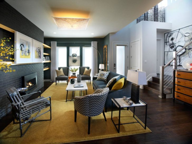
back to index ↑Color Scheme Examples
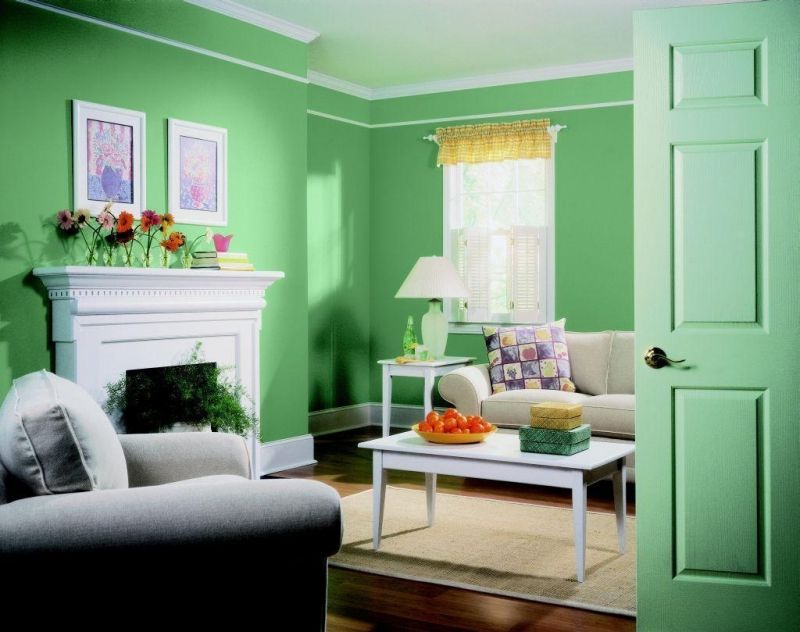
Having settled on a single-color room design and choosing several shades for this, do not forget to dilute the selected spectrum with neutral colors. Their introduction will help to make the interior light and smooth out the shade transitions. If a green spectrum is chosen, it is recommended to supplement it with inserts of white, milky, light gray, beige.
Green color complemented by white accents
The combination of colors chosen for the design of the room should be harmonious. Consider how to combine the shades that are most popular.
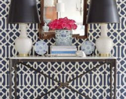
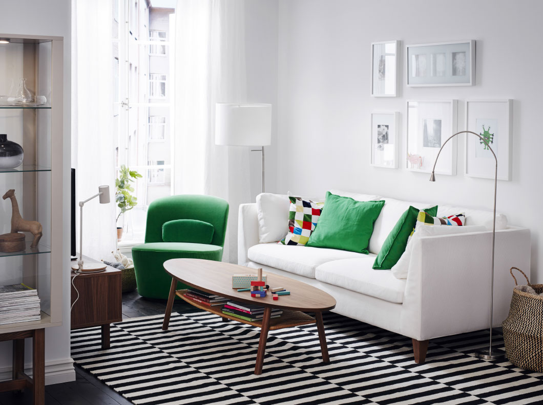
White is super versatile. It is combined with any representative of the tint spectrum, but is especially good when paired with red and black. His duets with brown and peach are always interesting. He will make a successful party in a purple and blue hue.
White color is combined with any shade
Natural beige, neutral gray, black, milky colors - soothe too flashy colors, smooth out their aggressiveness. If they themselves take on the role of a background color, then it will be necessary to select adequate companions for them.
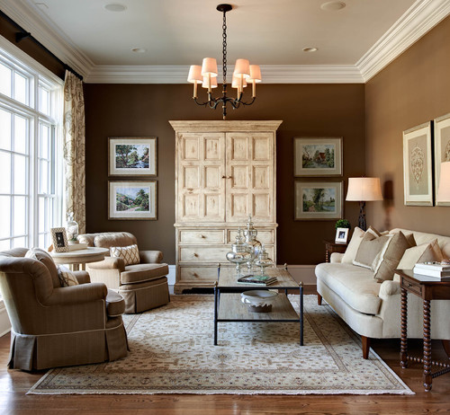
The whole brown spectrum goes well with beige, especially the color of cocoa, dark chocolate. His duets with purple and representatives of a muted green scale are interesting: khaki, olive, marsh.
The whole brown spectrum goes well with beige.
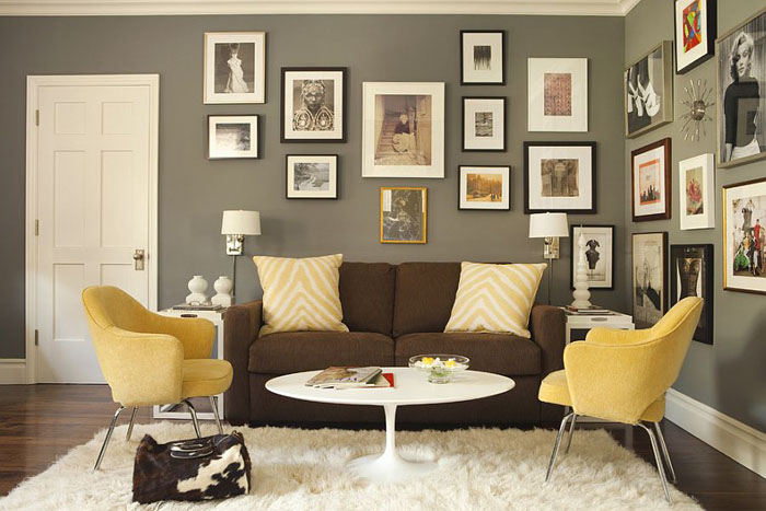
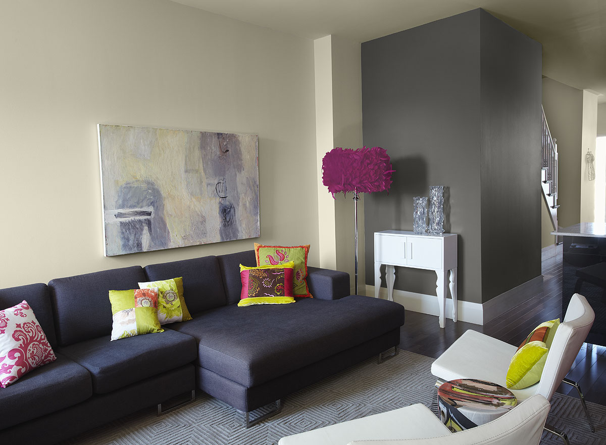
The gray color in the interior will need a “cheerful” partner. It is worth looking for among the pink, green, yellow spectrum. You can make interesting compositions by complementing gray with white and black. Monochrome furnishings will be enlivened by contrasting accessories, such as red cushions or bright raspberry lampshades.
Gray color complemented by “cheerful” yellow
Black color is simply defiantly strict. To make it more elegant, dilute the palette with cream, beige or chocolate shades. Of the more modern color combinations in the interior, I would like to highlight the combination of black with yellow and rich red.
The flashy positivism of yellow also needs to be corrected. It can be diluted with inserts of white, green, blue, strokes of brown and jet black.
Dilute the black palette with yellow
It is difficult to create a harmonious combination of colors in the interior, when red plays the title role, and this is putting it mildly. He is too heavy in terms of energy and emotions. Units can be in his environment for a long time. But for all its shortcomings, red is still very much loved, and many people strive to get an extraordinary color in the interior.
A generous introduction to the composition of golden, pink, white, purple, silver, blue, black shades will help to realize what you want. Moreover, the more we mix colors, the better the atmosphere in the room will turn out.
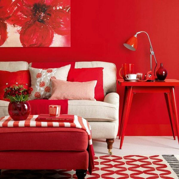
Bright interior in red and white
The coldness of blue will be diluted with turquoise, gold, purple, red, white and gray shades, and they will do it in such a way that it will become a symbol of home comfort.
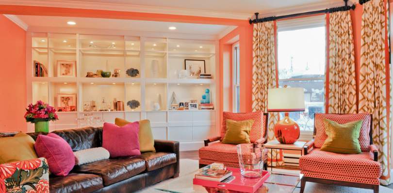
Orange willingly shares its vigor with pink, green, brown, gray, black. With caution, but still you can combine it with yellow and red.
Surprisingly, caution is also needed in drawing up a color scheme involving green. He is not friendly with every shade. For example, black, against its background, can appear only in scanty strokes. Much better green feels surrounded by aquamarine, yellow and orange colors, in combination with lime, gray or white.
Orange will willingly share its energy with green
The role of a background screen saver is rarely given to the violet spectrum, since it tends to compress space and make the atmosphere depressing. In a completely different way, it will be perceived in the company of golden, lavender, apricot. The list of companions includes: salad, white, pink, orange, blue.
Purple in the company of gold
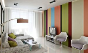
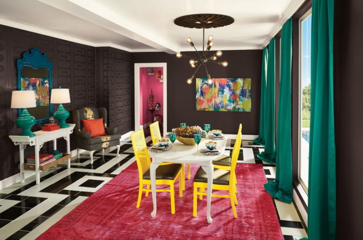
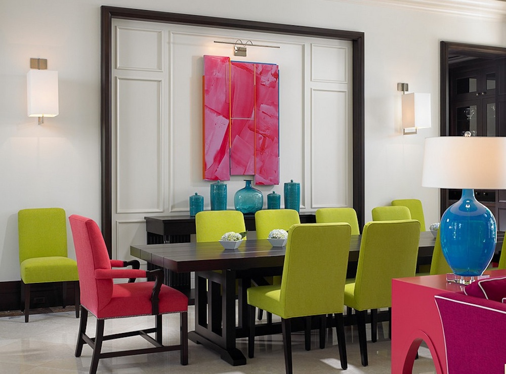
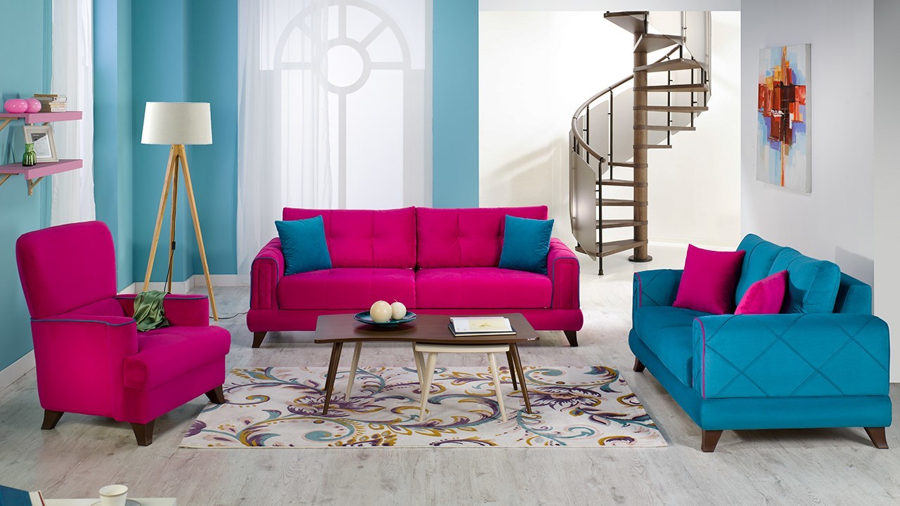
Modern stylish interior design requires an extraordinary approach to the combination of colors. The design is often based on contrasting, and quite sharp and not always acceptable at first glance. At the peak of popularity are red-white, blue-green, duets, as well as orange-aquamarine-black, yellow-blue-black trios. Compositions where black is mixed with lime color look very original.
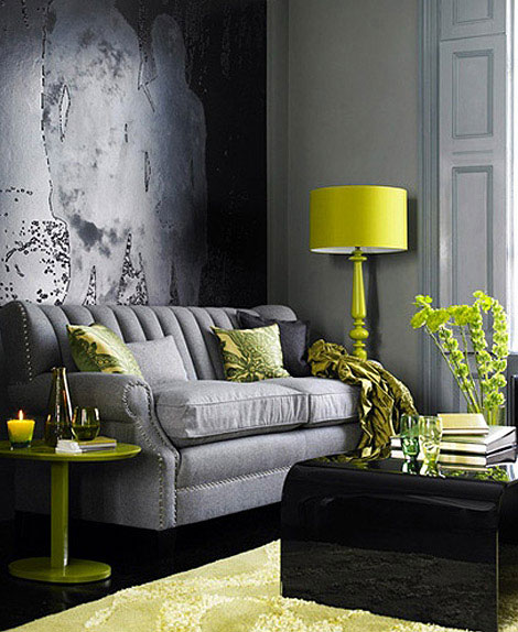
The original combination of black with lime color
Unusual styles that prefer a riot of colors
There are more than enough examples of neutral, monochrome, two or three color interiors. Have you seen a lot of multi-color stylistic solutions, and even a stunningly harmonious look? Let's get acquainted, maybe one of them is the embodiment of your dreams.
Boho chic color combinations
“Boho is distinguished not only by the original mixing of colors, but also by the presence of many different ornaments in the decoration”
The direction is bohemian, having learned a lot from the hippie culture. Boho - perfectly reflects the non-standard vision of life by creatively gifted natures. This is the style of extraordinary people. There are no design rules here. It seems that there is a complete cacophony in the atmosphere, a lot of random. This also applies to color combinations. The house is terribly overloaded with accessories, furniture items, decor elements. It seems that everything that was dug up at flea markets, in the parental home, was demolished here. From the diversity of the surrounding space, ripples appear in the eyes, but this is his cymus.
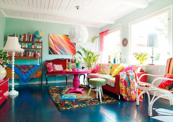
A riot of colors in the boho interior
If we discard emotions and take a closer look at boho color schemes, it becomes obvious that the bohemian interior is by no means a product of chaos. Everything that is included in it is selected with great care. Although the colors differ in a variety of palettes, nevertheless they are in harmony, as they complement each other perfectly. Even accessories and decorative ornaments sustained in different styles are connected by a common idea.
Boho is distinguished not only by the original mixing of colors, but also by the presence of many different ornaments in the decoration. Here you can find:
1. Checkered mesh and paisley.
2. Floral theme and knitting.
3. Unpretentious zigzags and stripes.
Boho style is distinguished by original mixing of colors
Rainbow pop art
Luxurious in its brightness, vintage style meets with multicolor. And this is its main attraction, without which the direction will lose all its splendor and attractiveness. Accent walls are often found here.
In fact, the riot of colors in pop art is manifested in everything, including furniture upholstery and accessories. Variegated colors in the interior intersect in a geometric pattern. It is very important that they are clean, rich and pleasing to the eye. Pink is considered the favorite of the style, but there is a place in pop art for acid tones.
Rainbow pop art style
In general, this approach is typical for the design of many retro styles, which also provides for a combination of bright colors in the interiors.
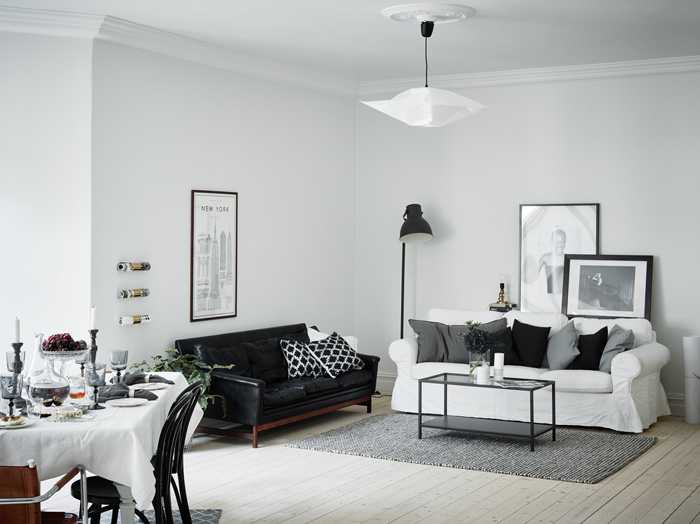
Modern interior design
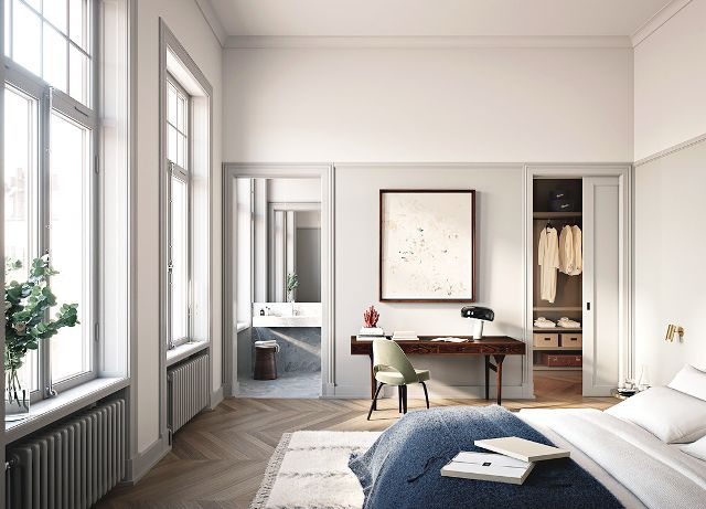
This is a more European approach to home improvement. All global surfaces here are laconically white, sometimes cream or in a light gray solution. Bright colors are added with small "splashes". It can be household appliances or small furniture design, carpet, textiles.
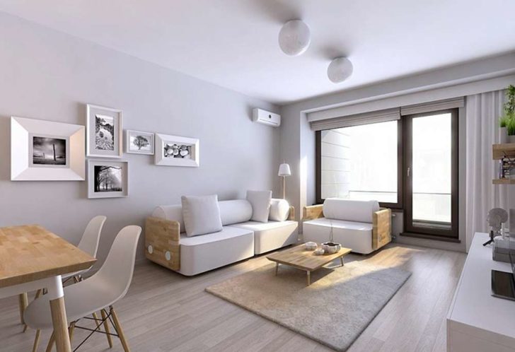
Modern interior in light gray
Additional colors are introduced very dosed. There should really be a feeling that the color in the interior is splashed.
back to index ↑Conclusion
Of course, it will not be possible to thoroughly understand such a complex issue as the correct combination of colors in the interior, just by reading the article, but you can completely get a general idea of \u200b\u200bthe rules for the color design of the house. Oh, and by the way, a sofa in cherry upholstery will be lost against the background of lilac walls. Or do you have a different opinion on this?
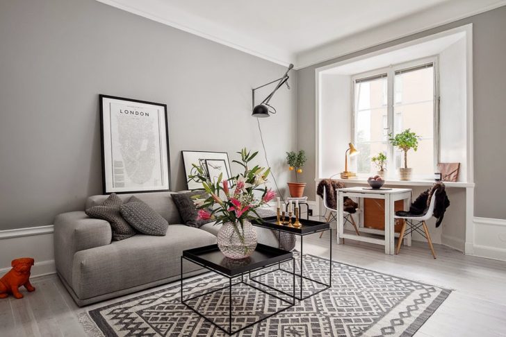
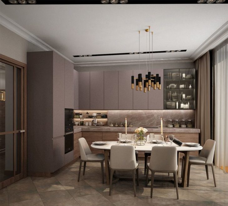
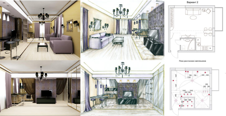
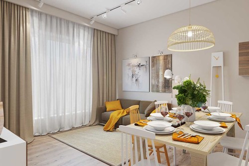
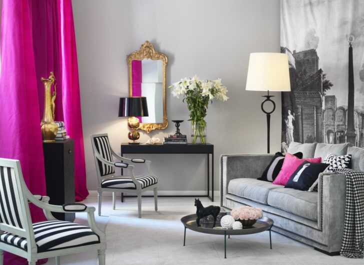
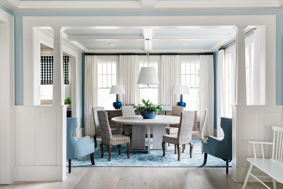
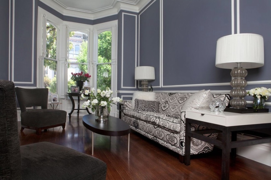
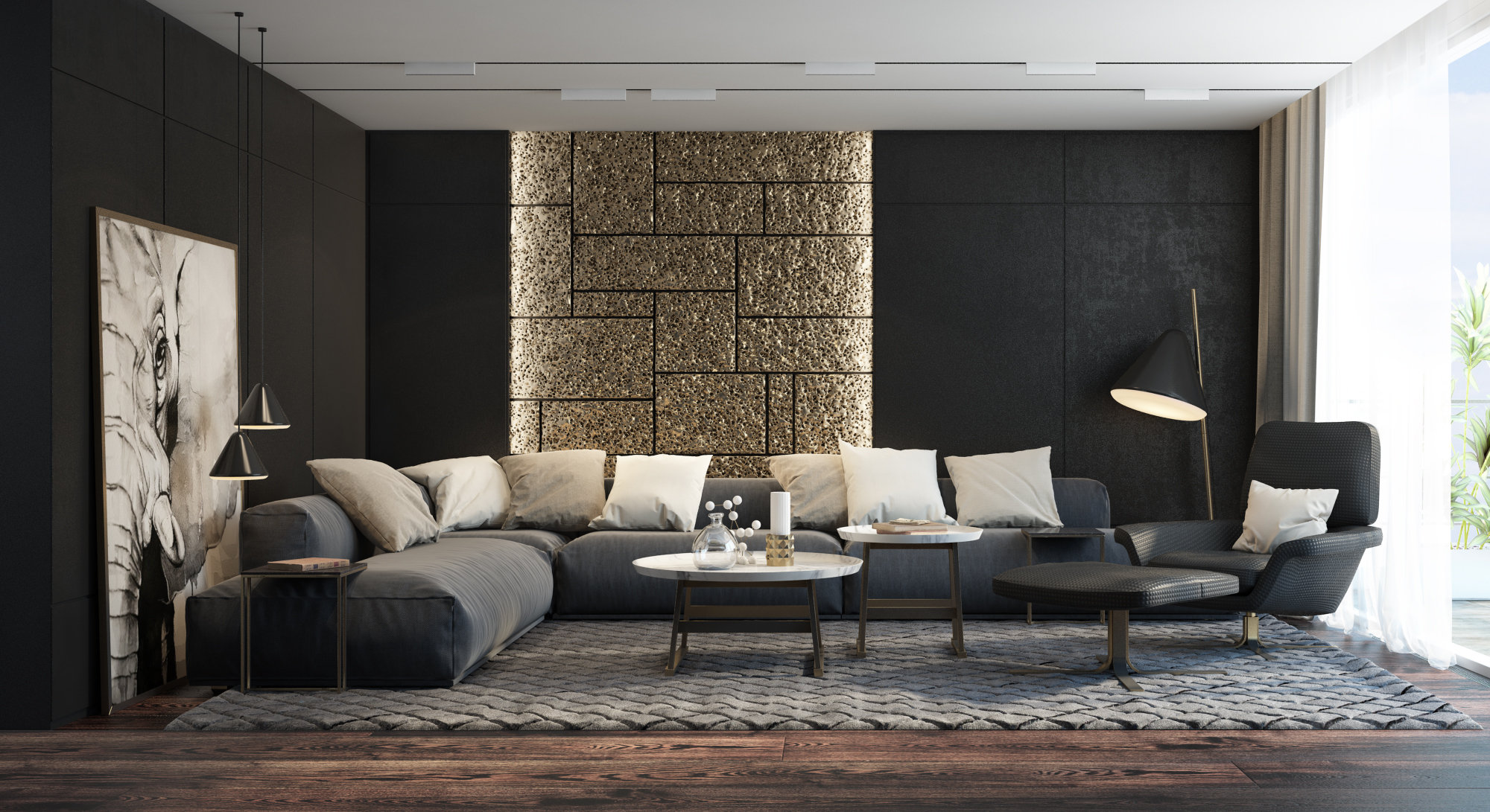
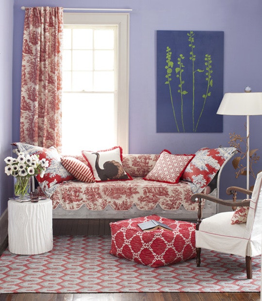
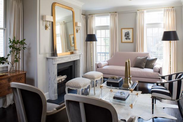
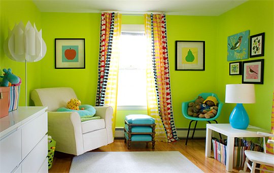
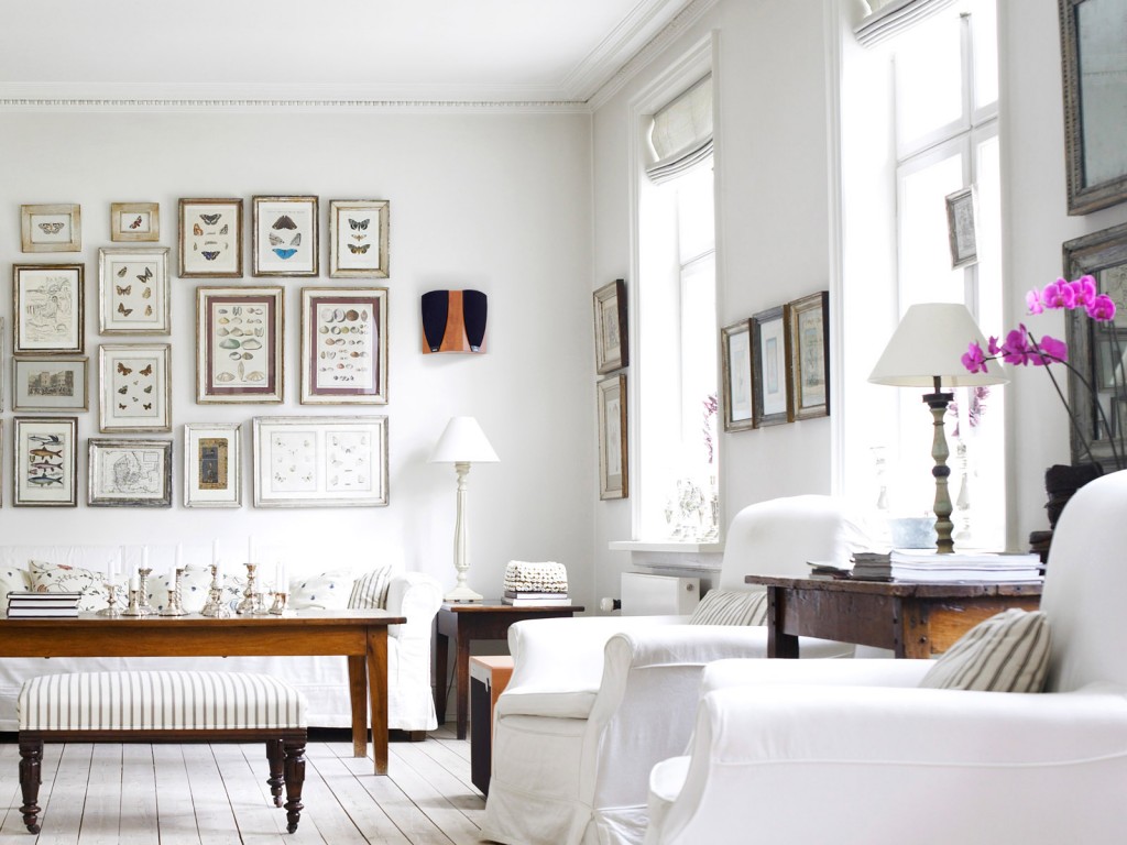
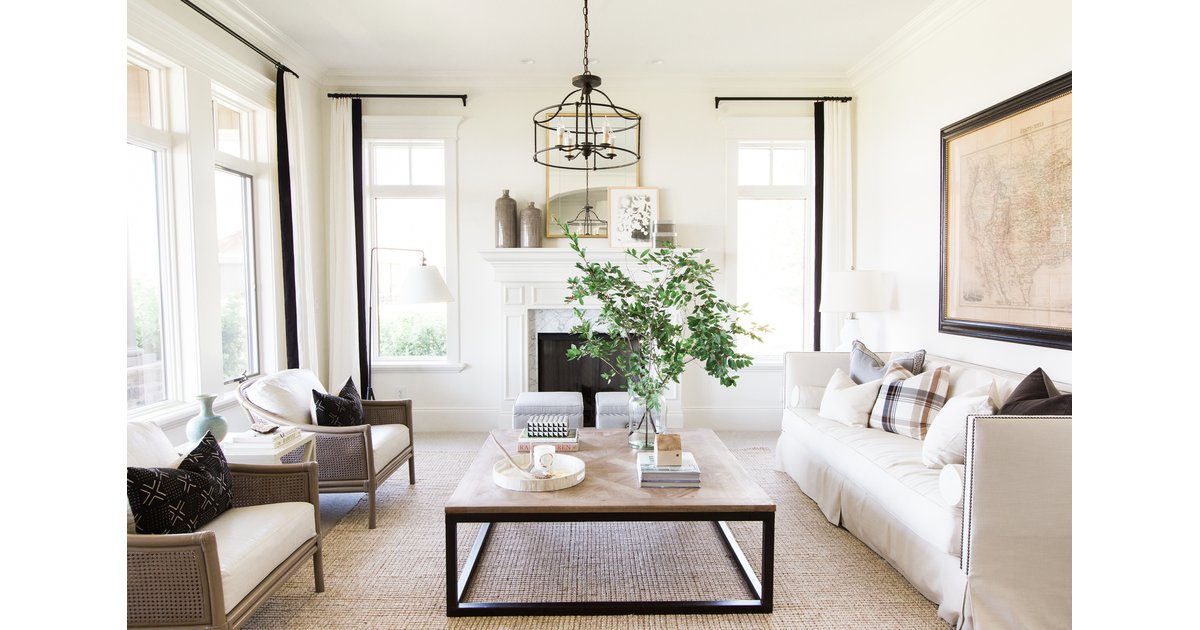
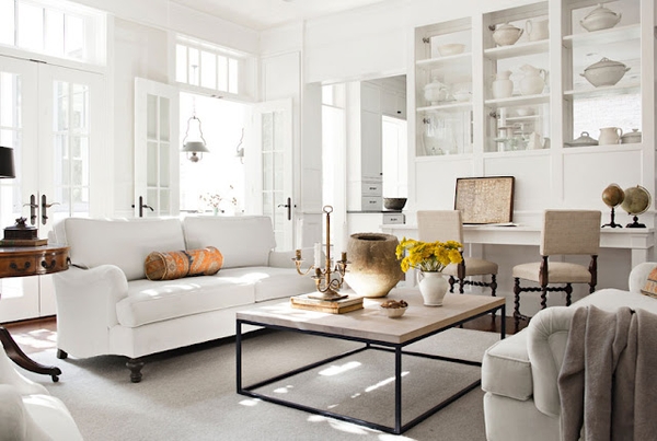
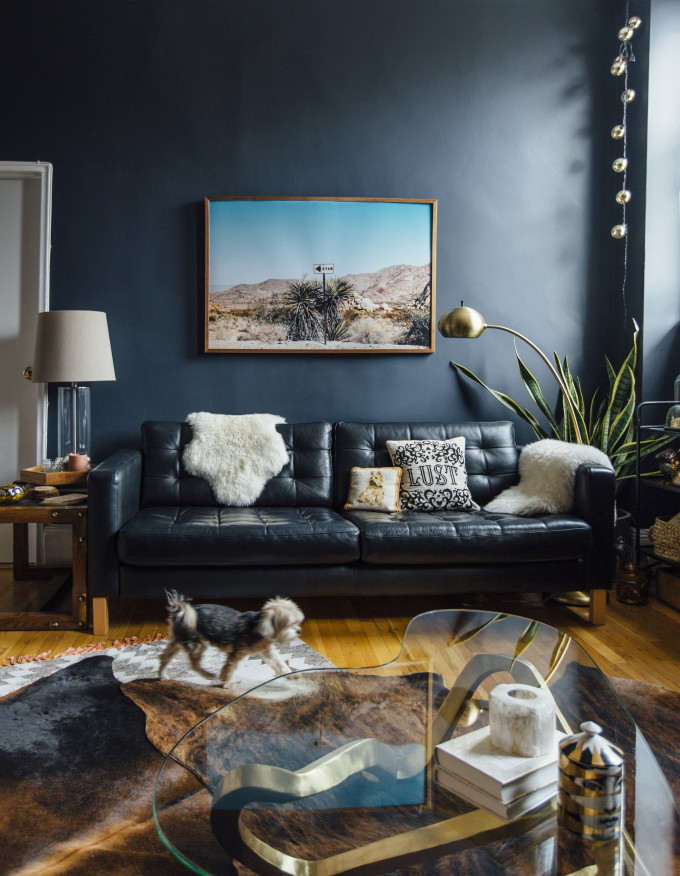
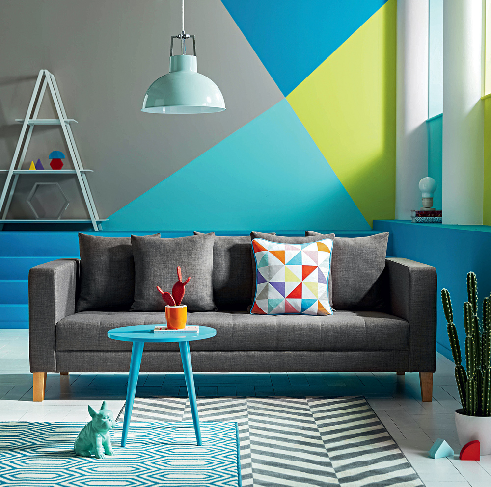
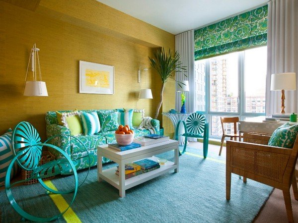
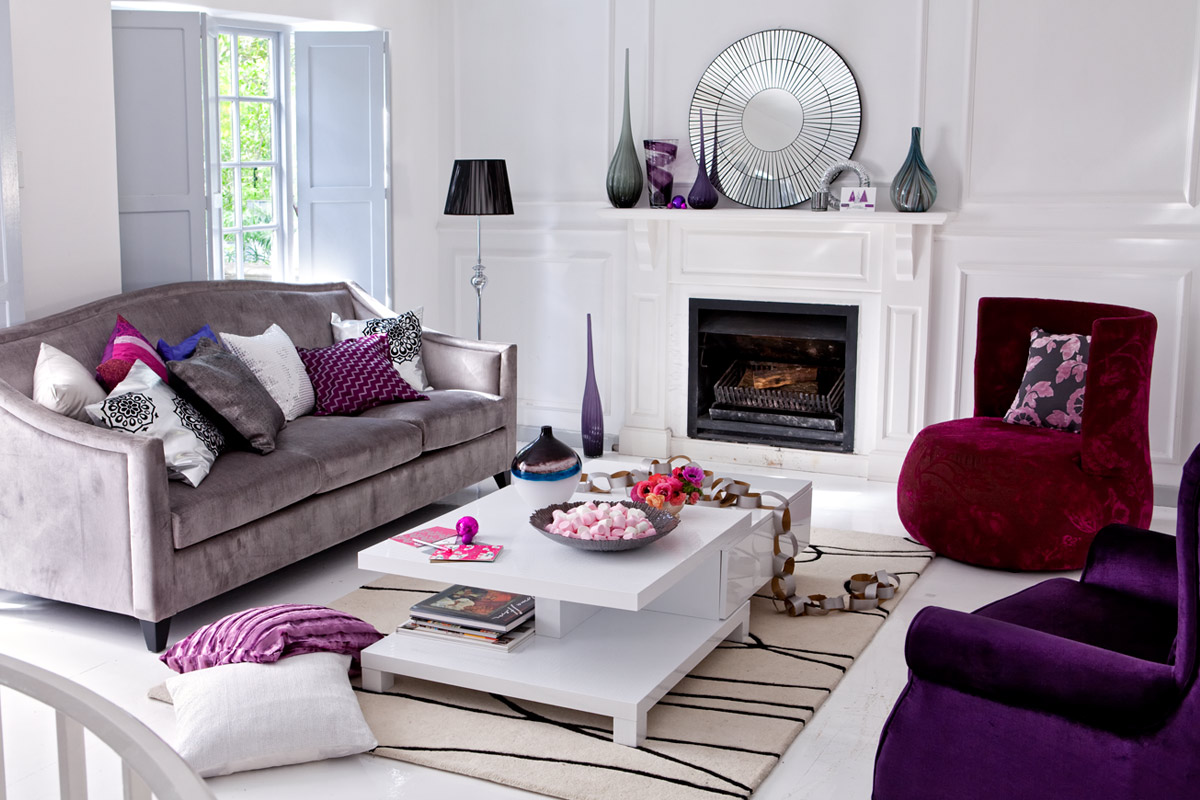
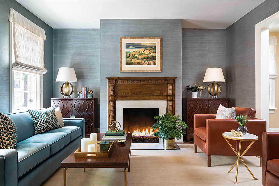
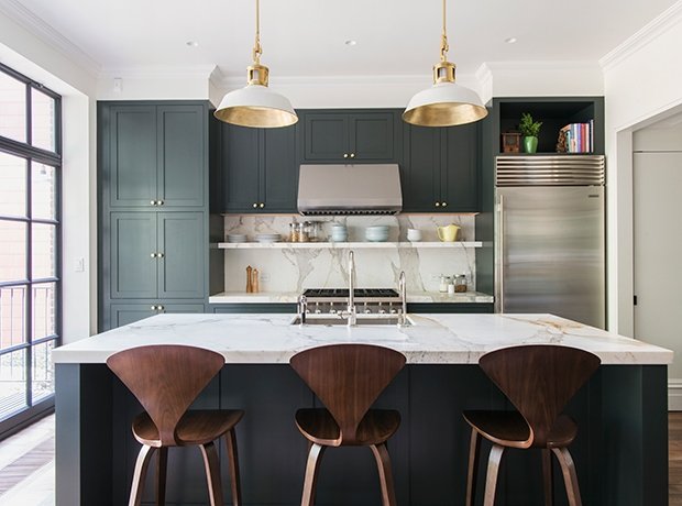
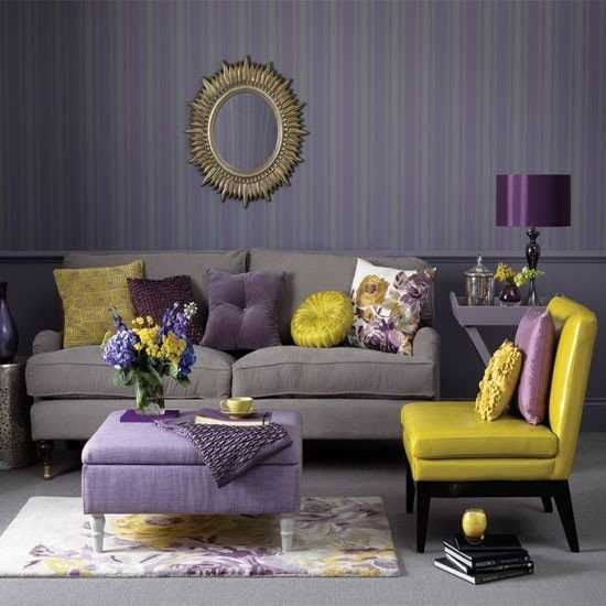
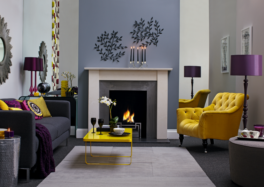
Photo gallery - color in the interior
Video