It would seem, what difficulties can be fraught with combined painting of walls? Grab a roller or brush and get to work! But as practice shows, the finish, made from the bay-floundering, usually does not please with the effect. What's the catch? No, not in technology, but in the selection of shades, the quality of the paints themselves and, of course, the adequacy of such a solution for a particular room. The greatest number of problems arises in the process of painting walls in two colors. Over this task sometimes, and designers rack their brains for weeks. The problem lies precisely in the limited number of partner colors.
Agree, it is much easier to achieve harmony in the interior if you have an abundance of options for combining colors. By mixing three to five colors, you can get a dozen combinations. It is necessary to try to achieve a harmonious solution with just two shades on hand. How exactly? Let's figure it out together.
Painting walls in two colors: working recommendations
Combined painting requires planning and preparatory work. First of all, you will have to be puzzled by the selection of harmoniously combined tones. This is possible only after you decide what kind of result you want to get:
1. Contrast effect.
2. Ombre effect.
In the first case, you will need bright colors that are noticeably different from each other, possibly diametrically opposed in their spectra. If for the first time you decide to resort to painting the walls in two colors, use shades that are similar in intensity and color scheme in combination.
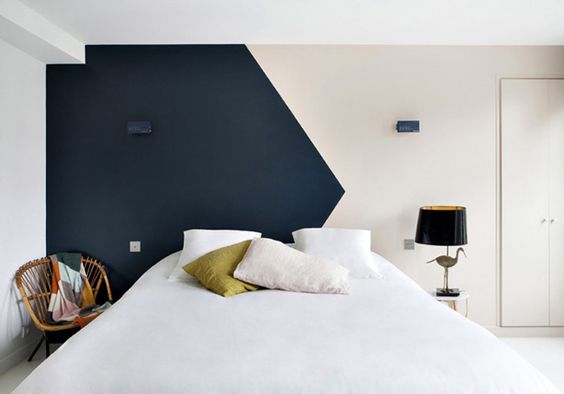
contrast effect
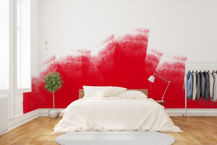
In the second variant, it will be necessary to combine consonant tones that have the ability to smoothly change each other. So it will look good to paint the walls in two neutral colors, let's say gray and cream. You can choose a combination of pastel colors by arranging peach with sand or turquoise with delicate mint.
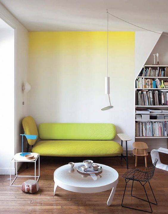
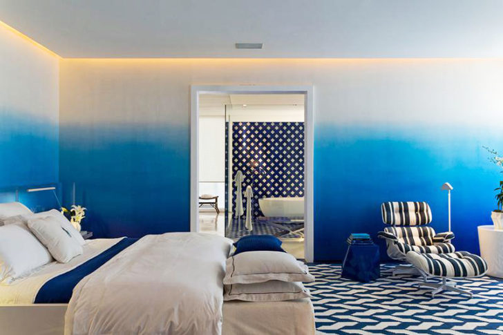
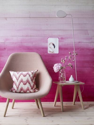
Ombre coloring
Paint should always be taken with a margin, since it will be extremely difficult to choose an absolutely identical shade. In fact, this will only be possible if the required tone of the composition was given automatically in a specialized store. If you are going to mix colors for painting walls in two colors yourself, then it is better to have an extra reserve liter of shade than to try to mix it later.
What else is needed for a quality job is masking tape. With it, it will be possible to protect untreated surfaces and even create a pattern.
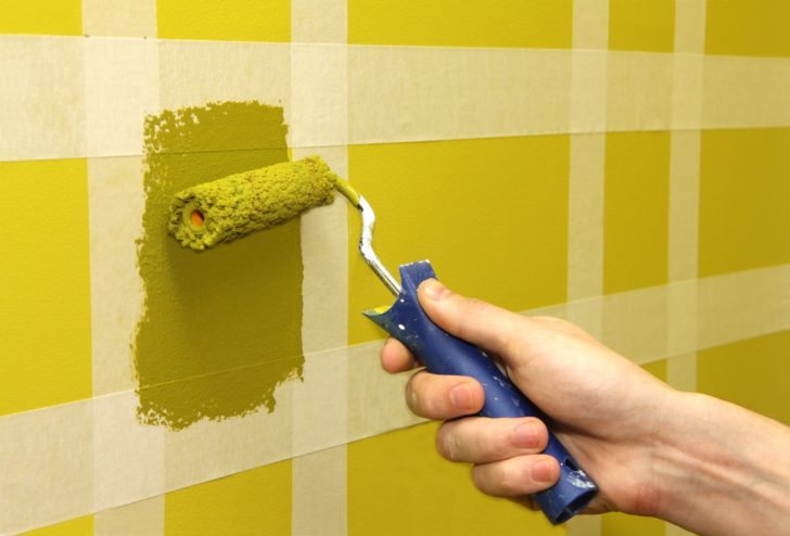
Masking tape will help create a picture
With the combined painting of the walls, you need to be prepared for the fact that the joints of the colors will not get the appearance of a neat, perfectly even line. Without the experience of painting work and the possession of special skills, it will certainly not be possible to achieve an effective result. So you need to be ready to perform additional corrective finishing work.How to correct the deficiency will be described in detail below.
back to index ↑Combined wall painting: selection of partner colors
To choose a harmonious pair of shades, it is enough to have a color wheel at hand. When approached with imagination, you can get the perfect combination of color ensembles that generate impressive effects.
Today it is fashionable to mix black and white paints, cold pastel colors, gray and beige spectrum. If you look at the photo of the options for painting the walls in two colors, you can also notice such a trend in decoration as the use of related tones and tint variations from the same spectral range. In the latter case, the shades should have similarities in such indicators as saturation, intensity, color temperature and please the eye with a smooth transition.
What is meant? Let's look at a specific example. Green goes well with orange, but it will no longer work as partners with peach when painting walls with two colors. In this combination, it is better to replace it with an olive tone.
Harmonious combination of green and olive color
In general, it is better to engage in the selection of colors using a computer. So it will be possible to more accurately imagine how the color duet will look in reality and assess its relevance.
If the selected shades cannot be found in finished form, they can always be obtained by tinting. In the latter case, it is necessary to order portions of paints for the combined painting of walls with a good margin, since it will be extremely difficult to get exactly the right tone the second time, and the surfaces will turn out to be unevenly painted.
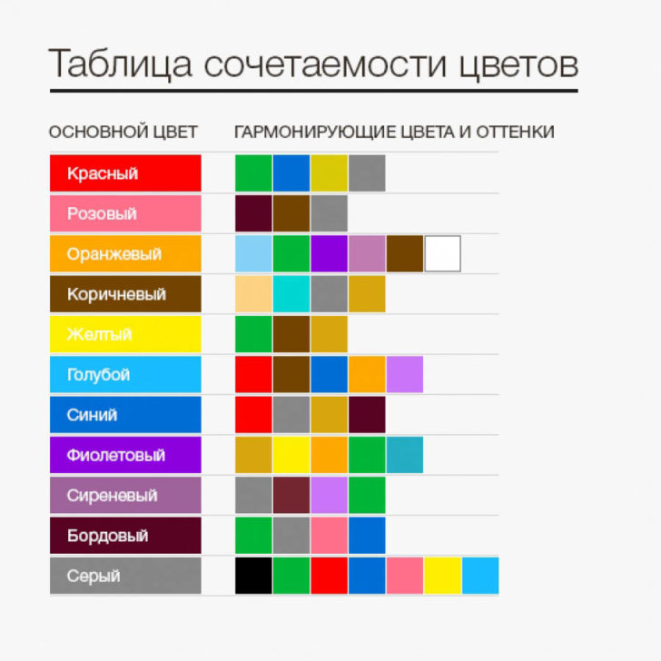
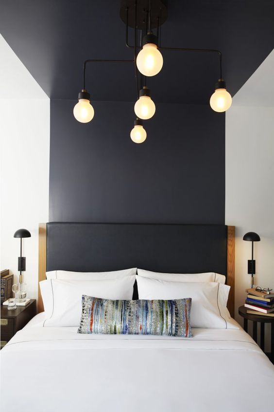
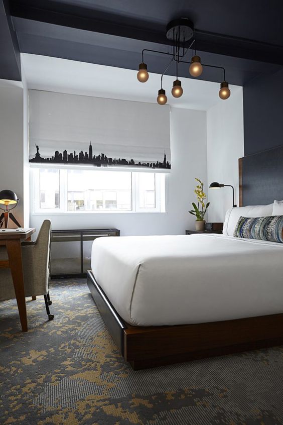
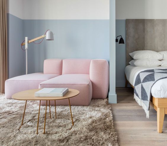
When painting walls in two colors, consider color compatibility
In addition to the ratio that is pleasing to the eye, when choosing background colors, one must take into account the psychological aspect of their personal interaction and impact on a person. This is worth talking about in more detail.
back to index ↑The effect of color on mood
Unpleasant sensations from the environment can arise even when simply viewing the various options for painting walls in two colors in the photo. Now imagine what it would be like to be inside such a room, and even stay there for several hours? Knowing the psychology of color will help to avoid excesses. So, what is he, beloved, preparing for us?
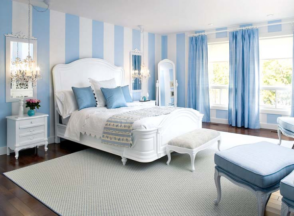
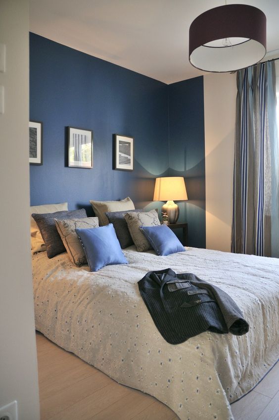
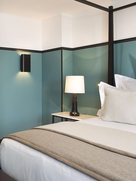
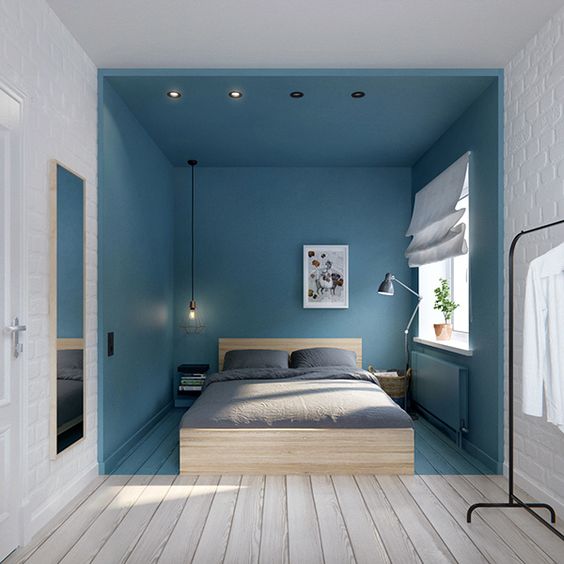
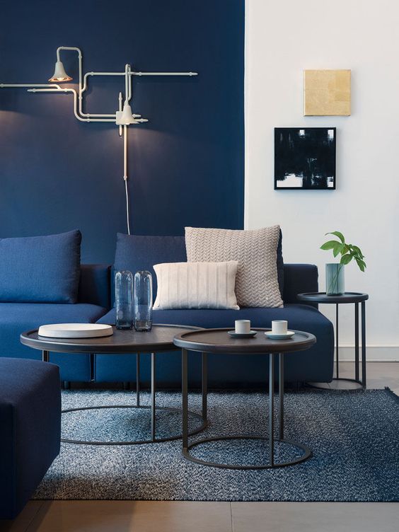
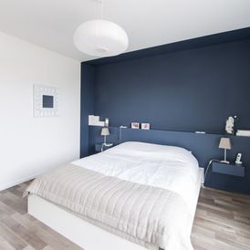
Blue
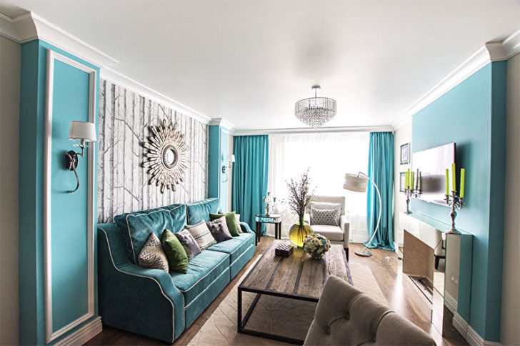
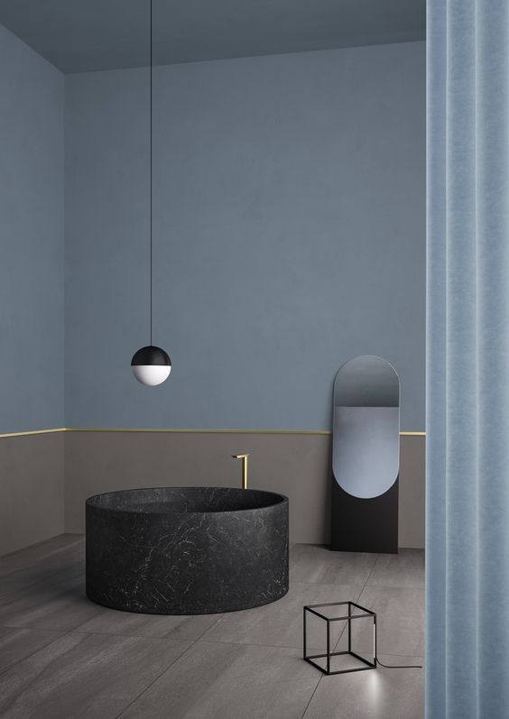
The representative of the cold spectrum is associated with coolness, freshness, purity. It affects the perception of space. Represents it as spacious and filled with fresh air. The abundance of shades - from delicate blue to rich, mesmerizing depth of sapphire - makes it possible to actively use blue in the combined painting of walls.
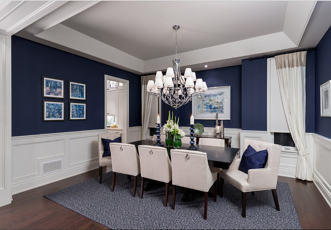
Blue with combined wall painting
Its soothing, relaxing, lulling effect is very necessary in the bedroom, relaxation corners. But in a cozy living room with him it will not work. His coldness is not at all conducive to conversations.
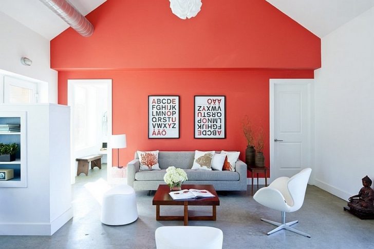
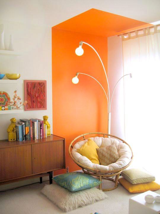
Orange
Spectrum of life-loving optimists. His cheerfulness gives an energy charge of positive, calls for activity. The interiors created with his participation are bright and warm to such an extent that they are associated with the tropics. This is what stops designers from using it as a background. But for painting walls in two colors, it is more than suitable. To cool his ardor, you should take a shade as a partner to orange:
- blue
- white;
- cool greens.
The first will make it calmer and add contrast to the interior. The second one will muffle the brightness, but with it the orange will seem even warmer.
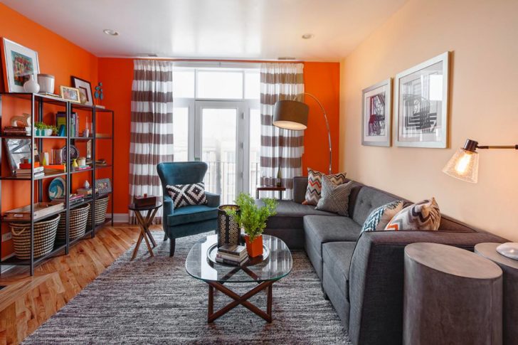
Beige will make orange even warmer.
By and large, shades of the orange spectrum, with their pronounced color intensity, are better to play the role of local accents than to put them as a background screensaver. For options in what doses to introduce orange, look at the photo for painting the walls in two colors.
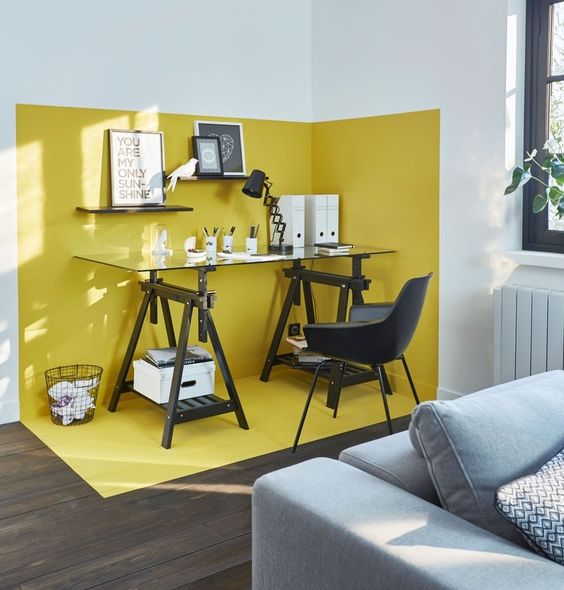
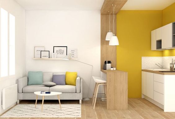
Yellow
A color with a wide tint spectrum, including both deep rich warm tones and cold faded ones. In any case, yellow is also full of positive and is able to fill the room with an atmosphere of happiness, even on the most cloudy day. The association with the sun gives experts the right to recommend it for use in rooms with poor natural light.
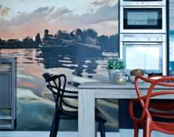
When painting walls with two colors, yellow should not be given primacy either. Its abundance can irritate or give rise to unreasonable anxiety. But for the decor of the kitchen and dining room, this color is very good, as it awakens the appetite.
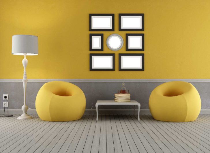
Original grey-yellow duet
As partners for yellow, you can safely take representatives of the blue and green spectrum, as well as white. The yellow-gray duet looks interesting.
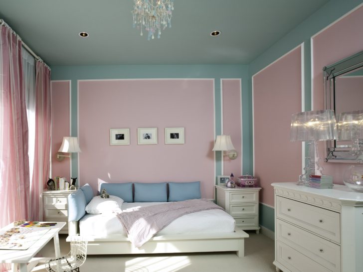
Red
The spectrum is hyperactive, energetic, stimulating to action, but in unlimited quantities it acts excitingly, irritatingly and even provokes aggression. It is clear that in the combined painting of walls with two colors, red needs a calm partner. White color can extinguish the fire of passions.
Its combinations with gray and not bright blue are perceived interestingly.
White color will reduce the intensity of red
To make red sound in an oriental style, purple tones or pinks are added to it.
In the living room, you can make an accent wall in red blooms. This solution will add comfort and depth to the interior.
Accent wall in red
White
Self-sufficient and may well perform solo. It is cool, fresh, clean, and sterile clean, so walls should be painted in two colors to avoid unwanted effects.
White color can be used in rooms of any functionality
In what proportions to correlate partners decide for yourself, but do not forget to take into account the stylistic interior features. So in minimalism, white is given the leading role, and in Empire style it is a finishing one. The neutrality of the color makes the environment with it comfortable both for rest and for work, so it can be used in rooms of any functionality.
natural palette
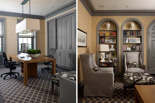
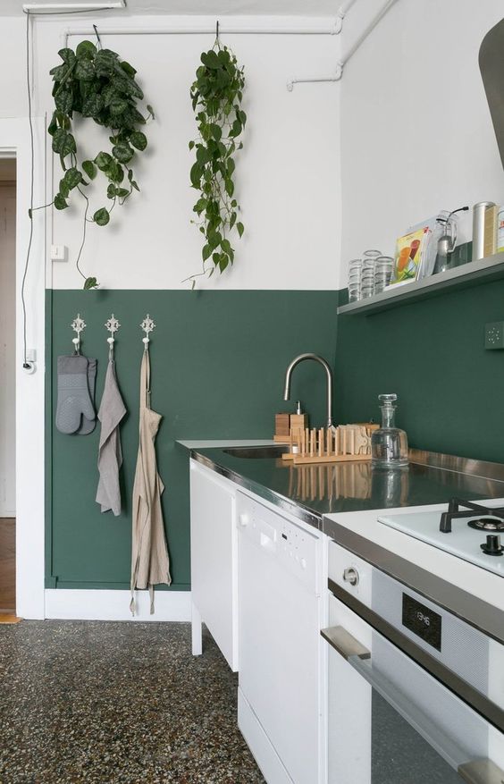
This category includes natural colors. If the task of combined wall painting is to create a working environment in the room and promote concentration, use beige, gray and even black in the palette. They will serve as an excellent background for bright inserts.
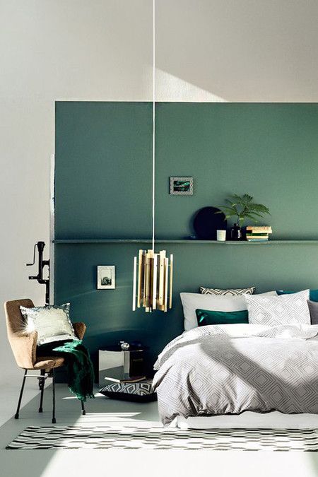
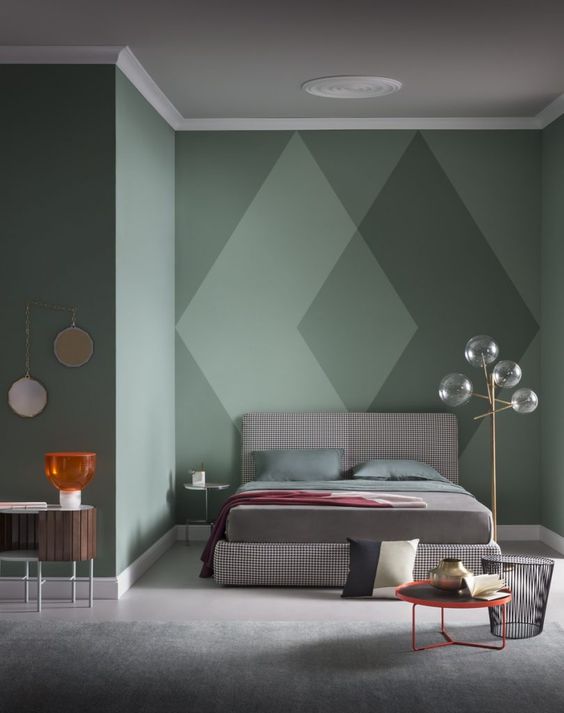
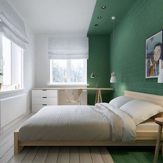
You need a calm, anti-depressive environment that has a calming effect and corrects your mood - you should use the green spectrum in interior decoration.
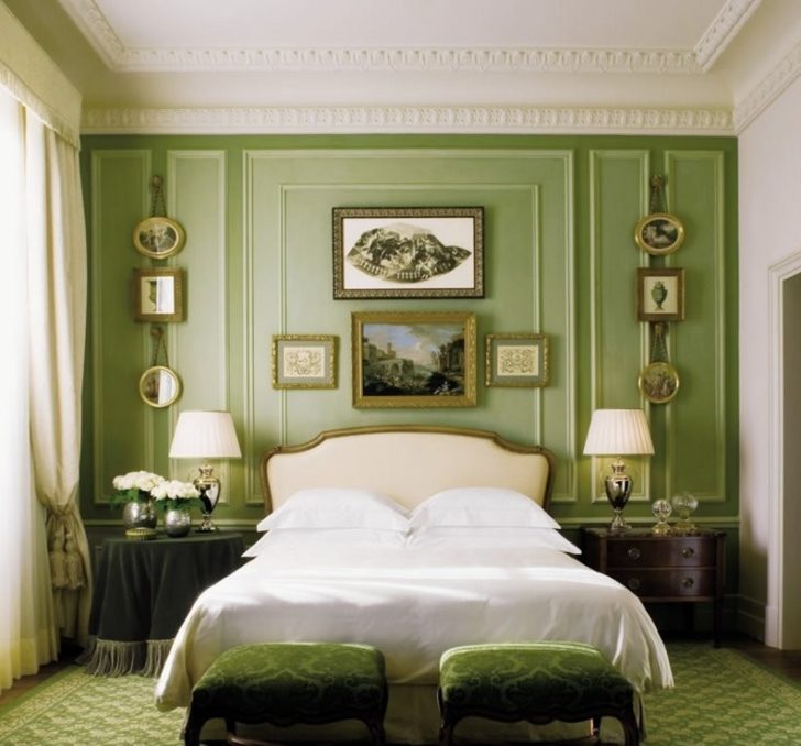
Green color has a calming effect
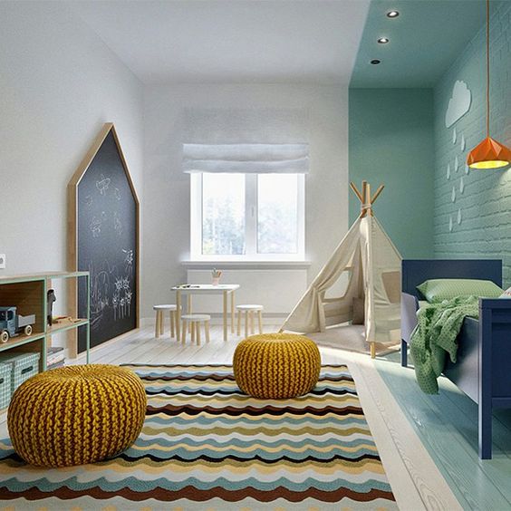
When painting walls in two colors in the living room and bedroom, it is allowed to use the game of shades of green. You can combine as you like, the main thing is to guess with the context of the atmosphere. Carefree aquamarine brings light ease, and dark green - conservatism and business rigor.
back to index ↑The most successful color duets
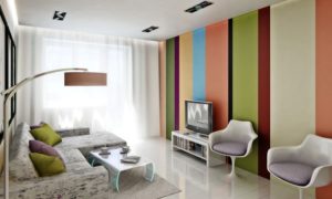
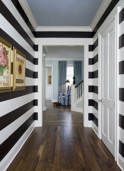
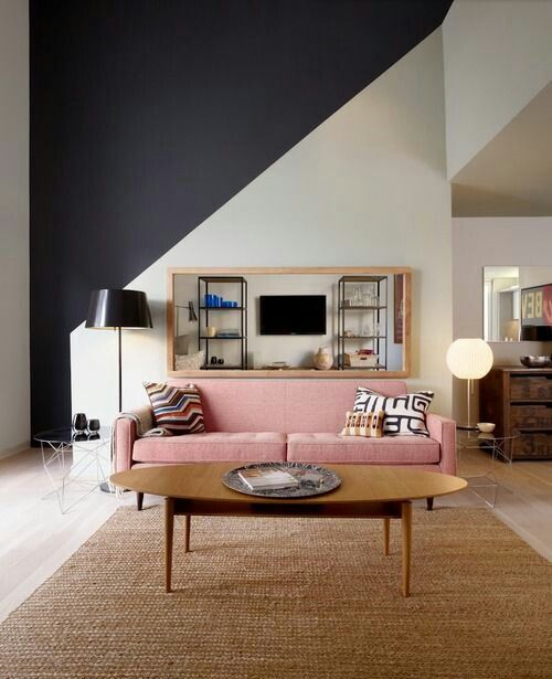
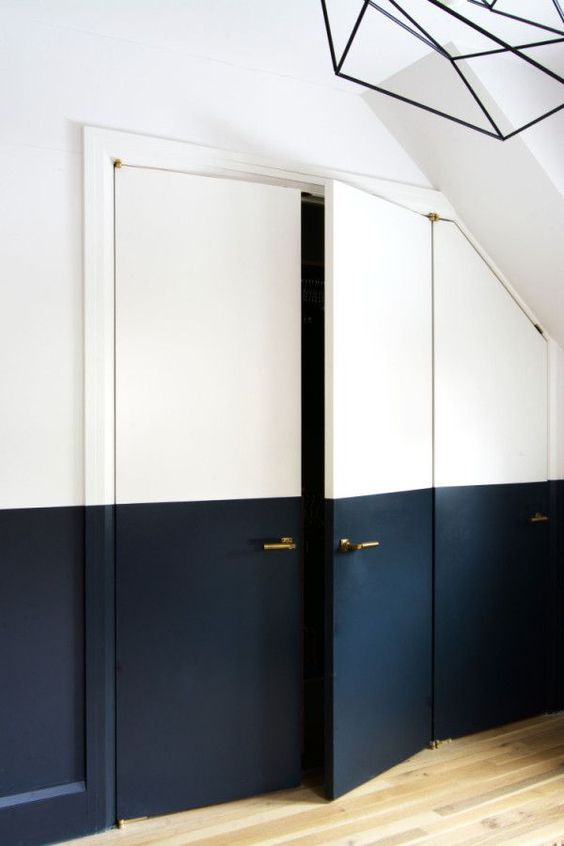
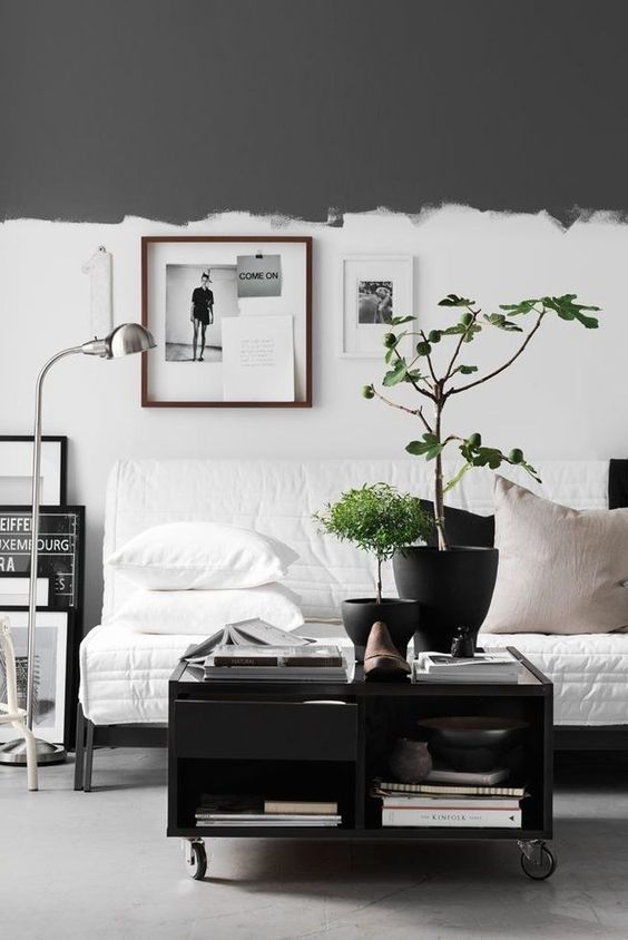
A non-standard approach to the design of the walls will diversify the atmosphere in the room and make the atmosphere in it more lively. A separate line today in painting walls in two colors are contrasting solutions. Creative people who are not afraid of bold ideas decide to combine the incongruous. If you want to join their cast, try the current combination of black and white. You can go further and play on the opposition of red and black or combine crimson with purple. How interesting the interior will turn out after painting the walls in these two colors, look at the photo.
Contrasting coloring will diversify the atmosphere in the room
The more conservative part of the audience will be impressed by completely different combinations, distinguished by the calmness of colors.
What do designers offer in the new season?
Mix anything and everything, but in reasonable tandems.
White color will look great paired with blue, yellow, bright green tint.
Brown colors should be added to lilac, as well as the freshness of cream and the cheerfulness of yellow.
It looks very stylish to paint the walls in two colors such as:
- coffee and caramel;
- milk and rich chocolate;
- cream and grey.
Stylish combination of cream and gray
Rooms with such walls are especially warm and cozy.
Bright, with a claim to originality, the atmosphere will allow you to create a mix of beige and juicy turquoise.
Mix of beige and juicy turquoise
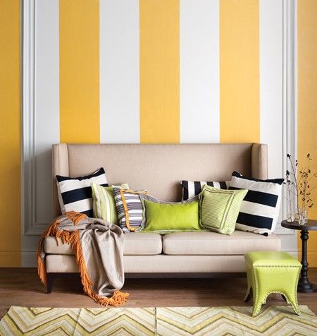
When painting walls in two colors, you can combine the yellow, orange and red spectrum. It will turn out fun and lively, just what you need for a game room.
Sophisticated purple also did not stand aside. Its depressiveness is perfectly softened by shades of beige.
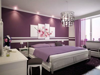
The depressiveness of purple is perfectly softened by beige
Wall painting technology in two colors
Designers know about a dozen ways to make the walls of a room colorful using two-tone paints.
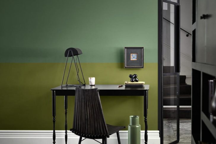
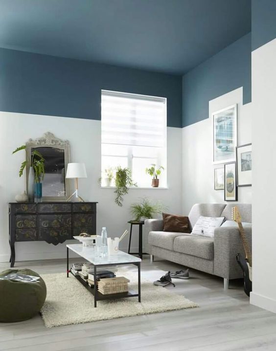
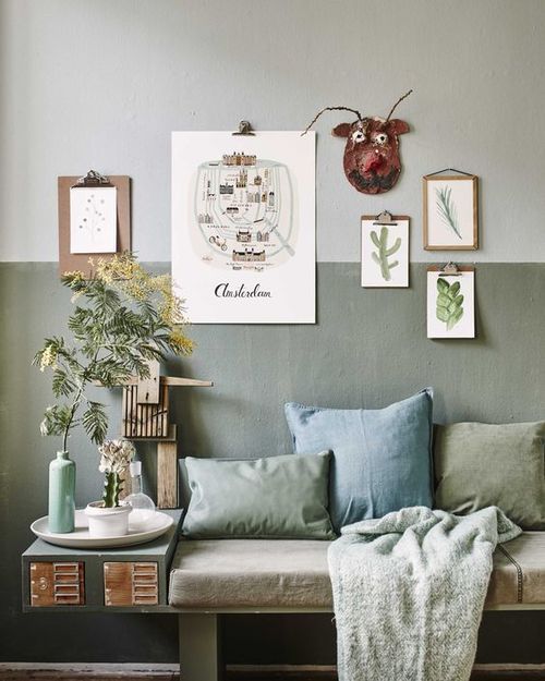
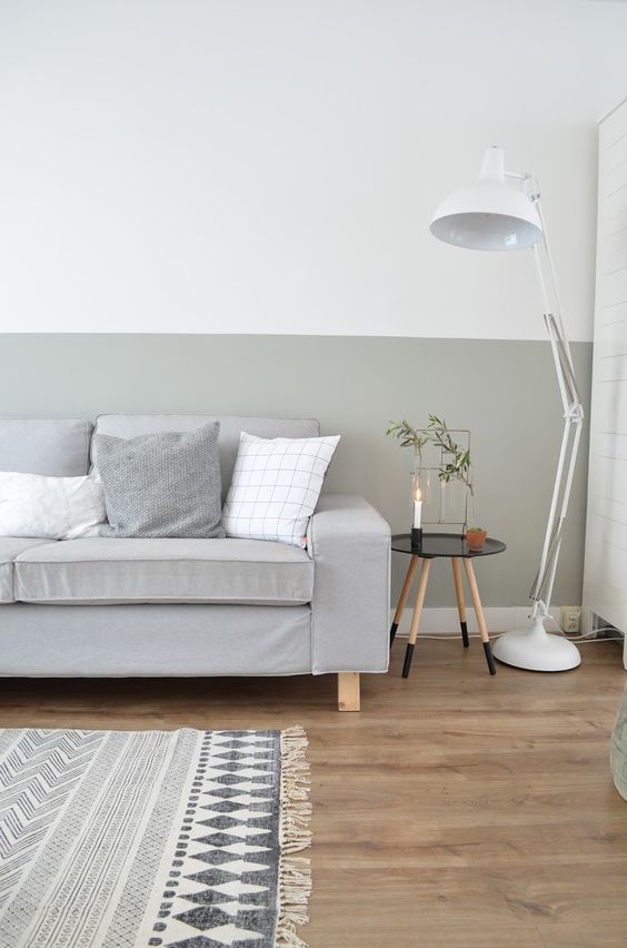
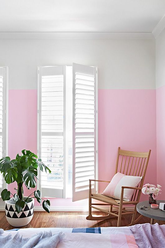
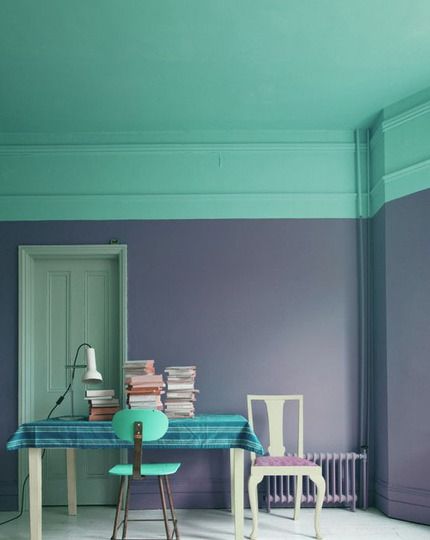
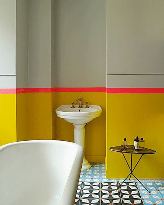
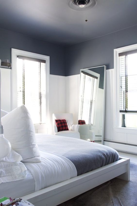
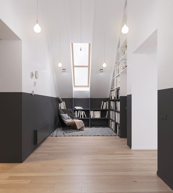
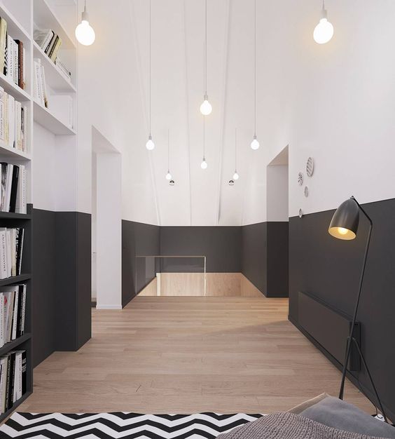
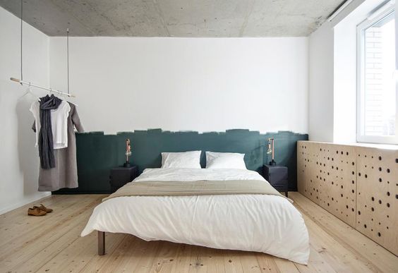
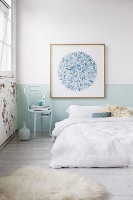
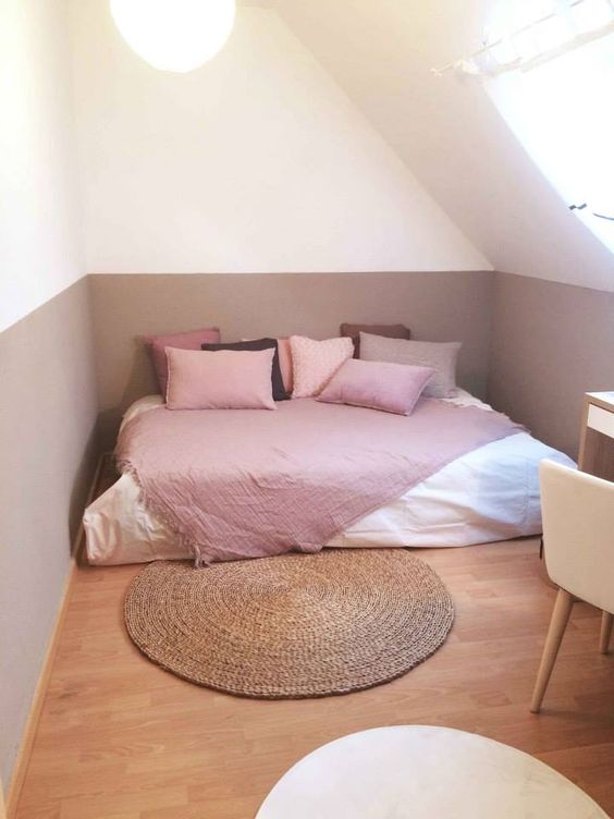
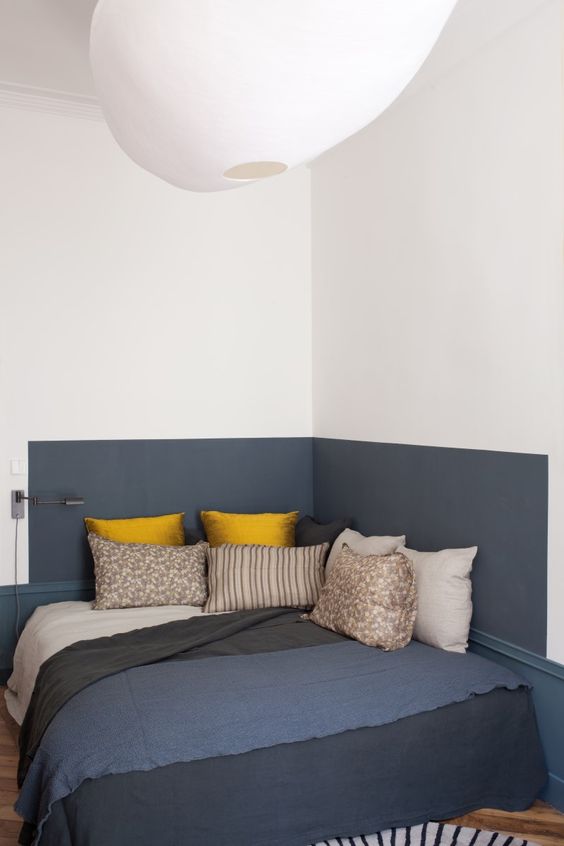
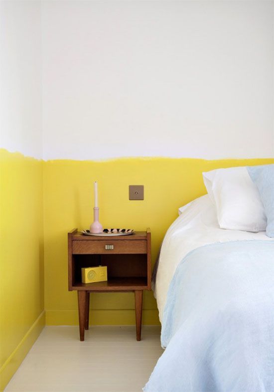
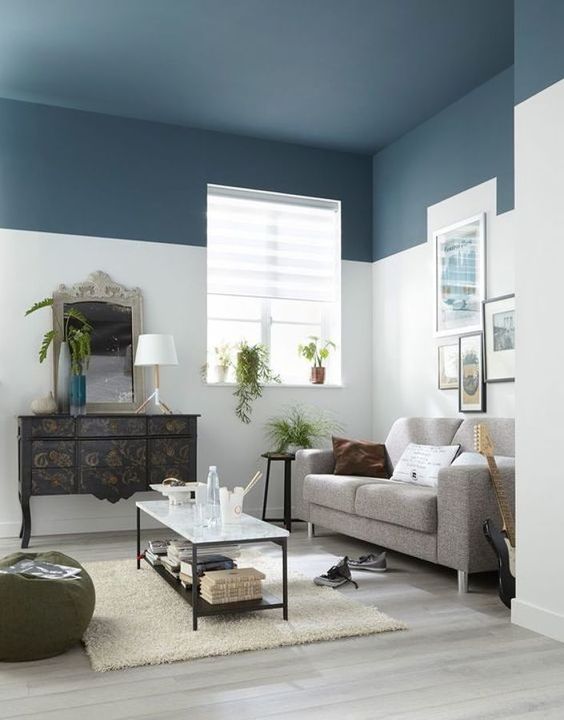
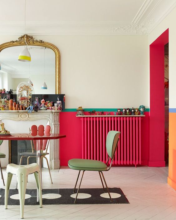
Colored horizontals
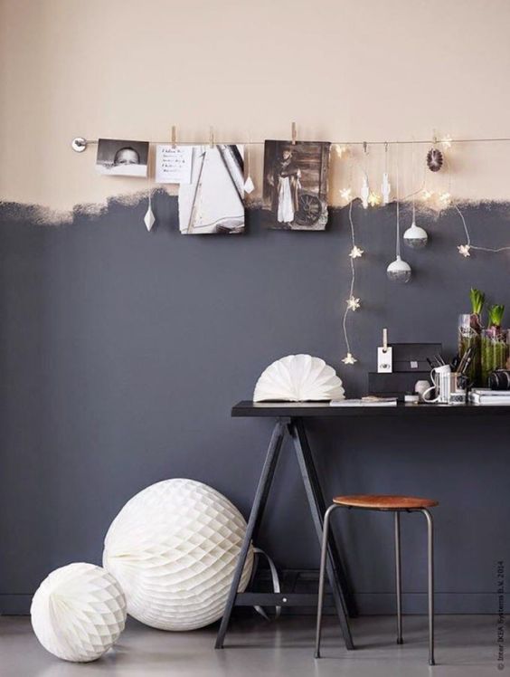
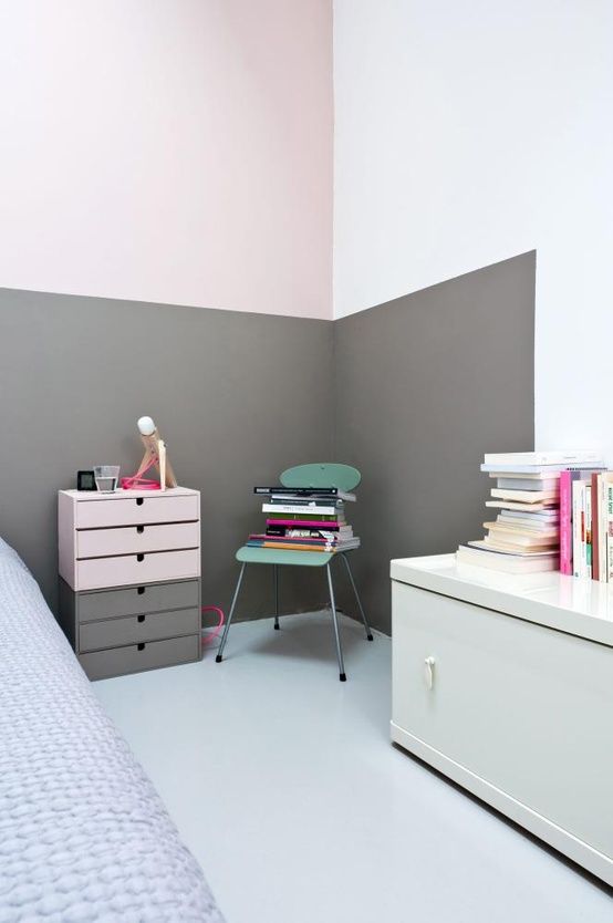
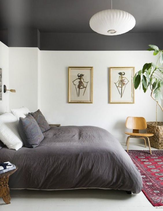
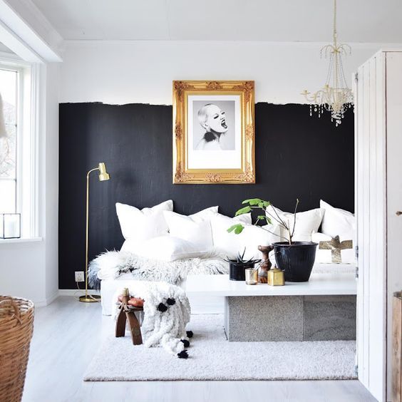
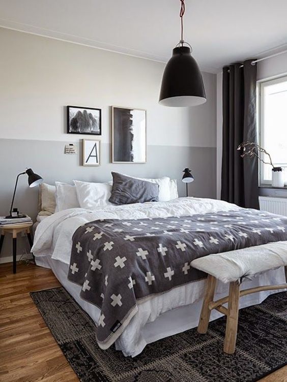
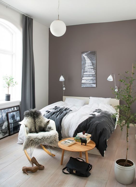
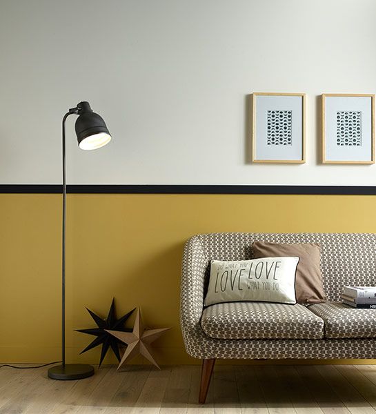
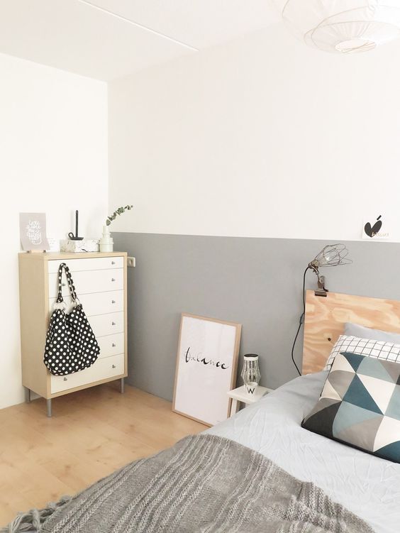
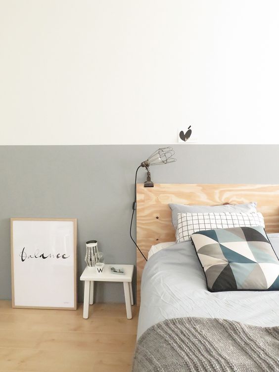
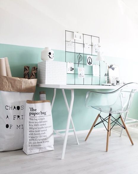
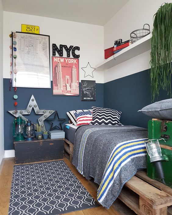
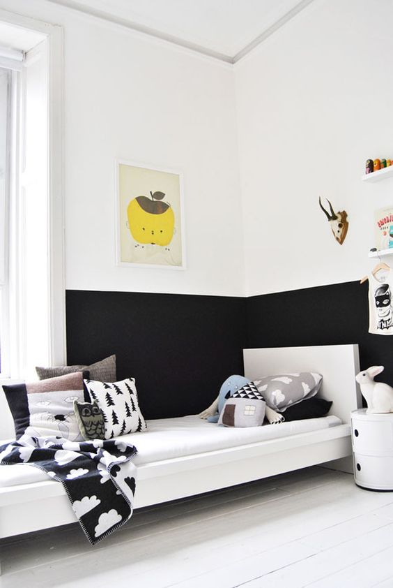
In the standard version, such a division of the walls during painting is perceived as decor with panels. The border line of shades runs at a height of 1/3 from the floor, which is relevant for classic and newfangled stylistic interiors.
But look at the photo of the combined painting of the walls in two colors. You will see that this is far from the only possible solution. The border can be moved to the middle or even driven under the ceiling. Moldings are used for its decorative design.

Original wall painting in two colors
If there is a desire to tinker, a striped print may appear on the wall surface. To implement the idea will require specific skills and great accuracy. The process is laborious, but pleasing with the results.
Striped wall print
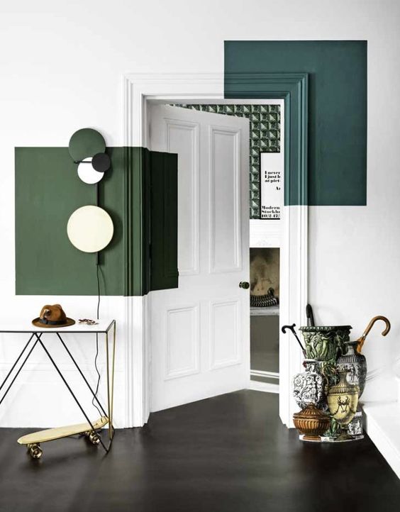
Color inserts
Painting walls in two colors using this technology also imitates panels, but already vertical. It looks truly luxurious, so the reception is often implemented in glamorous baroque-type interiors.
Vertical painting imitating panels
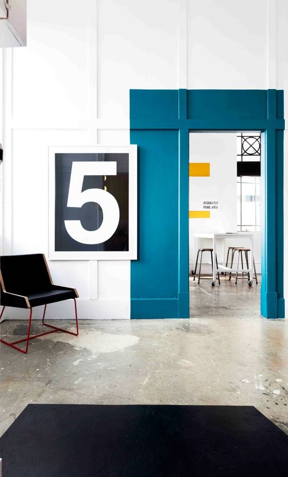
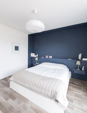
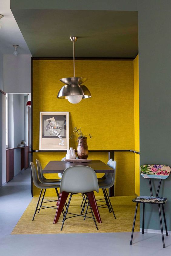
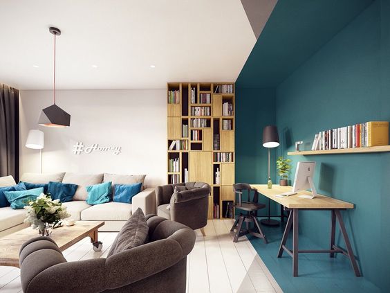
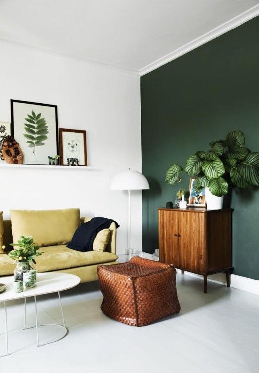
accent wall
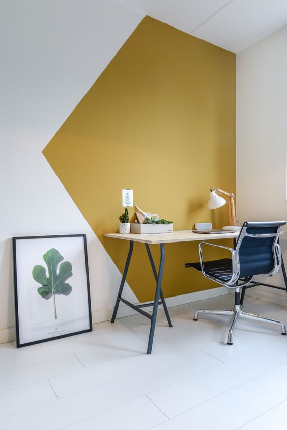
The technique of combined wall decor, which is very popular in our time. The idea is simple to implement, but at the same time allows you to get a creative interior.
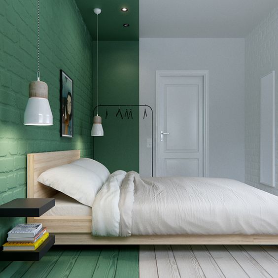
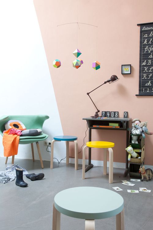
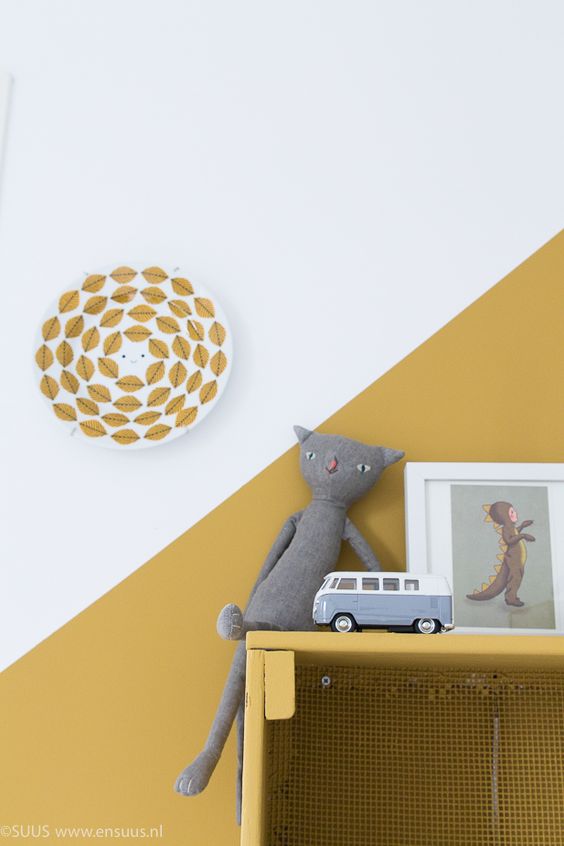
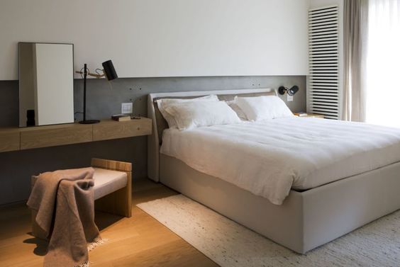
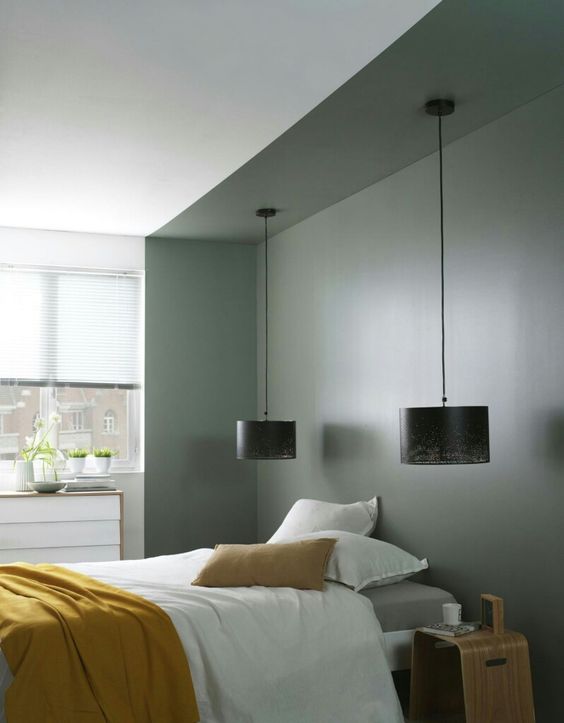
The idea of painting the walls in two colors is as follows: three of the four surfaces in the room are decorated with one pastel or neutral shade, and the fourth one stands out against their background in bright contrast in the living room and kitchen or in a calmer, but different tone from the background in the bedroom.
Painting the walls in two colors will help to get a creative interior
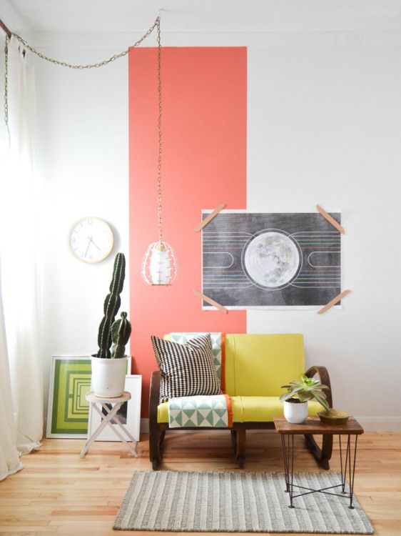
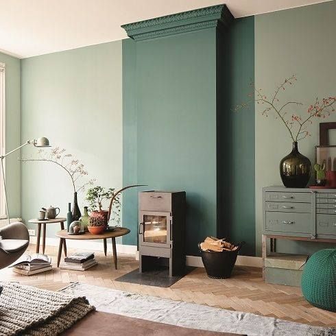
By applying the technology in a slightly different aspect, you can get rid of the plane of the wall surfaces, which will also add creativity to the environment and present the interior in a completely new perspective. For this combined painting, only part of the walls is awarded. A wide vertical strip of a different color from the background will appear at the junctions of the walls or in their center. Reception is good when you need to hide the flaws of the layout or, on the contrary, highlight some of its advantages.
Contrasting painting will get rid of the flatness of wall surfaces
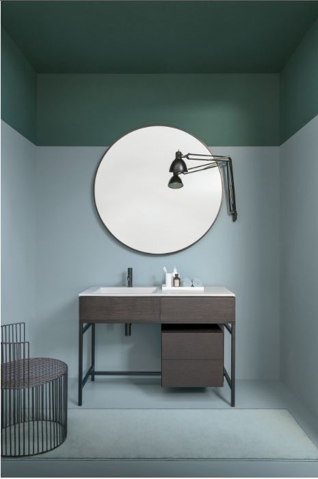
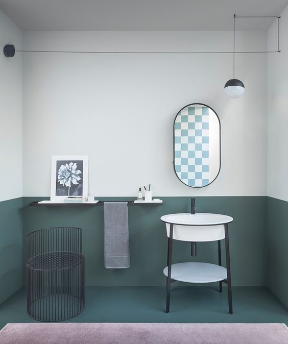
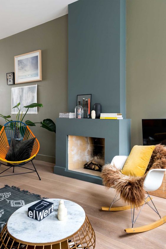
The color accent often serves the cause of zoning. With its help, recreation or eating areas are highlighted, attention is focused on the arch or fireplace, niches and piers. As the photos show, painting the wall in two colors is attracted not only to the decor of the living space. Reception is also relevant for corridors with bathrooms. In the first case, in such a simple way, they get rid of the monotony of the situation, in the second, they single out the shower or washbasin area.
Highlighting a recreation area with a contrasting color
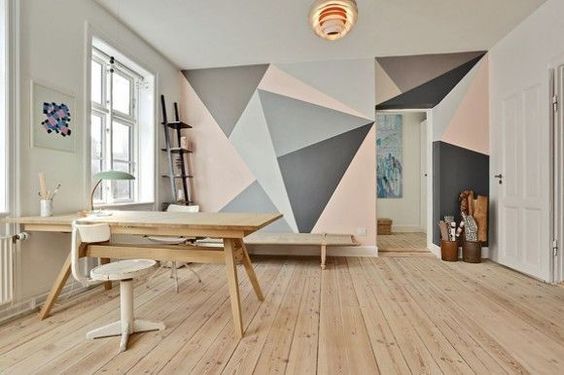
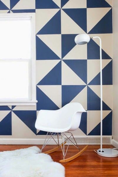
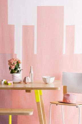
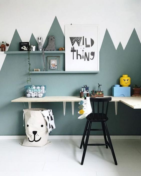
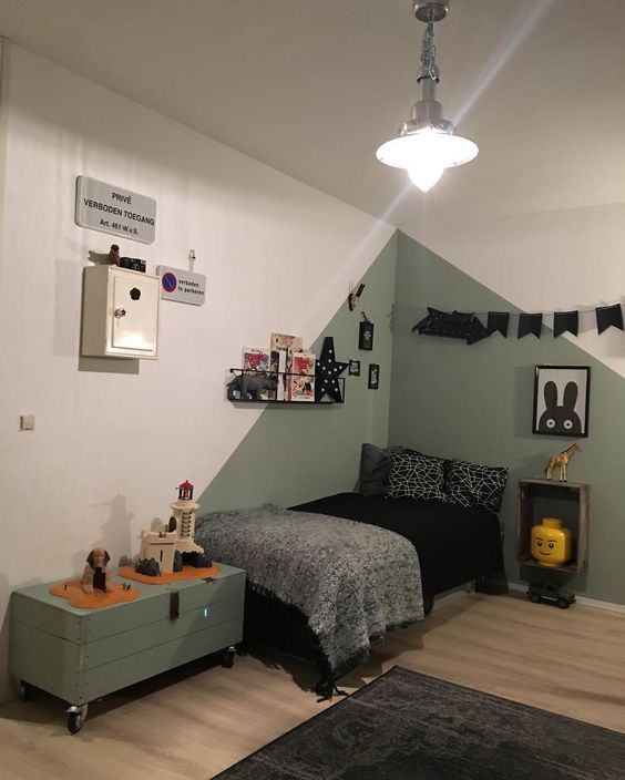
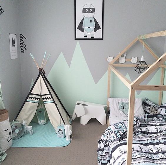
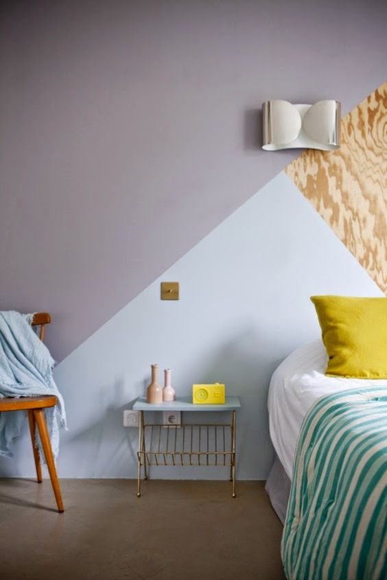
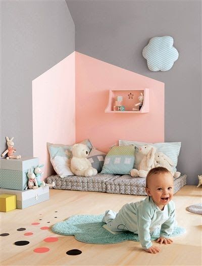
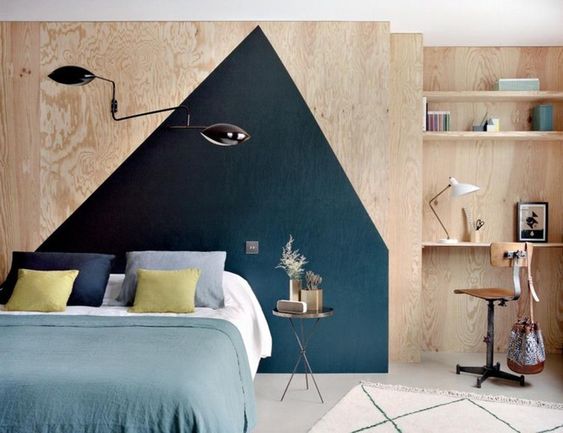
Combinations of complex shapes
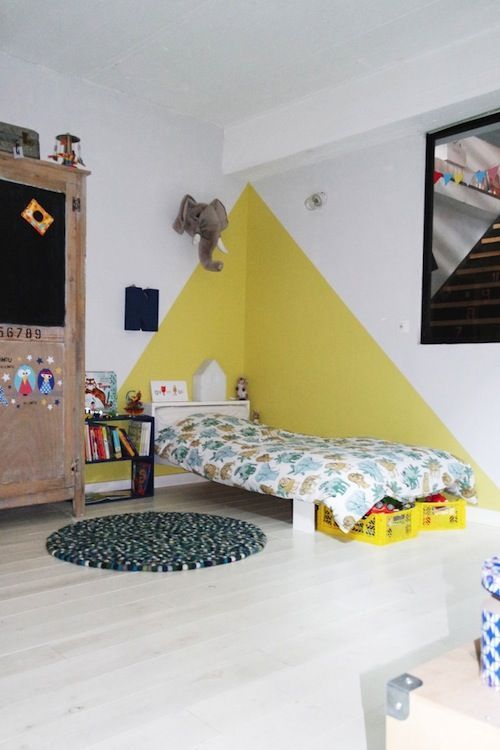
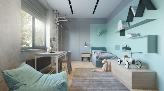
In this case, we will talk about the appearance of repeating figures against the general background of the walls. These can be scatterings of squares or bundles of triangles. The idea is good for the decor of nurseries, kitchens, bedrooms, decorated in a vintage spirit.
This technique of painting walls with two colors is difficult to implement.To apply an ornamental-geometric pattern on the surface, something similar to the ornament on a sweater, you will have to sweat.
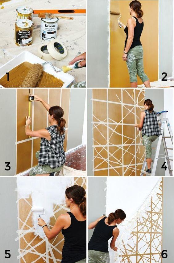
An example of applying a graphic pattern to a wall
The process will be step by step. First of all, you will have to paint the walls in the base color. The next step will be marking the location of future elements of the ornament. This is done on a well-dried surface. Masking tape is glued over the resulting lines, after which the delimited area will need to be painted over with the selected shade. Unbeaten options for such a two-color wall painting can be searched on the Internet.
Sometimes patterns are complemented by gradient transitions or enhance the decorative finish with molding frames. The latter are glued strictly along the contour of the figures.
A polka dot wall will make a great impression. The latter can be located on the surface in an arbitrary order or drawn according to some scheme.
It is not necessary to make peas of the same diameter. Here it is quite acceptable to play on a variety of forms. Here's what you should strictly adhere to, so it's the contrast in painting the walls in two colors. The decor should be bright, clearly visible, not merging and not blurring along the base layer.
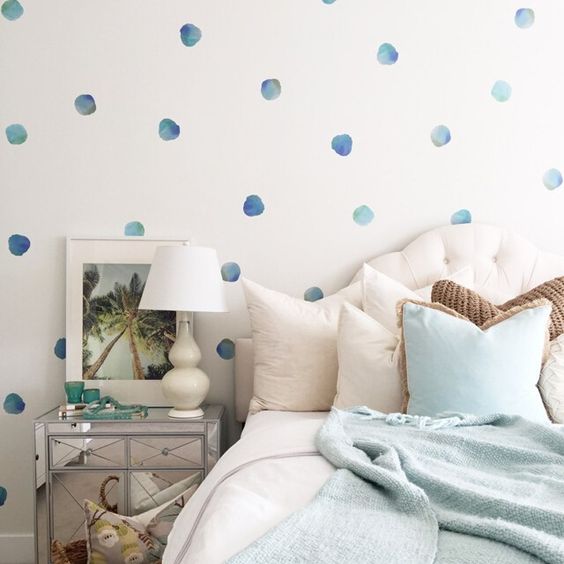
A polka-dot wall will make a great impression
Pea walls will decorate a nursery or kitchen, interpreted in a retro style.
In principle, you can draw on the wall whatever you want. Fantasy patterns, and linear ornaments that repeat the outlines of furniture, and drawings that have a meaningful plot will do. But if in the first versions it is permissible to involve a stencil in the implementation of ideas, then in the latter, painting the walls in two colors will have to be done live, that is, to show your artistic gift. Does the prospect scare you? Then consider that the exclusive interior is already in your pocket.
Linear ornament on the wall
color gradation
The secret of this technology is that when decorating the room, the walls are painted not with two colors, but with a tint palette of one. Different saturation of tone, smoothly turning into each other, and give the desired color gradient.
Gradient wall painting
Usually four shades are involved in the work, the most delicate of which meets you in the hallway. As you move deeper into the house, the color saturation increases. The interior solution looks exciting, so do not rush to dismiss it, but rather see how effective such a combined wall painting is in the photo. Surely what you see will inspire you.
Gradient painting looks exciting
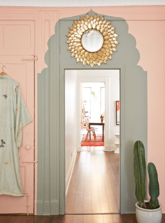
Border decoration
It is not always possible even for masters to clearly draw the boundaries between two colors. But this is not a reason to get upset and refuse the option of wall decoration you like. An unprofessional hand that performed the combined painting of the walls will help to hide wooden slats, moldings, stone borders, and mosaic masonry. Additional decor will not only spoil the impression, it will become the highlight of the interior.
For a smooth transition between colors, use moldings
But in general, who said that the junction of shades should be even? It is quite possible to make it arched, wavy, zigzag - in general, the way the author of the project wished to see it.
Zigzag transition between colors
Conclusion
The design of rooms is, first of all, a wild fantasy. Ideas for creating stylish interiors can be born in your head. Analyze them, and then grab a roller or brushes and turn your abode into a dream home. Combined wall painting is the easiest way to move away from boring standards, so do not miss this opportunity.
Photo gallery - painting walls in two colors
Video