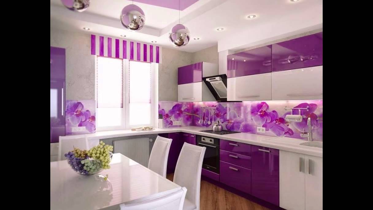
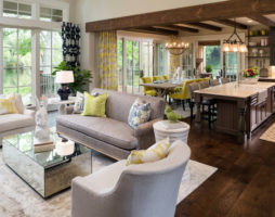
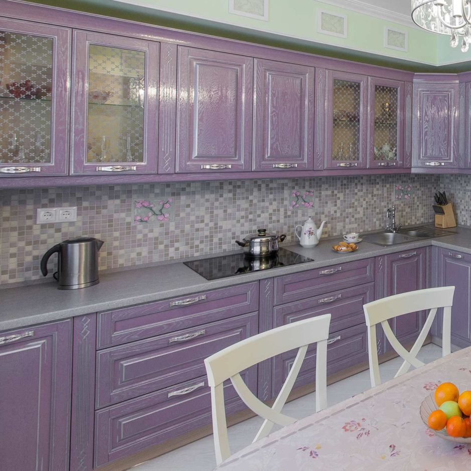
This is one of the typical shades of Provence - a style that is not going to go out of fashion: of course, because a huge base of ready-made projects has been developed, and the potential of this design direction promises new and new discoveries.
The lavender palette is wonderful. She is sentimental - and for this she is loved by the ladies. At the same time, it is moderately cool, which is why it is readily accepted by men. What laws does the kitchen design in lilac color obey?
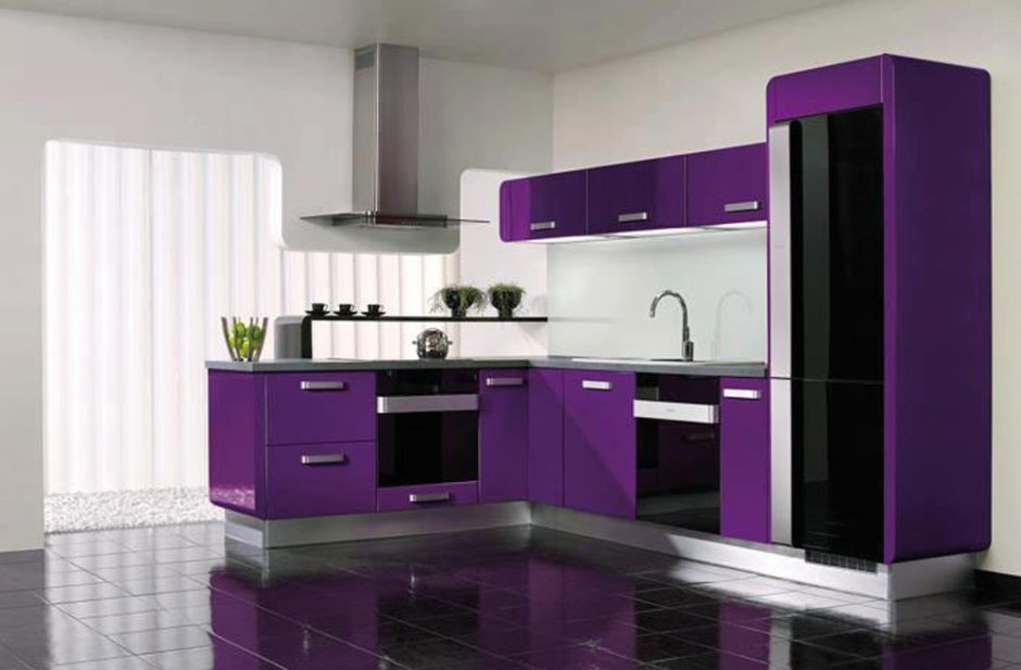
However, the scope of the palette is not limited to Provence. All shades of lilac are used in high-tech and neoclassic, the most delicate - in shabby chic, smoky - in the Scandinavian style.
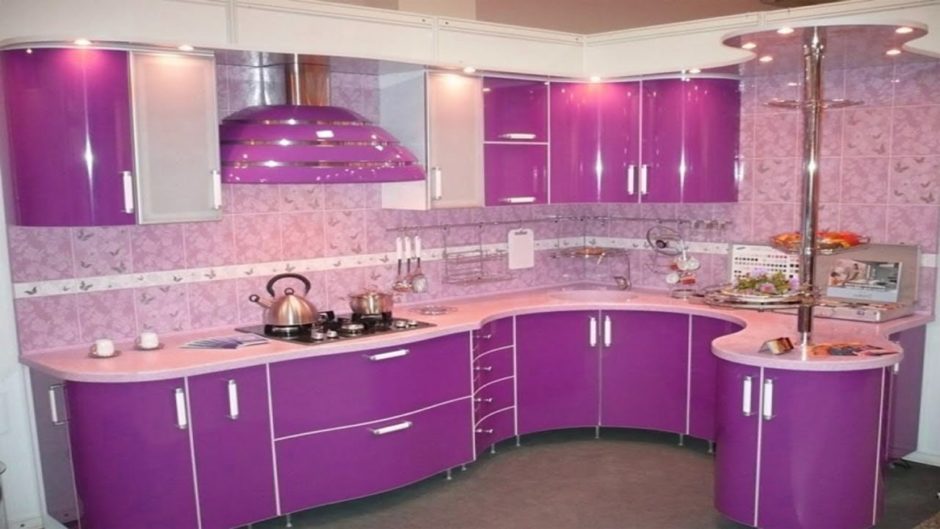
Lilac color is not as simple as it can to appear. I'll tell you a secret: to create a lavender mood in the kitchen, one pale lilac accent, one elegant element is enough. Moreover - if you use a wallpaper with a pattern with a gray-beige-olive-lilac scale, then with a high probability, the eye will fix the lilac component, leaving other colors the role of the background. And here is the total lilac the interior is an extremely risky idea, although it cannot be said that it is doomed to failure. In any case, in an extremely light range, real masterpieces.
lavender walls
Experimenting with painting kitchen walls in lavender are successful provided that the tone is very diluted with white, and more a little grey. In more saturated versions, lilac "clogs" everything the rest of the details, leaving them no chance to be noticed. This color activity - a rather rare occurrence, so not all designers work with purple.
Yes, in the interior modest lilac is surprisingly aggressive. Lavender kitchen projects in the photo confirm: it is worth using a medium-saturated paint for walls, as space begins to shrink like shagreen leather.
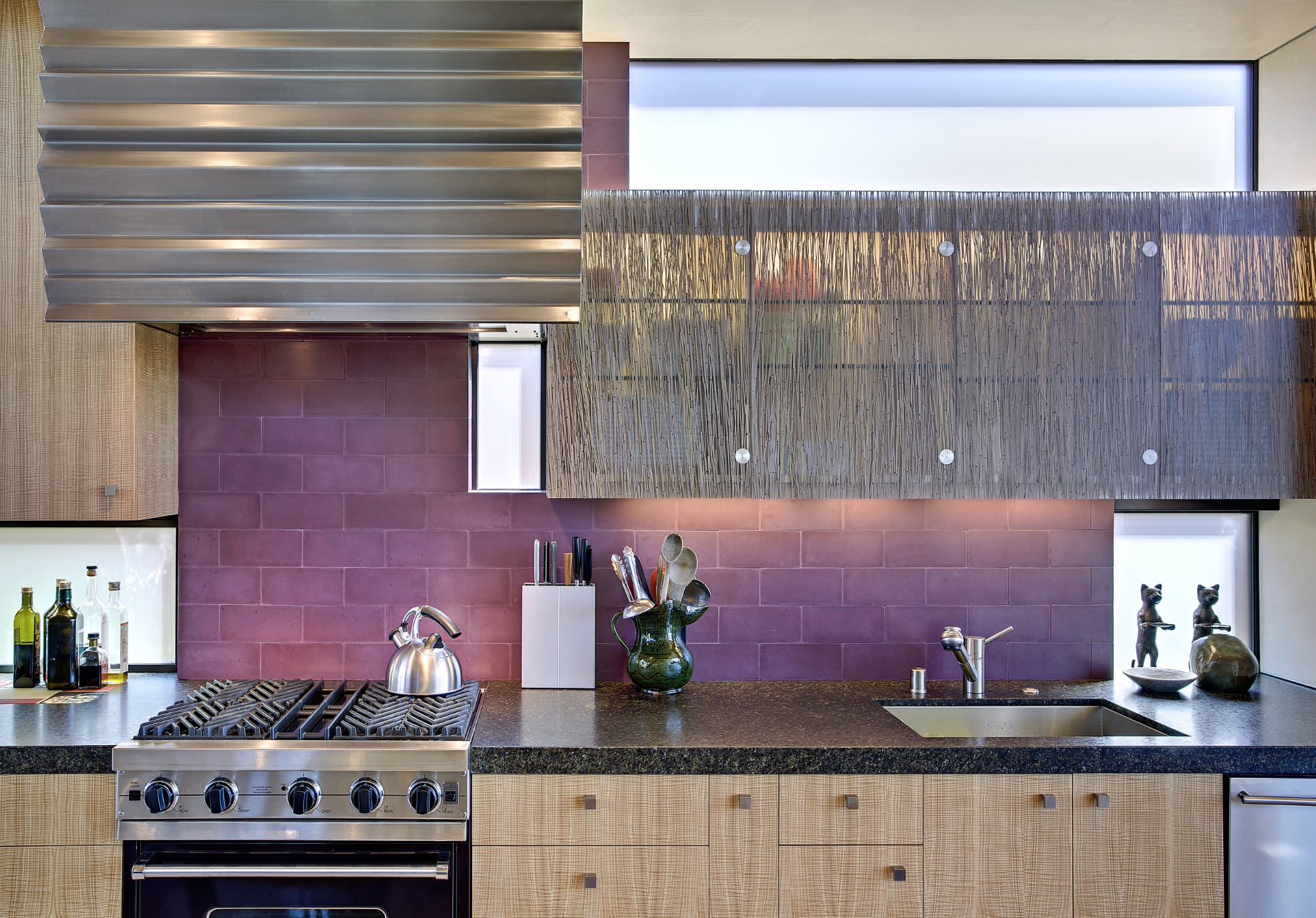
If you use solo smoky lilac accent - to complete one wall, a niche or an apron in it, even with a small area of painted surfaces, it will leave the impression that the design of the kitchen is made in lavender tones.
Interior palette
"King makes retinue". The character of the kitchen lavender tones are largely determined by the choice of additional color accents. Which color next to lilac will emphasize its charm, which will give the interior has a special character?
So, to decorate the kitchen in lavender tones, you need to decide on companion colors. What to choose - win-win combinations or bold, unexpected, trendy?
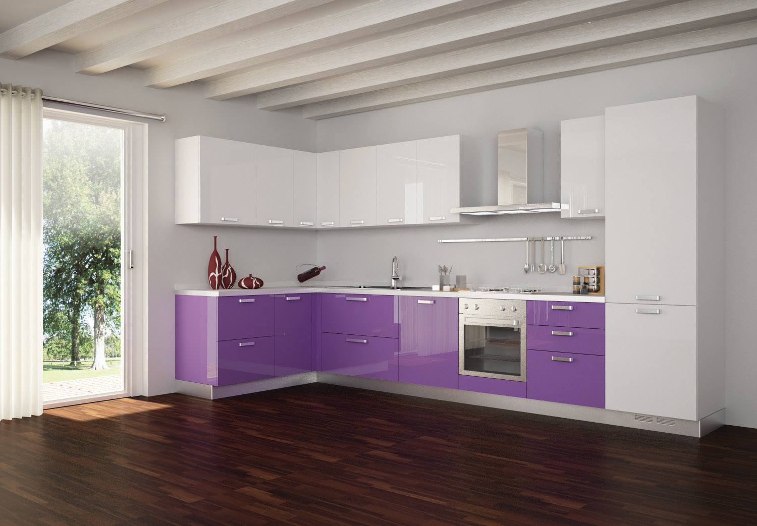
Purple and white
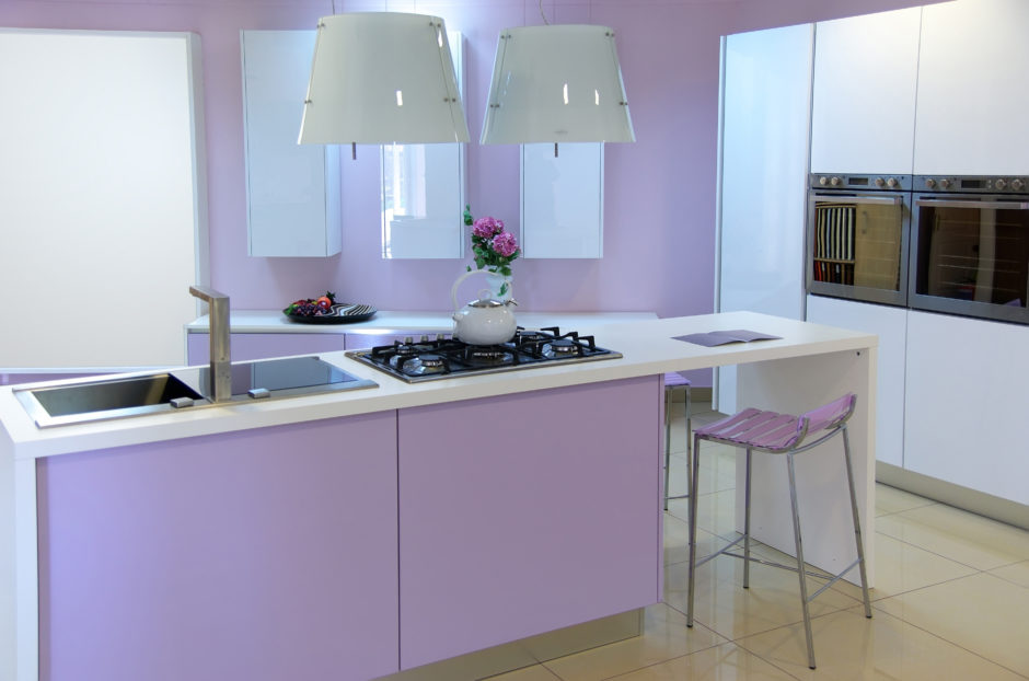
classic palette lilac with white - airy, self-sufficient and flawless. You can withstand the entire interior in two colors or allow one or two additional ones into it: steel and wood, gray and olive, gray and marsala, etc.
Very good white furniture against the backdrop of lavender walls. By the way, kitchen facades, especially if they decorated with panels, often left white.
All these interiors combines a light touch of dreaminess, grace, elegance. They'll like it lovers of perfect order and sterility: in such a kitchen, feeling of purity and freshness.
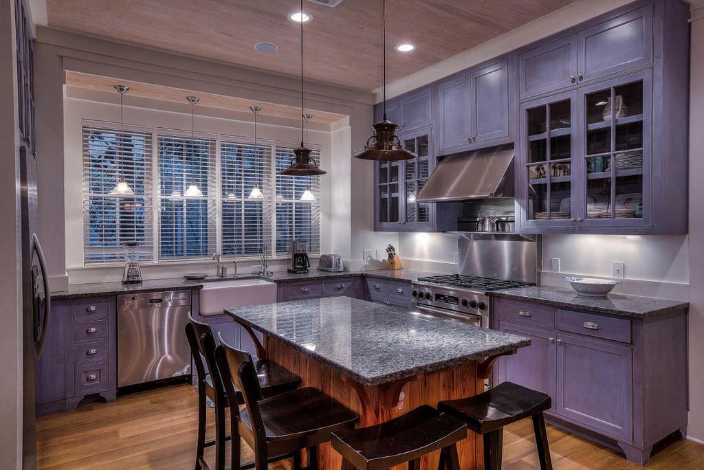
Severe gray
Gray brings lavender to kitchen design certainty, stability. The second argument in his favor is that he is firmly settled in the fashion palette. Finally, unlike lilac, gray is associated with a "masculine" design and helps to reconcile the tastes of the inhabitants of the house.
Gray furniture, despite its many years popularity, still looks fresh and stylish. Maybe because renovation of kitchens is not done often and not everyone used it in their apartment such a chip?
It is reasonable to take gray porcelain stoneware or laminate for flooring. A bold enough step is to paint part of the walls gray. Examples decorations help to see how effectively this technique works in a lavender kitchen (design on Photo).
Both options are interesting - lilac kitchen furniture against a gray wall and vice versa.
You can not ignore the hot trend: natural stone for countertops and backsplash. Actual use of imitations gray granite and marble in a lavender kitchen, and natural finishes will a real sensation.
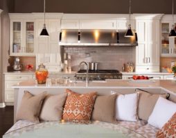
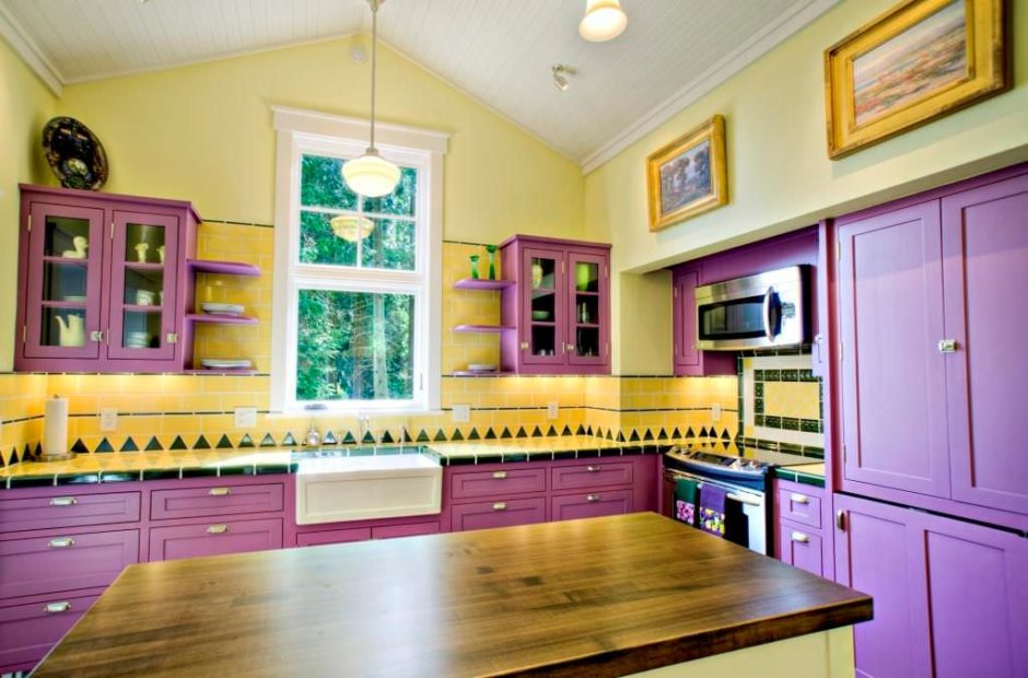
Seductive cream
Vanilla and lavender color in the interior of the kitchen, it would seem, repeats the alliance with white, but no! All shades of vanilla warm, sentimentally sweet - completely neutralize the detached coldness purple. The mood of the interior is dominated by comfort and soft luxury.
The chosen palette suggests feminine design, in the spirit of Provence and shabby chic. The design is organically complemented by curtains with floral motifs, living plants, retro elements in utensils, furniture fittings, in models of kitchen appliances.
Universal beige
Beige-lavender kitchen - another warm interior for introverts and just lovers of peace. It is also good in that beige tones visually dissolve or look completely natural furniture from light wood of cold shades - and this helps to avoid forced variegation. everything is organic in this design - the floor, doors, countertop fit easily into the selected palette.
A discreet neutral background is the perfect way to presentation of spectacular designer accessories in accent colors. It could be modern collectible tableware, chandelier, posters or designer tiles on apron - they have no chance of going unnoticed.
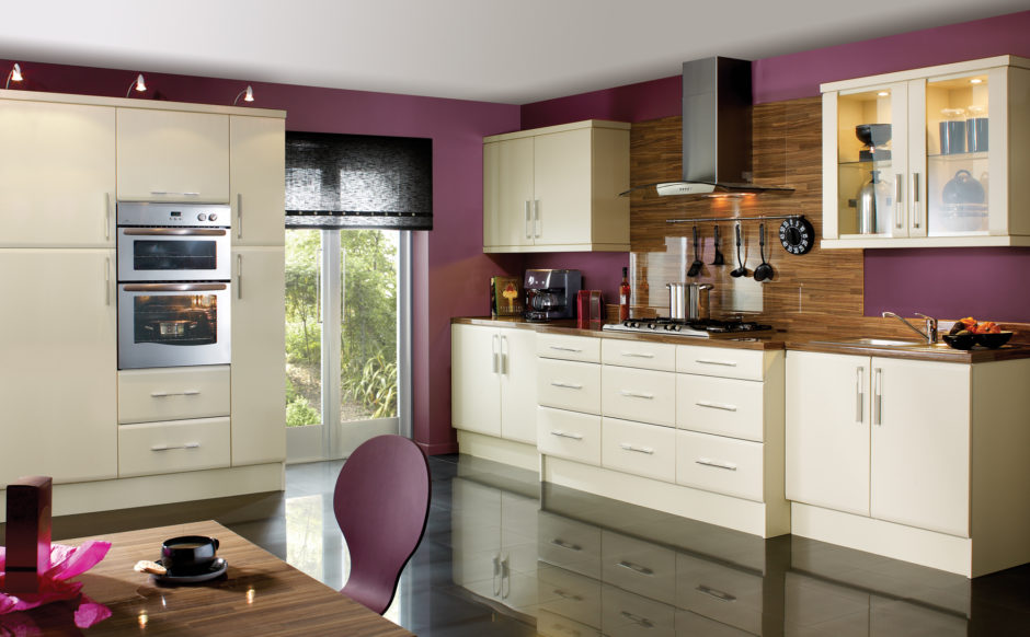
Wooden furniture in a dark chocolate palette will add solidity, as well as interspersed with a fashionable shade of TawnyPort (Port wine). But, unlike the chocolate tone, port wine will bring passion to the design. By the way, it is one of the hottest colors of 2019.
Adorable pistachio
Whoever said that the lilac interior lacks brightness and playfulness has not seen lavender-colored kitchen projects (photo) with the addition of pistachio.
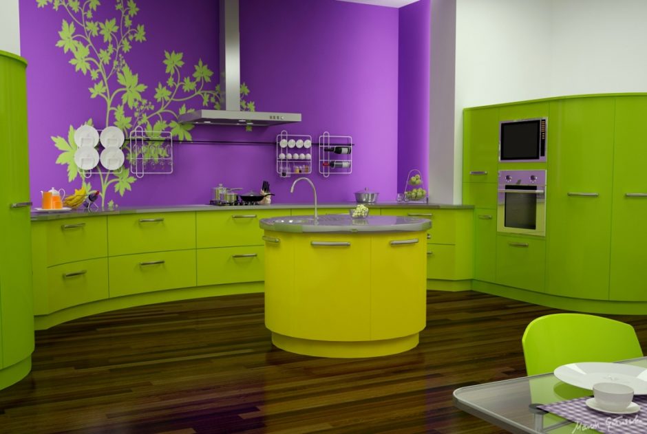
Separately, these shades are very restrained, but together they create a temperamental, optimistic alliance, open to combinations with gray, mustard, brown.
Light shades are used in Provencal design, more saturated - in minimalism, but in any case, the kitchen looks very picturesque. Dark wooden dining room furniture makes it look solid and takes away towards neoclassicism.
Olive or eucalyptus
This combination seems to be close to the previous one, but painted with a completely different mood - more thoughtful, nostalgic.
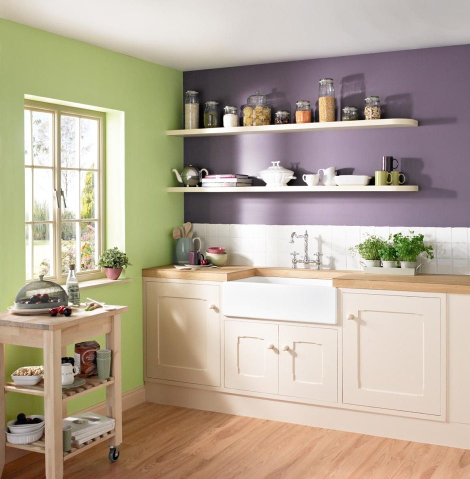
Olive is not as heavily sun-drenched as pistachio. And eucalyptus can be seen as a new incarnation olive. This shade, as if covered with a gray wax haze, actively uses a well-known Scandinavian concern in its furniture, positioning it just like olive. It makes the perfect combination with lavender, successfully complemented by gray or beige, and rather belongs to the traditional Provencal palette than Scandinavian.
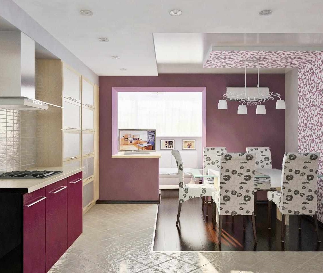
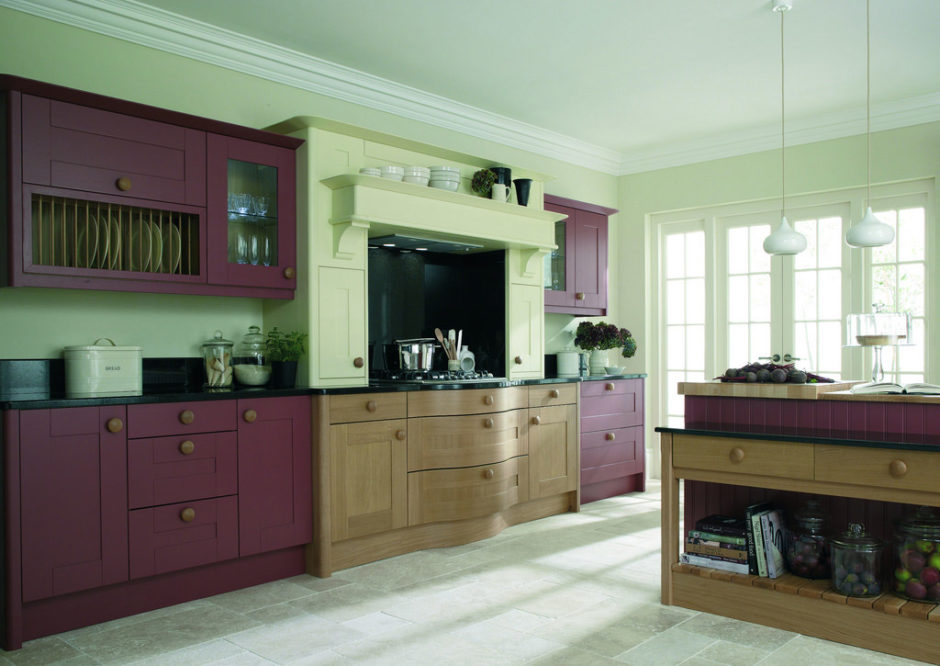
wine notes
Add passion to your lavender kitchen with a new palette color for 2019 – burgundy in a shade of port wine..
Juicy, punchy TawnyPort can easily to seize leadership in lavender cuisine, but this is already a matter of compliance proportions.
With skillful dosing, the color of port highlights and enhances the mauve, creating a juicy tonal contrast.
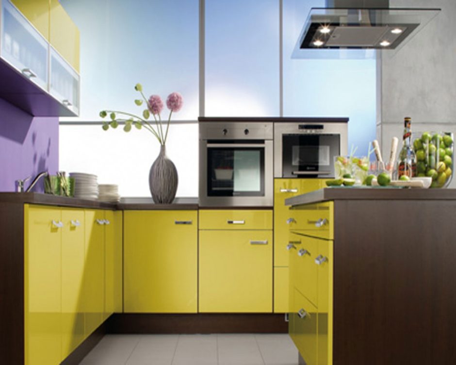
Mustard-colored splint
An optimistic hot contrast is present in a pair of lilac - mustard. The spicy companion decisively changes the mood of the kitchen in lavender tones without leaving a trace of her refined sophistication. brightly, boldly, openly! Mustard returns the romantic mood of the interior to a joyful one. reality.
This pair is easily adjacent to additional colors - wine, olive, pistachio and dark blue, which diversify palette, being present in accessories and decor.
Golden highlights
Another way to revive and brighten purple interior - add some gold to it. Golden glare will sparkle on brass fittings, in the ornament of wallpaper with golden contours, in frames for photographs on walls, in furniture upholstery or on curtains.
A cute game of "Empire" gives the kitchen a lavender colors some conviviality, sublimity. It can be enhanced by for historical interiors with techniques: white stucco friezes with light gilding, graceful contours of furniture, wallpaper in the form of panels framed by embossed frames. Of course, such a design makes sense in a fairly spacious kitchen-dining room.
chocolate wedge
Kitchen design in lavender tones takes on classic solidity in the presence of brown.
This palette is suitable for rooms with a good natural lighting.
The role of ideal accents in such an interior is played by cream-colored additions and large green plants.
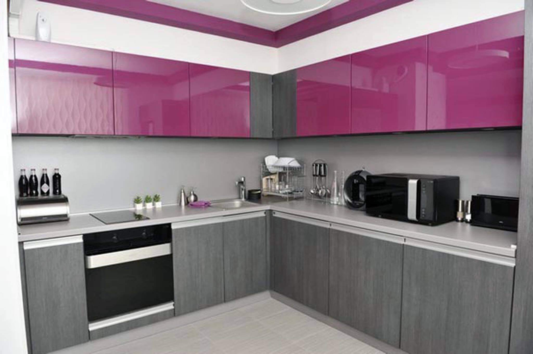
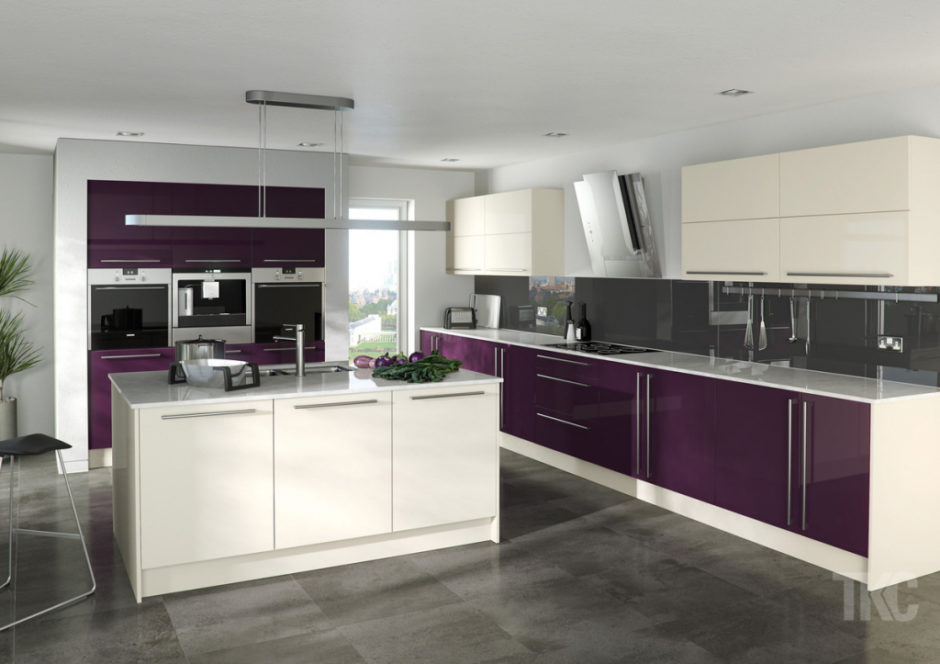
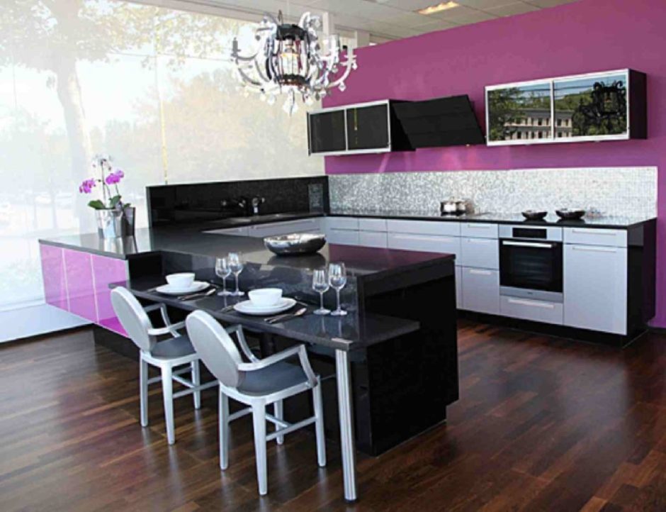
Black and lilac
Scandinavian style clearly showed how black accessories can emphasize the freshness of lilac. It is desirable that they were contoured - furniture with thin legs, roof rails, cornices. Doesn't violate harmony with the black front of the oven or the glass-ceramic surface of the stove.
Drawings with floral motifs
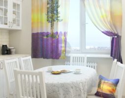
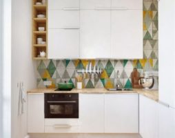
Huge popularity in the design of the kitchen use images of lavender sprigs on wallpaper, fabrics, ceramic tiles, crockery. Of course, this is a tribute to the Provence style, where this trend came from. But French provincial style is unable to "privatize" lavender floral motifs - they began to be found in neoclassical interiors, and in minimalism.
Also available in lilac palette finishing materials and fabrics with other floral patterns - they can see roses, lilacs, peonies, but their palette and romantic mood unite.
Lilac accents
It was found that light shades of purple act soothingly. They are able to relieve anxiety, adjust to philosophical way, quench conflict. It is believed that lilac reduces appetite - and this moment is very appreciated by women.
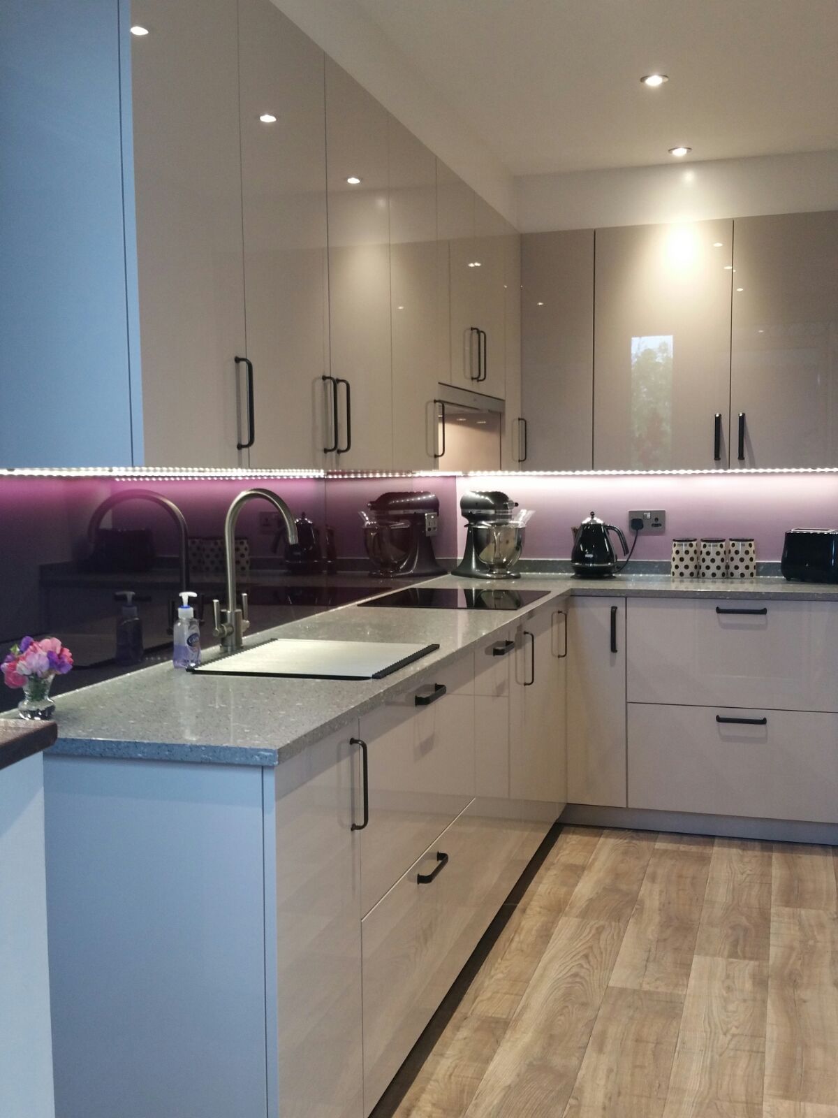
To avoid excessive melancholy of the interior, but to maintain its elegance, lavender tone can be added to the kitchen through accessories or trim details.
- Accent wall, wall painting panels, wallpaper with a purple pattern - all these are ways to bring color to the design walls, but do not make it the main or the only one.
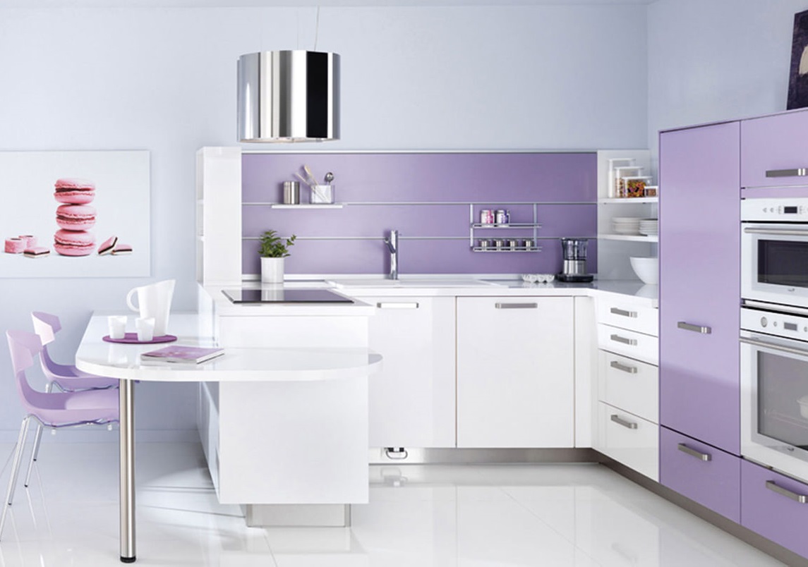
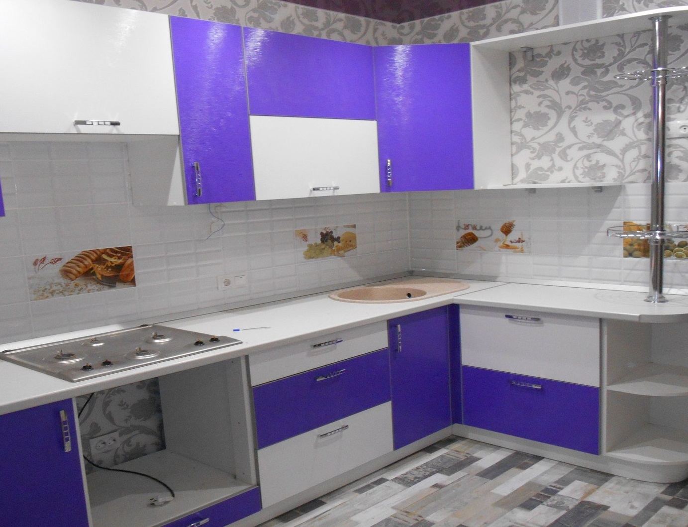
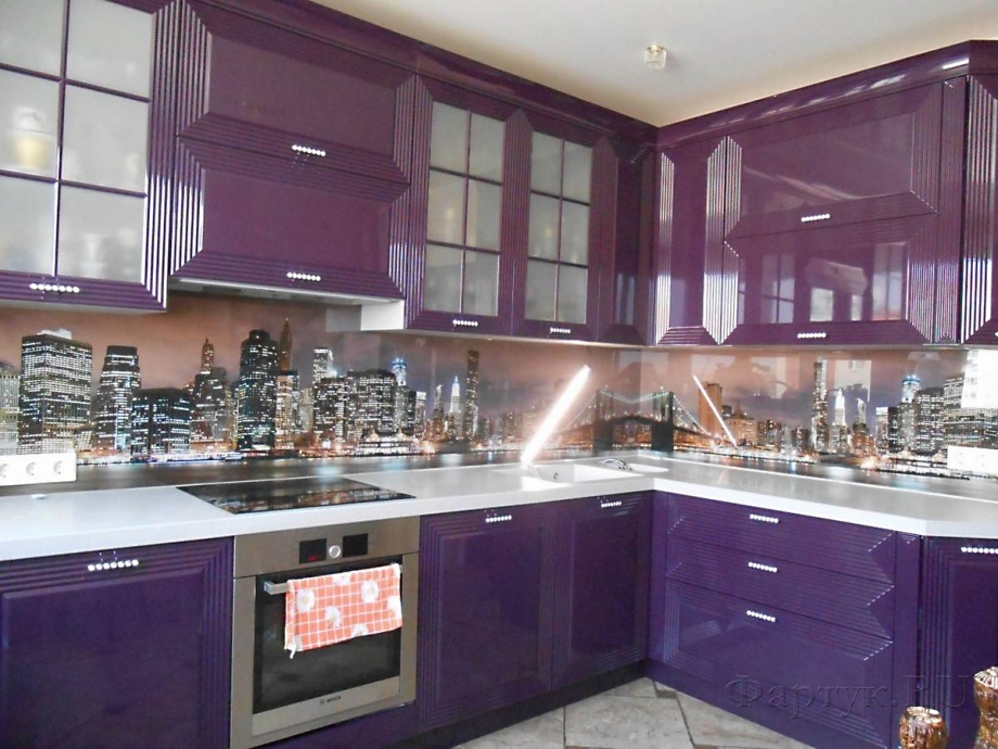
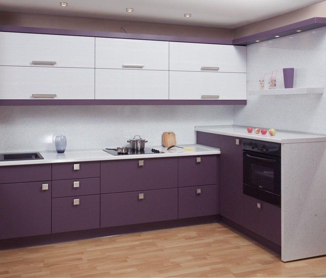
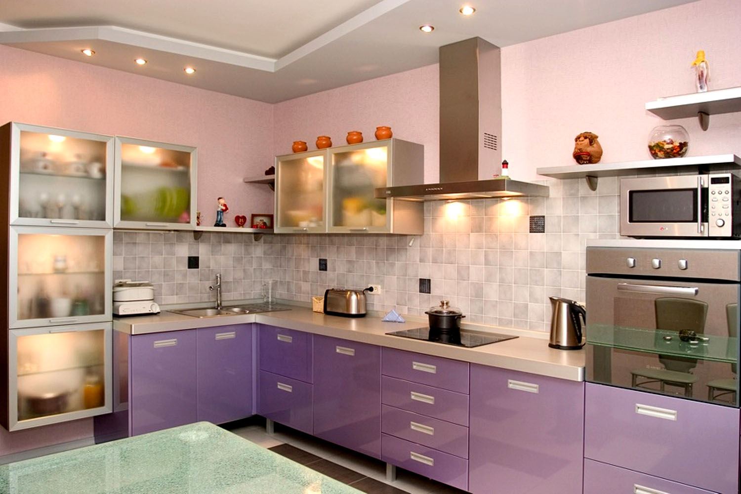
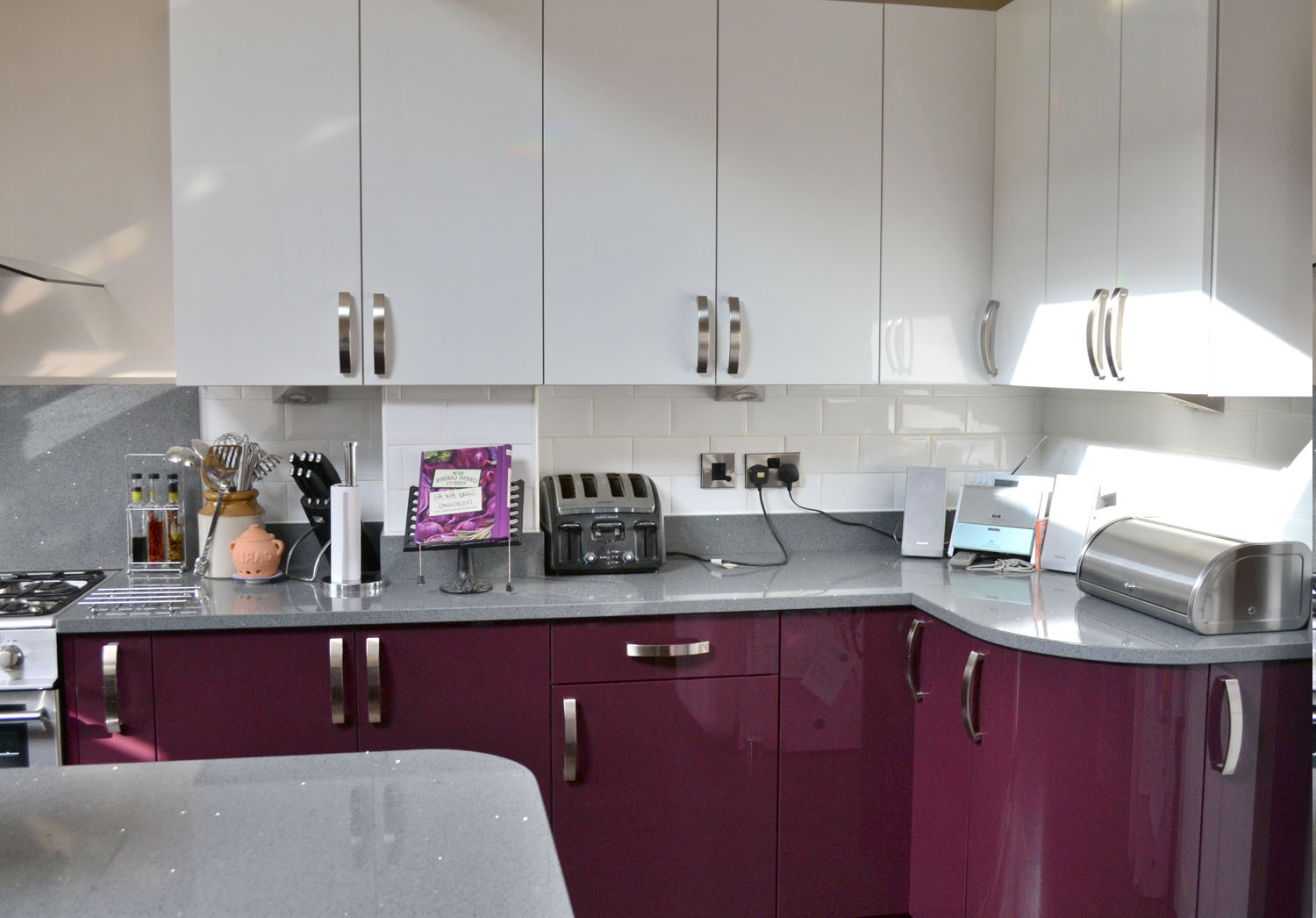
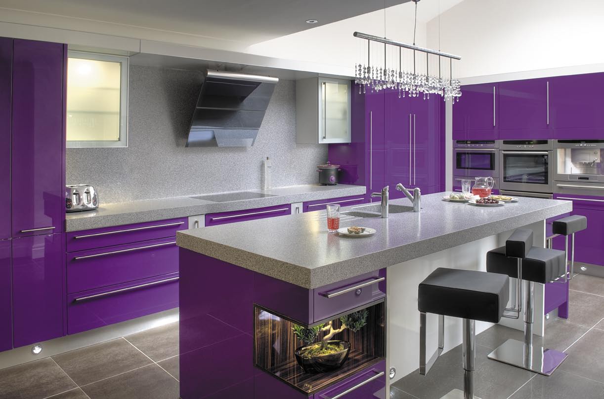
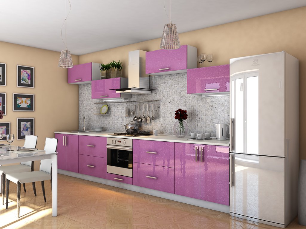
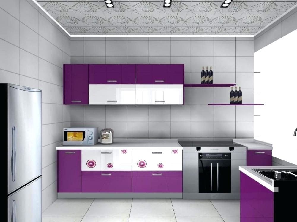
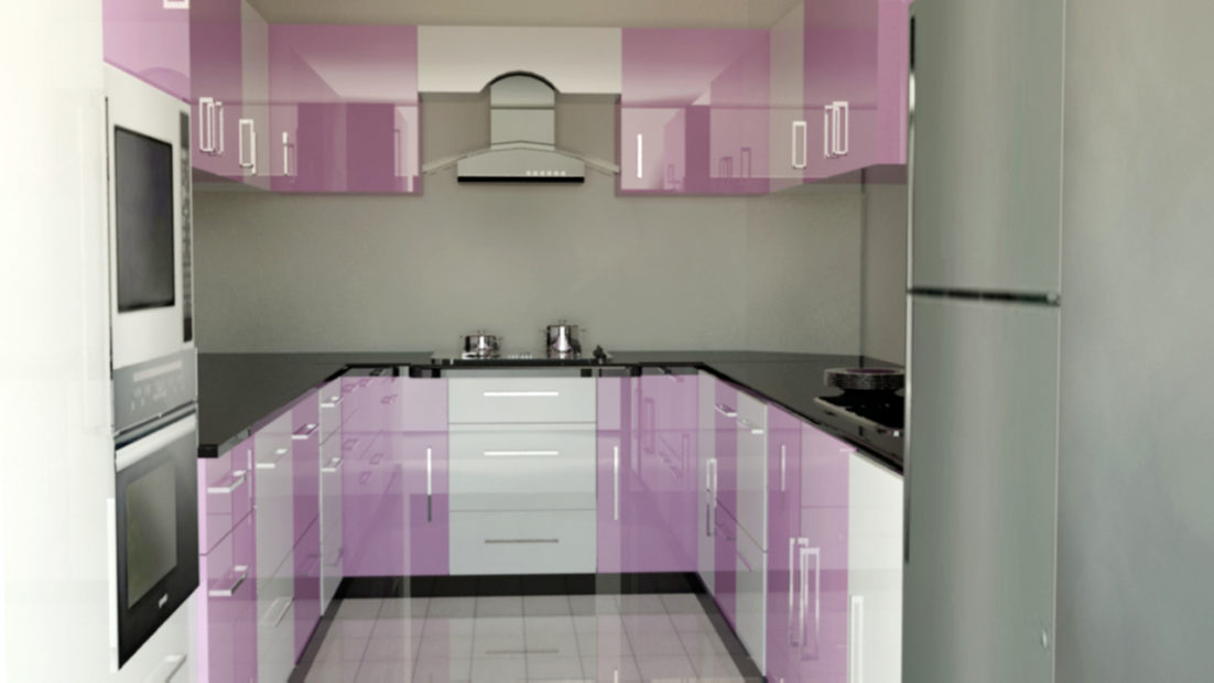
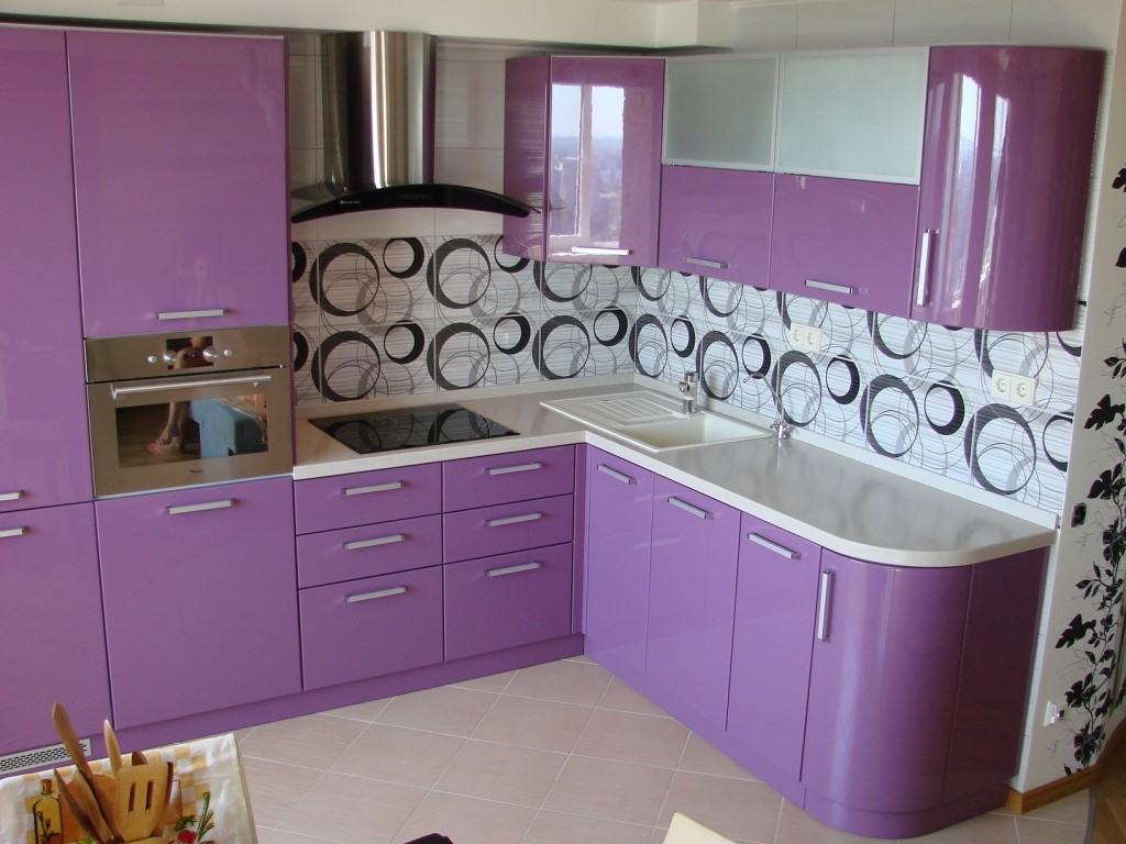
- Lilac kitchen fronts pastel shades. A saturated shade is often broken - used only for lower cabinets or wall cabinets, or replace the top of the kitchen set with open shelves.
- Lavender color and pattern textiles - curtains, tablecloths, napkins, towels, seat cushions, rugs.
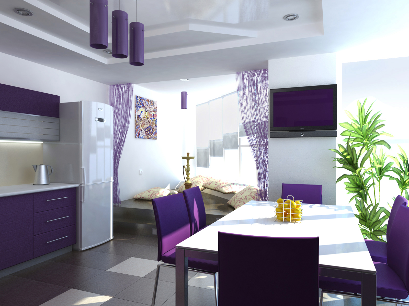
- Lilac dining room furniture. Chairs or a table painted with purple paint will create a lavender mood.
- Lilac apron - small square, but an accent wall fragment.
Always in fashion

Rarely which of the colors is perceived as definitely "beautiful" - this can be said about lavender without any doubt. He beautiful in itself and able to ennoble everything around. Therefore purple interiors are always in trend - at least one of the shades is officially announced favorite (in 2019 it is “port wine”), and the rest are pulled into real projects and look consistently relevant.